41
plot(density(rexp(100))

Obviously all density to the left of zero represents bias.

I'm looking to summarize some data for non-statisticians, and I want to avoid questions about why non-negative data has density to the left of zero. The plots are for randomization checking; I want to show the distributions of variables by treatment and control groups. The distributions are often exponential-ish. Histograms are tricky for various reasons.

A quick google search gives me work by statisticians on non-negative kernels, e.g.: this.

But has any of it been implemented in R? Of implemented methods, are any of them "best" in some way for descriptive statistics?

EDIT: even if the from command can solve my current problem, it'd be nice to know whether anyone has implemented kernels based on literature on non-negative density estimation

Danica
  • 21,852
  • 1
  • 59
  • 115
generic_user
  • 11,981
  • 8
  • 40
  • 63
  • 3
    Not what you are asking, but I wouldn't apply kernel density estimation to something that should be exponential, especially for presentation to non-statistical audiences. I would use a quantile-quantile plot and explain that the plot should be straight if the distribution were exponential. – Nick Cox Jul 29 '13 at 07:28
  • I'm presenting randomization checks, and I want to show the distributions of variables by treatment and control groups. I don't have any priors on what the distributions should look like, though they often happen to be exponential-ish. Before you ask, this is better than simply presenting means, variances, and tstats, because of outliers on the tails over-affecting means. – generic_user Jul 29 '13 at 07:30
  • I see. Your initial example of an exponential did concentrate my mind. Perhaps revise your question because this comment does make much clearer what you want. – Nick Cox Jul 29 '13 at 07:44
  • 7
    `plot(density(rexp(100), from=0))` ? – Stéphane Laurent Jul 29 '13 at 07:59
  • 5
    One thing that I have sometimes done fairly successfully is to get a kde on the logs, and then transform the density estimate (not forgetting the Jacobian). Another possibility would be to use a log-spline density estimate set up so it knows about the bound. – Glen_b Jul 29 '13 at 09:52
  • What do you do about zero values? And I learned about jacobians from a particularly bad teacher... Your comment might be an answer. – generic_user Jul 29 '13 at 10:25
  • 1
    possible duplicate of [How can I estimate the density of a zero-inflated parameter in R?](http://stats.stackexchange.com/questions/6588/how-can-i-estimate-the-density-of-a-zero-inflated-parameter-in-r) – Andy W Jul 29 '13 at 12:07
  • 1
    I discussed the transformation method mentioned by @Glen_b in http://www.stata-journal.com/sjpdf.html?articlenum=gr0003 (see pp.76-78). Zeros might be accommodated by using log(x + 1) rather than log and modifying the Jacobian. – Nick Cox Jul 29 '13 at 13:44
  • 1
    @NickCox +1 On the other hand if there are a non-trivial proportion of exact zeros, density estimation probably isn't what you want. – Glen_b Jul 29 '13 at 22:16
  • 1
    @Glen_b I agree. See my early comment about preferring quantile plots here myself, but I am bending over backwards to accommodate the question. – Nick Cox Jul 29 '13 at 22:23

4 Answers4

27

An alternative is the approach of Kooperberg and colleagues, based on estimating the density using splines to approximate the log-density of the data. I'll show an example using the data from @whuber's answer, which will allow for a comparison of approaches.

set.seed(17)
x <- rexp(1000)

You'll need the logspline package installed for this; install it if it is not:

install.packages("logspline")

Load the package and estimate the density using the logspline() function:

require("logspline")
m <- logspline(x)

In the following, I assume that the object d from @whuber's answer is present in the workspace.

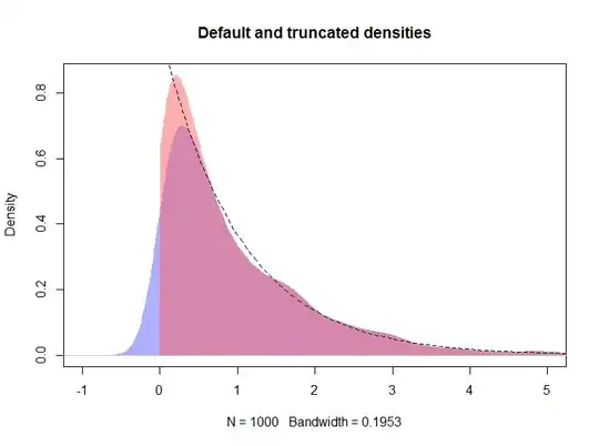
plot(d, type="n", main="Default, truncated, and logspline densities", 
     xlim=c(-1, 5), ylim = c(0, 1))
polygon(density(x, kernel="gaussian", bw=h), col="#6060ff80", border=NA)
polygon(d, col="#ff606080", border=NA)
plot(m, add = TRUE, col = "red", lwd = 3, xlim = c(-0.001, max(x)))
curve(exp(-x), from=0, to=max(x), lty=2, add=TRUE)
rug(x, side = 3)

The resulting plot is shown below, with the logspline density shown by the red line

Default, truncated, and logspline densities

Additionally, the support for the density can be specified via arguments lbound and ubound. If we wish to assume that the density is 0 to the left of 0 and there is a discontinuity at 0, we could use lbound = 0 in the call to logspline(), for example

m2 <- logspline(x, lbound = 0)

Yielding the following density estimate (shown here with the original m logspline fit as the previous figure was already getting busy).

plot.new()
plot.window(xlim = c(-1, max(x)), ylim = c(0, 1.2))
title(main = "Logspline densities with & without a lower bound",
      ylab = "Density", xlab = "x")
plot(m,  col = "red",  xlim = c(0, max(x)), lwd = 3, add = TRUE)
plot(m2, col = "blue", xlim = c(0, max(x)), lwd = 2, add = TRUE)
curve(exp(-x), from=0, to=max(x), lty=2, add=TRUE)
rug(x, side = 3)
axis(1)
axis(2)
box()

The resulting plot is shown below

Comparison of logspline density estimates with and without a lower bound on the support

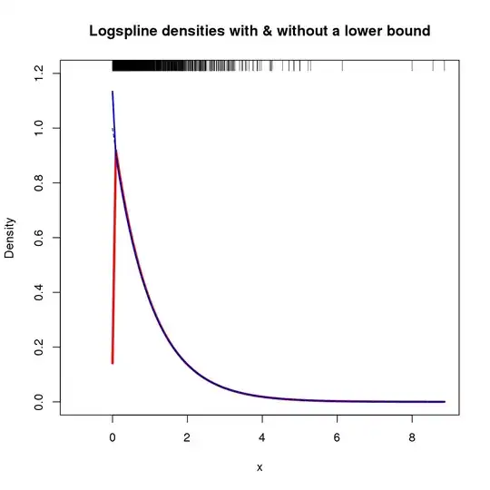
In this case, exploiting knowledge of x results in a density estimate that doesn't tend to 0 at $x = 0$, but is similar to the standard logspline fit elsewhere over x

vkehayas
  • 701
  • 5
  • 13
Gavin Simpson
  • 37,567
  • 5
  • 110
  • 153
  • 1
    +1 I like this idea but am surprised it works *so* well with the example data (from an exponential distribution). Do you have some intuition as to why that is? In some sense it does *great* near $0$ but it is missing the "lump" of values near $1$ in the actual data, so I wonder whether there's not some kind of trade-off between good accuracy at low values and low accuracy (or, equivalently, large bandwidths) at high values. – whuber Sep 27 '13 at 19:58
  • @whuber Good question. I only came across this approach recently myself. I suspect a good question to ask here is, as the truncated and logspline methods are just estimates of the true density, are the differences in fit significant, statistically? I'm not sure exactly why it does so well at zero, though. I'd appreciate knowing why too. – Gavin Simpson Sep 27 '13 at 20:09
  • @GavinSimpson, Thanks for this nice answer. Can you reproduce the last plot with the lastest version of `logspline`? For me, the density of both, the bounded and the unbounded version go to zero at `x = 0`. – cel Nov 21 '14 at 16:27
25

One solution, borrowed from approaches to edge-weighting of spatial statistics, is to truncate the density on the left at zero but to up-weight the data that are closest to zero. The idea is that each value $x$ is "spread" into a kernel of unit total area centered at $x$; any part of the kernel that would spill over into negative territory is removed and the kernel is renormalized to unit area.

For instance, with a Gaussian kernel $K_h(y,x) = \exp(-\frac{1}{2}((y-x)/h)^2) / \sqrt{2\pi}$, the renormalization weight is

$$w(x) = 1 / \int_0^\infty K(y,x) dy = \frac{1}{1 - \Phi_{x, h}(0)}$$

where $\Phi$ is the cumulative distribution function of a Normal variate of mean $x$ and standard deviation $h$. Comparable formulas are available for other kernels.

This is simpler--and much faster in computation--than trying to narrow the bandwidths near $0$. It is difficult to prescribe exactly how the bandwidths should be changed near $0$, anyway. Nevertheless, this method is also ad hoc: there will still be some bias near $0$. It appears to work better than the default density estimate. Here is a comparison using a largish dataset:

Figure

The blue shows the default density while the red shows the density adjusted for the edge at $0$. The true underlying distribution is traced as a dotted line for reference.


R code

The density function in R will complain that the sum of weights is not unity, because it wants the integral over all real numbers to be unity, whereas this approach makes the integral over positive numbers equal to unity. As a check, the latter integral is estimated as a Riemann sum.

set.seed(17)
x <- rexp(1000)
#
# Compute a bandwidth.
#
h <- density(x, kernel="gaussian")$bw # $
#
# Compute edge weights.
#
w <- 1 / pnorm(0, mean=x, sd=h, lower.tail=FALSE)
#
# The truncated weighted density is what we want.
#
d <- density(x, bw=h, kernel="gaussian", weights=w / length(x))
d$y[d$x < 0] <- 0
#
# Check: the integral ought to be close to 1:
#
sum(d$y * diff(d$x)[1])
#
# Plot the two density estimates.
#
par(mfrow=c(1,1))
plot(d, type="n", main="Default and truncated densities", xlim=c(-1, 5))
polygon(density(x, kernel="gaussian", bw=h), col="#6060ff80", border=NA)
polygon(d, col="#ff606080", border=NA)
curve(exp(-x), from=0, to=max(x), lty=2, add=TRUE)
whuber
  • 281,159
  • 54
  • 637
  • 1,101
4

To compare distributions by groups (which you say is the goal in one of your comments) why not something simpler? Parallel box plots work nicely if N is large; parallel strip plots work if N is small (and both show outliers well, which you say is a problem in your data).

Peter Flom
  • 94,055
  • 35
  • 143
  • 276
  • 1
    Yeah, thanks, that works. But I like density plots. They show more about the data than boxplots do. I guess I am kind of surprised that nothing seems to have been already implemented. Maybe I'll implement one of these things myself one day. People would probably find it useful. – generic_user Jul 29 '13 at 10:56
  • 1
    I like density plots, too; but you have to consider your audience. – Peter Flom Jul 29 '13 at 11:27
  • 1
    Have to agree with @PeterFlom on this one. Don't get too complicated if your audience isn't statistically knowledgeable. You could also do comparative/parallel box-plots with an overlay of butterfly plots on top. That way the box-plot summary is visible as well as all the data. – doug.numbers Jul 29 '13 at 21:45
  • The suggestion that different people comprehend aggregated plots differently is certainly correct. Despite understanding what a density plot is (and understanding that it is not a probability) I have no understanding of what a "parallel boxplot" might be. It suggests a parallel coordinates plot but I suspect that is not correct. – DWin Oct 03 '13 at 17:14
2

As Stéphane comments you can use from = 0 and, additionally, you can represent your values under the density curve with rug (x)

chl
  • 50,972
  • 18
  • 205
  • 364
Aghila
  • 657
  • 5
  • 18
  • 4
    Correct me if I am wrong but `from=0` looks as if it just suppresses plotting for values below 0; it doesn't correct the calculation for the fact that some of the distribution has been smeared below 0. – Nick Cox Jul 29 '13 at 09:36
  • 1
    That is correct. Using the `from` command yields a plot that looks like it has the peak just right of zero. But if you look at histograms with continually smaller bins, a lot of data will show the peak AT zero. The `from` is just a graphical trick. – generic_user Jul 29 '13 at 10:26
  • @NickCox I'm not sure but I don't think `from=0` suppresses anything. It just starts the "grid" at zero. – Stéphane Laurent Jul 29 '13 at 10:41
  • The difference is whether the estimated density is non-zero for negative values, not whether or not it is plotted. Researchers may decide not to worry about this if all they want is a visualization. – Nick Cox Jul 29 '13 at 13:36
  • @NickCox The command `density(rexp(100), from=0)` has nothing to do with the graphic – Stéphane Laurent Jul 29 '13 at 16:55
  • @Stéphane Laurent Indeed; `plot()` is what defines the graphic. But my question (poorly expressed; I am not a routine R user) remains about precisely what is being calculated. – Nick Cox Jul 29 '13 at 17:44
  • @NickCox I don't know. I don't really "trust" density estimation :) BTW [five years ago](http://forums.cirad.fr/logiciel-R/viewtopic.php?t=1084) I encountered the same trouble with the peak at $0$. – Stéphane Laurent Jul 29 '13 at 18:38
  • @Nick Even for "just" a visualization the estimation method is still worth worrying about. The default approach for most density algorithms is to produce an asymptotically unbiased estimate. To the extent to which some of the estimated density is negative (and forcibly not plotted), that reflects the removal of some of the density from the plot itself--most of which was taken from the smallest values. That creates a negative, varying bias in the KDE in the range roughly from $0$ up to two or three times the bandwidth. – whuber Jul 29 '13 at 21:25