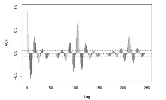
I'm having a bit of trouble understanding the blue dotted lines in the following picture of autocorrelation function:
Could someone give me a simple explanation, what they are telling me?
I'm having a bit of trouble understanding the blue dotted lines in the following picture of autocorrelation function:
Could someone give me a simple explanation, what they are telling me?
The lines give the values beyond which the autocorrelations are (statistically) significantly different from zero. Your ACF seems to indicate seasonality. I recommend Forecasting: Principles and Practice by Hyndman & Athanasopoulos, which is freely available online. (You can also buy a paper version.)
It looks like seasonality (of length 18 periods) and a longer cyclical term of about 6 seasonal intervals.
It might also be caused by an actual periodic function
What does the PACF or IACF look like?
Edit: The plot looks to be one generated in R; the blue dashed lines represent an approximate confidence interval for what is produced by white noise, by default a 95% interval
They are telling you whether the correlation at that lag is significant. Imagine if you have your samples all independent in the time series (which is the null hypothesis), the correlation at that lag will be calculated as
$ var( Corr(x, y) ) = var( \frac{Cov(x, y)}{\sigma_x * \sigma_y} ) = var( \frac{\mu_{xy}- \mu_x * \mu_y}{\sigma_x * \sigma_y} ) = var( \frac{\mu_{xy}}{\sigma_x * \sigma_y} ) = \frac{ (\mu_x^2 + \sigma_x^2)*(\mu_y^2 + \sigma_y^2) - \mu_x^2 * \mu_y^2}{n * \sigma_x^2 * \sigma_y^2} $
When $x$ and $y$ are with mean 0, you get $ var( Corr(x, y) ) = 1/n $.
Thus, if you are looking for the 95% confidence interval, you have $ [ -1.96/\sqrt{n}, +1.96/\sqrt{n} ]$.