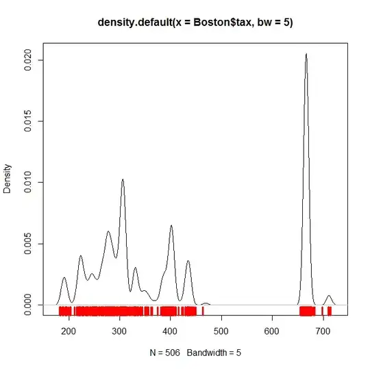
From the R package MASS, of the $506$ total observations in Boston, $369$ have a value for tax below 470 and $137$ have a value for tax above 665. In fact 666 is by far the most common value in the data set, appearing $132$ times.
So if the area of the density plot to the left is about twice the area to the right, then that could reasonably be taken as representing the distribution. Visual inspection suggests this might be what is happening.
A more accurate representation would have the right peak much higher and narrower, and this could be achieved by adjusting the parameters.
Added for comments:
For example with a much narrower bandwidth for the density function and some manual jitter:
library(MASS)
plot(density(Boston$tax, bw=5))
rug(Boston$tax + rnorm(length(Boston$tax), sd=5), col=2, lwd=3.5)
you would get something like this