Is there an official name for this extremely simple plot, in which vertical lines indicate the distribution of some samples in a range?
-
8"rug", when used with other plots. – Gimelist Dec 05 '14 at 12:43
-
7There is no official name. Much depends on whether the use of vertical lines is essential, or other symbols would be accepted, and on whether stacking or jittering is allowed when there are ties. At http://stats.stackexchange.com/questions/102735/what-to-call-this-graph-showing-icons-for-artists-on-a-horizontal-axis-indicatin/102739#102739 I give **22 different names** found for the wider sense of this kind of plot. – Nick Cox Dec 05 '14 at 14:45
4 Answers
The first example I have seen them referenced in are Strips displaying empirical distributions: I. textured dot strips (Tukey and Tukey, 1990) although I have never been able to actually get that technical report.
Tim is right: they are often accompanied as the rug on an additional plot to show the location of individual observations, but rug plot is a bit more general and that type of plot is not always on the rug of another plot as your question shows!
- Here is an example of using points on the rug instead of lines.
- Here is an example of the rug being points and not displaying all of the data, but only data missing in the other dimension of a scatterplot.
So a rug plot is not always a set of lines on the borders of another graph, and that type of plot in your question is not always on the margins of another plot. Here is an example of the lines superimposed on a kernel density instead of on the rug of the plot, called a beanplot. The larger lines I believe are used to visualize different quantiles (a.k.a. letter values) of the distribution.
(source: biomedcentral.com)
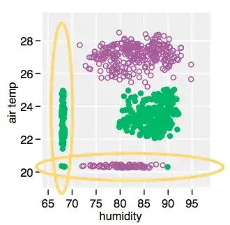
In Wilkinson's Grammar of Graphics it may be considered a one-dimensional scatterplot but using line segments instead of the typical default of circles. The point of this is to prevent many of the nearby points from being superimposed. If you have many points and draw them semi-transparently they eventually turn into a density strip, see the final picture in this post.
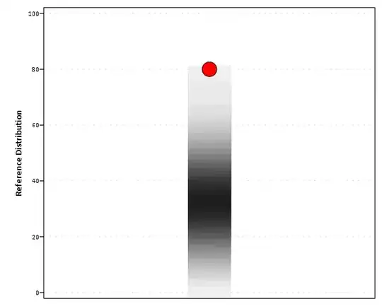
I've even seen them suggested to use as sparklines (Greenhill et al., 2011) in that example to visualize binary data. Greenhill calls them in that example separation plots, and here is an example taken from the referenced paper (p.995):
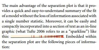
So in that example there are values along the entire axis, and color is used to visualize a binary variable. The black line in that plot is the cumulative proportion of red observations.

- 700
- 1
- 9
- 18

- 15,245
- 8
- 69
- 191
-
6+1 [Strip plot](http://www.itl.nist.gov/div898/software/dataplot/refman1/auxillar/striplot.htm) is a common term, too. – whuber Dec 04 '14 at 13:57
-
1@whuber: Strip plot, yes, or a [strip chart](http://www.cyclismo.org/tutorial/R/plotting.html#strip-charts). – amoeba Dec 05 '14 at 15:04
-
Strictly, the separation plot is quite different. It's a stacked bar chart with a unit interval being divided into bars of length $1/n$ for $n$ data points. The bars are stacked in the order of predicted response probability from a model and coloured one of two colours depending on which binary value was observed. For moderate $n$ it looks like a strip plot, but it isn't one. The point about a strip plot (or whatever else it's called) is that point symbols (which could be thin lines) are placed where they belong, not that we are subdividing a line into mutually exclusive segments. – Nick Cox Dec 10 '14 at 16:26
-
That is a fair description @NickCox, but I do not think separation plots are so different. In Wilkinson's grammar it can be considered a one dimensional scatterplot, with the rank on the single dimension and then using color to distinguish between the two types of points. With only two types of points you don't even need to have the data for one of the sets, so the OP's original graph *could be* a separation plot with the black bars displaying one category and the background grey the complement. – Andy W Dec 11 '14 at 14:23
-
It is not so different from some sparklines I've seen visualizing [wins/losses](http://www.edwardtufte.com/bboard/q-and-a-fetch-msg?msg_id=0001OR) for sports teams. (All graphs have to be mapped to a finite interval to project the data onto the page/computer screen, so whether the actual data is restricted to the unit interval I do not believe is material in describing the graph itself.) I would not call a scatterplot of ranked data a different name because the points are not placed "where they belong". – Andy W Dec 11 '14 at 14:24
-
I do not like the descriptor of stacking here to be frank though; it is reasonable in physical terms of say stacking a series of cards on top of each other, but most stacked bar charts convey counts and the stacks can be arbitrarily reordered. It is not inaccurate it is just not the usual sense in which it is used. – Andy W Dec 11 '14 at 14:24
-
Stacked bar charts; divided (subdivided) bar charts; no doubt other terms exist. I often quibble about good and bad terminology, so I am sympathetic to quibbling. But many stacked bar charts do not show counts and that's not essential to the definition at all. On the main point, the Greenhill et al. paper you cite shows that for a small number of data points, it doesn't look like a strip plot at all, because it isn't one. I think the principle here is that it may talk like a duck, look like a duck and act like a duck, but it's still a misconception to call it a duck. It's a goose. – Nick Cox Dec 11 '14 at 14:47
-
Nick, I agree with only a few observations the separation plot will not look like the strip charts displayed here. With only a few observations the typical strip charts will not look the same either! (Ditto a scatterplot will not look typical with only one or two points.) – Andy W Dec 11 '14 at 14:58
-
I think you're missing my point, but it's a side issue to your good answer, so there you go. – Nick Cox Dec 11 '14 at 18:23
It is called a rug plot (see e.g. here or here). In R it can be made with a rug
function.
The plot seems to appear also under another name, as strip chart, it is referred like this by Phillip I. Good in Introduction to Statistics through Resampling Methods and R/S-Plus (2005, Wiley). In R it is called by stripchart
function.
It seems that the tiny version that often accompanies a larger plot is called rug plot, while the standalone plot made of points or vertical lines is named strip chart.
-
Damn, I was *so* close -- I was looking for a *rag* plot (and predictably, came up with nothing). Thank you! – January Dec 04 '14 at 19:23
-
2I think in practice people only refer to such plots as rug plots when they are marginal to some other point such as a histogram or scatter plot. – Nick Cox Dec 05 '14 at 14:37
In commercial tagging of goods, Barcode or
if they are lines of frequency plotted on time, Spectrum.
EDIT1
When in electromagnetic clouds or gas chromatographs strengths are plotted linearly on frequency scale then also we can say Spectrum.

- 147
- 3
-
3Hi, welcome to the site. Unfortunately, this does not answer the question as the lines in barcodes or spectrums do not "indicate the distribution of some samples in a range" as the question specifies. – Juho Kokkala Dec 05 '14 at 12:02
-
4@JuhoKokkala I disagree in part. Barcodes used in industry don't match, agreed, but the term barcode plot has been used to indicate this kind of plot for real data. Similarly, spectroscopic data surely qualify as data too. I wouldn't stick to the OP's wording as it confuses "samples" and "sample values". – Nick Cox Dec 05 '14 at 14:36
-
2Rug plot is the closest, I agree. But it is been called a barcode plot too. The barcode plot, though, often has line thickness, or shade/transparency, to show density of closely located values. We use this sort of plot with DNA data a lot to mark locations of features. – Dianne Cook Dec 07 '14 at 17:16
I've same problem: What is the name of "bar code" like visualization for true/false data
My goal is represent a list of true/false array corresponding to an array of words in a fixed place in array. Like representation of "light spectrum" to identify the assorbement of specific a light wave .... in a same situation i want enphatize the missing words and the presents words
I the found on Vega the Strip Plot
https://vega.github.io/vega-lite/examples/tick_strip.html
I think that for my goal is better name to represent my visualization idea

- 101
- 3