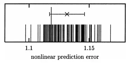
Is there any specific name for the barcode-like graph shown above? The vertical axis does not correspond to any number and (as far as I can tell) the graph only serves to illustrate spread in the data.
The graph appears in the context of a hypothesis test in nonlinear time series analysis. The numerous short impulses represent the test statistic computed under the null hypothesis. The single long impulse near the center shows the observed value. (Obviously, one cannot reject the null hypothesis here.)
The mean (cross $\times$) and the standard deviation (of the null distribution) is represented by the horizontal line.