17

I'm trying to understand the result I see in my graph below. Usually, I tend to use Excel and get a linear-regression line but in the case below I'm using R and I get a polynomial regression with the command:

ggplot(visual1, aes(ISSUE_DATE,COUNTED)) + geom_point() + geom_smooth()

So my questions boil down to this:

  1. What is the gray area (arrow #1) around the blue regression line? Is this the standard deviation of the polynomial regression?

  2. Can I say that the whatever is outside the gray area (arrow #2) is an 'outlier' and whatever falls inside the gray area (arrow #3) is within the standard deviation?

enter image description here

kjetil b halvorsen
  • 63,378
  • 26
  • 142
  • 467
adhg
  • 559
  • 2
  • 4
  • 15

3 Answers3

14

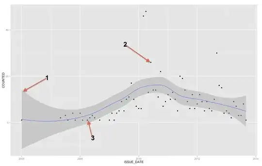
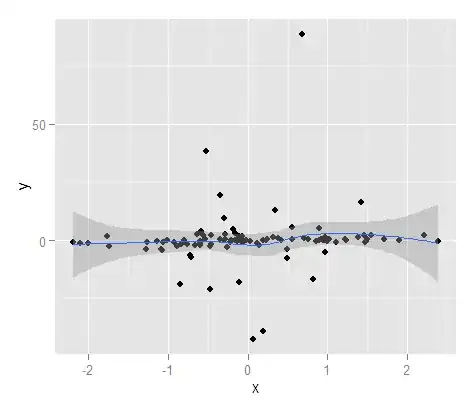
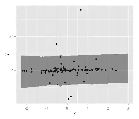
The gray band is a confidence band for the regression line. I'm not familiar enough with ggplot2 to know for sure whether it is a 1 SE confidence band or a 95% confidence band, but I believe it is the former (Edit: evidently it is a 95% CI). A confidence band provides a representation of the uncertainty about your regression line. In a sense, you could think that the true regression line is as high as the top of that band, as low as the bottom, or wiggling differently within the band. (Note that this explanation is intended to be intuitive, and is not technically correct, but the fully correct explanation is hard for most people to follow.)

You should use the confidence band to help you understand / think about the regression line. You should not use it to think about the raw data points. Remember that the regression line represents the mean of $Y$ at each point in $X$ (if you need to understand this more fully, it may help you to read my answer here: What is the intuition behind conditional Gaussian distributions?). On the other hand, you certainly do not expect every observed data point to be equal to the conditional mean. In other words, you should not use the confidence band to assess whether a data point is an outlier.


(Edit: this note is peripheral to the main question, but seeks to clarify a point for the OP.)

A polynomial regression is not a non-linear regression, even though what you get doesn't look like a straight line. The term 'linear' has a very specific meaning in a mathematical context, specifically, that the parameters you are estimating--the betas--are all coefficients. A polynomial regression just means that your covariates are $X$, $X^2$, $X^3$, etc., that is, they have a non-linear relation to each other, but your betas are still coefficients, thus it is still a linear model. If your betas were, say, exponents, then you would have a non-linear model.

In sum, whether or not a line looks straight has nothing to do with whether or not a model is linear. When you fit a polynomial model (say with $X$ and $X^2$), the model doesn't 'know' that, e.g., $X_2$ is actually just the square of $X_1$. It 'thinks' these are just two variables (although it may recognize that there is some multicollinearity). Thus, in truth it is fitting a (straight / flat) regression plane in a three dimensional space rather than a (curved) regression line in a two dimensional space. This is not useful for us to think about, and in fact, extremely difficult to see since $X^2$ is a perfect function of $X$. As a result, we don't bother thinking of it in this way and our plots are really two dimensional projections onto the $(X,\ Y)$ plane. Nonetheless, in the appropriate space, the line is actually 'straight' in some sense.

From a mathematical perspective, a model is linear if the parameters you are trying to estimate are coefficients. To clarify further, consider the comparison between the standard (OLS) linear regression model, and a simple logistic regression model presented in two different forms:
$$ Y = \beta_0 + \beta_1X + \varepsilon $$ $$ \ln\left(\frac{\pi(Y)}{1 - \pi(Y)}\right) = \beta_0 + \beta_1X $$ $$ \pi(Y) = \frac{\exp(\beta_0 + \beta_1X)}{1 + \exp(\beta_0 + \beta_1X)} $$ The top model is OLS regression, and the bottom two are logistic regression, albeit presented in different ways. In all three cases, when you fit the model, you are estimating the $\beta$s. The top two models are linear, because all of the $\beta$s are coefficients, but the bottom model is non-linear (in this form) because the $\beta$s are exponents. (This may seem quite strange, but logistic regression is an instance of the generalized linear model, because it can be rewritten as a linear model. For more information about that, it may help to read my answer here: Difference between logit and probit models.)

gung - Reinstate Monica
  • 132,789
  • 81
  • 357
  • 650
  • +1 The examples in the documentation suggest to me the confidence is pretty high, perhaps 95%. – whuber Jan 17 '14 at 15:39
  • @gung thanks for the detailed answer (also you got a check!). I read your first statement and I'm a bit confused. Can you please elaborate more about it. If the resulted line is not straight line (y = mx+b) then what makes it linear? Thanks again for the answer. – adhg Jan 17 '14 at 16:22
  • The docs at http://docs.ggplot2.org/0.9.3.1/stat_smooth.html assert it's a 95% confidence band for the regression curve. – whuber Jan 17 '14 at 16:40
  • 2
    I think the default smoother Loess in use here, rather than polynomial regression? – xan Jan 17 '14 at 18:52
  • @adhg, I thought I had covered the linear vs. non-linear somewhere else, but I couldn't find it. So I added some extra material here. HTH – gung - Reinstate Monica Jan 17 '14 at 18:58
  • @xan, thanks for the tip. I don't really know ggplot2. I was responding to the fact that the question stated polynomial. If it's really a lowess, I think that would only impact the appropriateness the latter (peripheral) section. Moreover, I think I would categorize lowess as more *semi-parametric* rather than *non-linear*. – gung - Reinstate Monica Jan 17 '14 at 18:59
  • You seem to be making a specious distinction: if linearity is a property of a model, then how you write the model should not affect its linearity. Thus logistic regression cannot be linear and nonlinear at the same time. – whuber Jan 17 '14 at 19:54
  • @whuber, do you mean that I should state linearity is a property of the form of the model, rather than a property of the model? – gung - Reinstate Monica Jan 17 '14 at 19:57
  • I think people could consider "linear" in either sense. The deeper sense is the one that is independent of how the model is written. In that sense, for instance, the model $Y=\beta_0+\beta_0\beta_1 X+\varepsilon$ could be considered linear because it is linear in $\alpha_0=\beta_0$ and $\alpha_1=\beta_0\beta_1$. In some cases, though, this change would not be allowable because interest might focus on confidence intervals for the $\beta_i$. I think, though, that we may only be muddying the waters here and we should stick with the simplest, clearest examples of linear models as illustrations. – whuber Jan 17 '14 at 20:06
  • @xan You are correct: the curve clearly is not a polynomial fit. That misperception was introduced at the beginning of the question, not by gung or ladislav (whose answer begins with an appropriate correction), but fortunately it is not really germane to the answers, which apply regardless of the nature of the fit. – whuber Jan 17 '14 at 20:07
12

To add to the already existing answers, the band represents a confidence interval of the mean, but from your question you clearly are looking for a prediction interval. Prediction intervals are a range that if you drew one new point that point would theoretically be contained in the range X% of the time (where you can set the level of X).

library(ggplot2)
set.seed(5)
x <- rnorm(100)
y <- 0.5*x + rt(100,1)
MyD <- data.frame(cbind(x,y))

We can generate the same type of plot you've shown in your initial question with a confidence interval around the mean of the smoothed loess regression line (the default is a 95% confidence interval).

ConfiMean <- ggplot(data = MyD, aes(x,y)) + geom_point() + geom_smooth()
ConfiMean

enter image description here

For a quick and dirty example of prediction intervals, here I generate a prediction interval using linear regression with smoothing splines (so it is not necessarily a straight line). With the sample data it does pretty well, for the 100 points only 4 are outside the range (and I specified a 90% interval on the predict function).

#Now getting prediction intervals from lm using smoothing splines
library(splines)
MyMod <- lm(y ~ ns(x,4), MyD)
MyPreds <- data.frame(predict(MyMod, interval="predict", level = 0.90))
PredInt <- ggplot(data = MyD, aes(x,y)) + geom_point() + 
           geom_ribbon(data=MyPreds, aes(x=x,ymin=lwr, ymax=upr), alpha=0.5)
PredInt

enter image description here

(note: actual confidence intervals are smoother, as there was a code typo in the original answer)

Now a few more notes. I agree with Ladislav that you should consider time series forecasting methods since you have a regular series since sometime in 2007 and it is clear from your plot if you look hard there is seasonality (connecting the points would make it much clearer). For this I would suggest checking out the forecast.stl function in the forecast package where you can choose a seasonal window and it provides a robust decomposition of the seasonality and trend using Loess. I mention robust methods because your data have a few noticeable spikes.

More generally for non-time series data I would consider other robust methods if you have data with occasional outliers. I do not know how to generate prediction intervals using Loess directly, but you may consider quantile regression (depending on how extreme the prediction intervals need to be). Otherwise if you just want to fit to be potentially non-linear you can consider splines to allow the function to vary over x.

wwl
  • 668
  • 1
  • 6
  • 17
Andy W
  • 15,245
  • 8
  • 69
  • 191
4

Well, the blue line is a smooth local regression. You may control the wiggliness of the line by the span parameter (from 0 to 1). But your example is a "time-series" so try to look for some more proper methods of analysis than only fit a smooth curve (which should serve only to reveal possible trend).

According to documentation to ggplot2(and book in comment below): stat_smooth is a confidence interval of the smooth shown in grey. If you want to turn the confidence interval off, use se = FALSE.

Andy W
  • 15,245
  • 8
  • 69
  • 191
Ladislav Naďo
  • 2,202
  • 4
  • 21
  • 45
  • 1
    (1) I do not see in your reference where it claims the gray area is the pointwise confidence interval. It seems pretty clear from the examples that the gray area is instead a confidence interval for the *curve*. (2) Nobody would reasonably declare the large proportion of points beyond the gray area as "outliers"; there are just too many of them. – whuber Jan 17 '14 at 15:37
  • (1) my mistake, here I add a book which refers to "point-wise confidence interval": Wickham H (2009) ggplot2 Elegant Graphics for Data Analysis. Media 212. (page 14). (2) I agree. – Ladislav Naďo Jan 17 '14 at 15:40
  • Do any of your references state what the default confidence level is set at? – whuber Jan 17 '14 at 15:57
  • No, I can't find any reference about default setting. – Ladislav Naďo Jan 17 '14 at 16:02
  • I found the default on the first page of your reference: "(0.95 by default)." That means that either this smoother has serious bugs or else your interpretation of the reference is wrong: because such a large proportion of the data points typically lie beyond the gray area and assuming the code is correct, the gray area *has* to be a confidence region for the prediction (fitted curve) and not a confidence region for the points. – whuber Jan 17 '14 at 16:39
  • I'm not as experienced as you. If you consider my answer wrong, feel free to delete it completely. I do not want to earn my reputation by creating non-useful answers. – Ladislav Naďo Jan 17 '14 at 17:23
  • The issue here is that two conflicting but reasonable answers have been posted. People should decide between them based on the arguments adduced in their support, not on the experience or reputation of those making the arguments. That is why I have posted comments explaining the evidence that suggests to me why @gung's answer is the right one and this one may be in error--but it's always possible I am making a mistake somewhere, too. – whuber Jan 17 '14 at 17:37