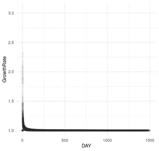
I have some data with fields GrowthRate and DAY. GrowthRate. E.g. If amount is 100 on day 1 and then 110 on day2, GrowthRate is 1.1. Data look like this:
set.seed(123)
exdata |>
  sample_n(200000) |>
  ggplot(aes(x = DAY, y = GrowthRate), color = 'grey') +
  geom_point(alpha = 0.01) +
  theme_minimal()
I fitted an nls() model to this and at a 'distance' it looks good:
mod.nls.c <- nls(GrowthRate ~ i + c * I(DAY^power),
                 data = exdata,
                 start = list(power = -0.01, i = 1, c = 2),
                 control = nls.control(maxiter = 200))

mod.nls.c |> summary()

Formula: GrowthRate ~ i + c * I(DAY^power)

Parameters:
        Estimate Std. Error t value Pr(>|t|)
power -6.285e-01  9.733e-04  -645.7   <2e-16 ***
i      9.898e-01  6.423e-05 15410.8   <2e-16 ***
c      4.587e-01  7.141e-04   642.3   <2e-16 ***
---
Signif. codes:  0 ‘***’ 0.001 ‘**’ 0.01 ‘*’ 0.05 ‘.’ 0.1 ‘ ’ 1

Residual standard error: 0.03025 on 1064596 degrees of freedom

Number of iterations to convergence: 25
Achieved convergence tolerance: 7.8e-06
Here's the predictions layered on top of the ggplot:
exdata$PredictionsNLSC <- predict(mod.nls.c)
set.seed(123)
exdata |>
  sample_n(200000) |>
  ggplot(aes(x = DAY, y = GrowthRate)) +
  geom_point(alpha = 0.01, color = 'grey') +
  geom_line(aes(x = DAY, y = PredictionsNLSC), color = 'steelblue') +
  theme_minimal()
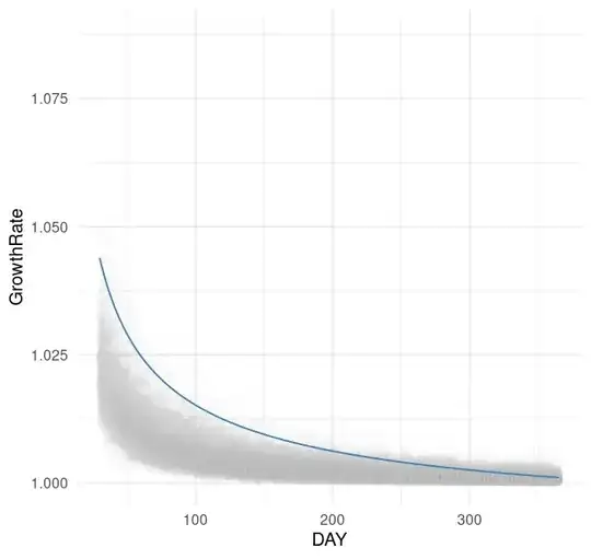
At fist glance this seemed fine. But if I zoom in, e.g. to between days30 and 365:
set.seed(123)
exdata |>
  sample_n(200000) |>
  filter(DAY >= 30 & DAY <= 365) |>
  ggplot(aes(x = DAY, y = GrowthRate)) +
  geom_point(alpha = 0.01, color = 'grey') +
  geom_line(aes(x = DAY, y = PredictionsNLSC), color = 'steelblue') +
  theme_minimal()
You can see that the fitted line is way above where it should ideally be.
I have 3 parameters in the nls() model: i (intercept); c (coefficient) and power (a power). I can describe what I'd like to do to the blue line in English: On the steep drop down at the start, I'd like the fit to go down a little more, then, the remaining long horizontal component to be lower down and flatter as it travels from left to right. I.e. I'd like it to fit better by cutting through the middle of the grey dots from geom_point() (the actuals).
Can this be done with these parameters? Is there another combination of params that I could try here?
[Edit]
From comment, here's the initial chart on log log scale (ggplot(aes(x = log(DAY), y = log(GrowthRate)), color = 'grey') +):
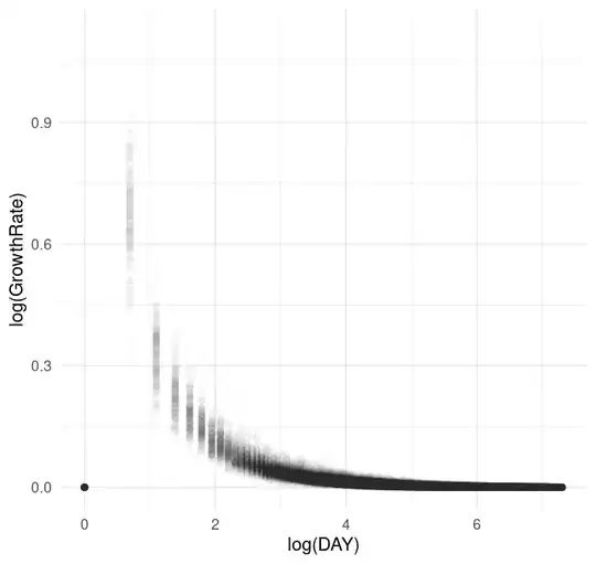
[Edit2]
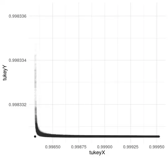
From suggestion to use Tukey's 3 point message, my attempt and resulting plot here:
# https://stats.stackexchange.com/questions/35711/box-cox-like-transformation-for-independent-variables/35717#35717
box.cox <- function(x, parms=c(1,0)) {
  lambda <- parms[1]
  offset <- parms[2]
  if (lambda==0) log(x+offset) else ((x+offset)^lambda - 1)/lambda
}
threepoint <- function(x, y, ladder=c(1, 1/2, 1/3, 0, -1/2, -1)) {
  # x and y are length-three samples from a dataset.
  dx <- diff(x)
  f <- function(parms) (diff(diff(box.cox(y, parms)) / dx))^2
  fit <- nlm(f, c(1,0))
  parms <- fit$estimate #$
  lambda <- ladder[which.min(abs(parms[1] - ladder))]
  if (lambda==0) offset = 0 else {
    do <- diff(range(y))
    offset <- optimize(function(x) f(c(lambda, x)),
                       c(max(-min(x), parms[2]-do), parms[2]+do))$minimum
  }
  c(lambda, offset)
}

data <- cbind(exdata$GrowthRate, exdata$DAY)
n <- dim(data)[1]
i3 <- c(2, floor((n+1)/2), n-1)
parms <- threepoint(exdata$GrowthRate[i3], exdata$DAY[i3])
y <- box.cox(exdata$GrowthRate, parms)
parms2 <- threepoint(y[i3], exdata$DAY[i3])
x <- box.cox(exdata$DAY, parms2)

exdata$tukeyY <- y
exdata$tukeyX <- x

set.seed(123)
exdata |>
  sample_n(200000) |>
  ggplot(aes(x = tukeyX, y = tukeyY), color = 'grey') +
  geom_point(alpha = 0.01) +
  theme_minimal()
