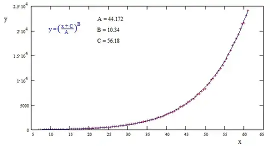
I need to define an equation to represent a series of points from a model. As they are predictions from an already fit non-linear regression, noise shouldn't really be an issue. I have seen many examples that allow predictions to be made on the curves, but I am still confused about how I can retrieve an equation from various functions such as spline, etc.
Based on the formula I supplied for the nonlinear regression in brms (b1^b2, where b1 ~ 1 + x and b2 ~ 1), I would expect the relationship to resemble some sort of power function [ax^b or possibly (int + ax)^b].
I understand it may be just an approximation - that is fine as long as it is relatively similar (will be plot alongside model for comparison). Would greatly appreciate any insight whatsoever, let me know if I can provide further information. Have provided example data below.
x <- c(7, 7.5, 8, 8.5, 9, 9.5, 10, 10.5, 11, 11.5,
       12, 12.5, 13, 13.5, 14, 14.5, 15, 15.5,
       16, 16.5, 17, 17.5, 18, 18.5, 19, 19.5,
       20, 20.5, 21, 21.5, 22, 22.5, 23, 23.5,
       24, 24.5, 25, 25.5, 26, 26.5, 27, 27.5,
       28, 28.5, 29, 29.5, 30, 30.5, 31, 31.5,
       32, 32.5, 33, 33.5, 34, 34.5, 35, 35.5,
       36, 36.5, 37, 37.5, 38, 38.5, 39, 39.5,
       40, 40.5, 41, 41.5, 42, 42.5, 43, 43.5,
       44, 44.5, 45, 45.5, 46, 46.5, 47, 47.5,
       48, 48.5, 49, 49.5, 50, 50.5, 51, 51.5,
       52, 52.5, 53, 53.5, 54, 54.5, 55, 55.5,
       56, 56.5, 57, 57.5, 58, 58.5, 59, 59.5,
       60, 60.5, 61)

y <- c(38.0136100143096, 41.7377019494229, 45.0570784133659, 49.7413206704322,
       54.1226793545035, 58.5143924911556, 64.0149939443995, 70.2996105120598,
       74.5157778956172, 82.0845639640055, 88.1447395709772, 96.0901896008888,
       104.331306746698, 112.587794035369, 116.793284692497, 129.660032344424,
       139.148796580701, 154.021720779283, 164.352212638548, 174.265834929441,
       186.345636353806, 199.537020067263, 217.599140020487, 233.877433057235,
       246.132735977878, 267.47374365421, 283.863259012889, 301.899794004843,
       322.769938301311, 351.430583957233, 383.849198025211, 390.736999633559,
       423.249193342341, 454.638021905869, 485.240521462023, 509.31872397953,
       560.804077944124, 580.52077607546, 623.750134417424, 663.267081364541,
       698.778452300861, 737.091827116676, 796.938400847035, 856.419990917143,
       906.017778910945, 965.168165262045, 1013.84413110147, 1065.85753522486,
       1154.33958805326, 1204.13058748532, 1322.42312105971, 1385.41472565674,
       1464.95636449756, 1526.04430007742, 1609.84006688626, 1738.45992222218,
       1816.05261609804, 1896.50702990984, 2024.59349402727, 2142.55345863206,
       2216.16848789472, 2384.32905391336, 2534.20713772314, 2599.97048189298,
       2800.82684813604, 2956.9306593113, 3133.9558188069, 3320.82577045419,
       3477.57994233654, 3602.69160098815, 3800.51701252841, 4062.6001499355,
       4238.73826354165, 4645.61124406474, 4731.78190196944, 4947.75977778357,
       5211.86923419648, 5619.65143369664, 5817.33879970144, 6079.00167282099,
       6205.39929607976, 6681.42573862285, 7198.53801041513, 7267.01092369979,
       7816.95660375773, 8133.793609116, 8261.13289172042, 9053.74531584895,
       9473.33768555856, 10137.0504777871, 10400.797014819, 10966.3727089692,
       11494.3384956937, 11920.4271066324, 12400.9643350626, 13096.7674700334,
       13798.7159321491, 14358.3675127649, 15266.2675882016, 16072.0949530508,
       17058.7362901159, 17663.6886724086, 18390.5282871649, 19307.9213621373,
       20392.6725381775, 21431.4257870743, 21624.312458088, 23099.2069971926,
       24090.3844352512)

data <- data.frame(x, y)


library(ggplot2)

ggplot(data, aes(x,y)) + geom_point()
Note: For anyone wondering why I don't just use the coefficients supplied by the model (and can maybe explain how to do so), I have made a post about this here: Interpreting non linear brms output - estimates of posterior cooefficient and user supplied formula
However, I think an answer to this question would also be valuable.


