I was afraid this was going to be a continuous $\times$ continuous $\times$ categorical interaction... OK, here goes - first, we create some toy data (foo is a binary predictor, bar and baz are continuous, dv is the dependent variable):
set.seed(1)
obs <- data.frame(foo=sample(c("A","B"),size=100,replace=TRUE),
  bar=sample(1:10,size=100,replace=TRUE),
  baz=sample(1:10,size=100,replace=TRUE),
  dv=rnorm(100))
We then fit the model and look at the three-way interaction:
model <- lm(dv~foo*bar*baz,data=obs)
anova(update(model,.~.-foo:bar:baz),model)
Now, for understanding the interaction, we plot the fits. The problem is that we have three independent variables, so we would really need a 4d plot, which is rather hard to do ;-). In our case, we can simply plot the fits against bar and baz in two separate plots, one for each level of foo. First calculate the fits:
fit.A <- data.frame(foo="A",bar=rep(1:10,10),baz=rep(1:10,each=10))
fit.A$pred <- predict(model,newdata=fit.A)
fit.B <- data.frame(foo="B",bar=rep(1:10,10),baz=rep(1:10,each=10))
fit.B$pred <- predict(model,newdata=fit.B)
Next, plot the two 3d plots side by side, taking care to use the same scaling for the $z$ axis to be able to compare the plots:
par(mfrow=c(1,2),mai=c(0,0.1,0.2,0)+.02)
persp(x=1:10,y=1:10,z=matrix(fit.A$pred,nrow=10,ncol=10,byrow=TRUE),
  xlab="bar",ylab="baz",zlab="fit",main="foo = A",zlim=c(-.8,1.1))
persp(x=1:10,y=1:10,z=matrix(fit.B$pred,nrow=10,ncol=10,byrow=TRUE),
  xlab="bar",ylab="baz",zlab="fit",main="foo = B",zlim=c(-.8,1.1))
Result:
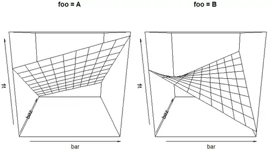
We see how the way the fit depends on (both!) bar and baz depends on the value of foo, and we can start to describe and interpret the fitted relationship. Yes, this is hard to digest. Three-way interactions always are... Statistics are easy, interpretation is hard...
Look at ?persp to see how you can prettify the graph. Browsing the R Graph Gallery may also be inspirational.