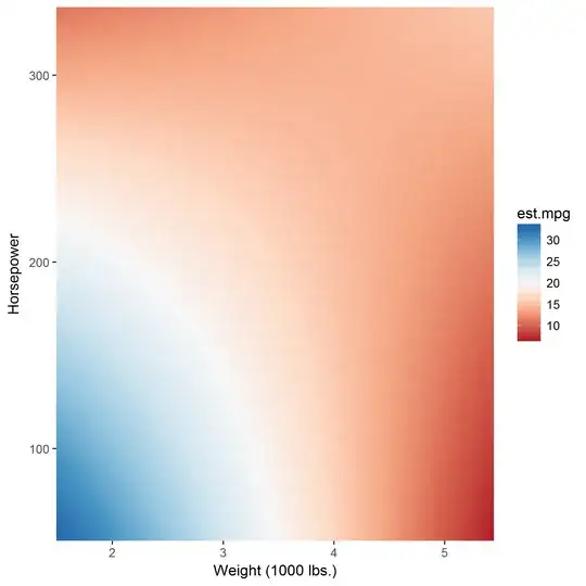
Recently, I came across a publication using a level/tile/contour plot to illustrate the relationship between two continuous variables and a continuous response (with the input variables on the x and y axes and the response plotted as a color). This struck me as a very intuitive way to plot this type of interaction, but I have since had difficulty finding similar uses of this type of plot in this context.
Here is a contrived example of such a plot, using mtcars and ggplot2 in R.
lm.mod <- lm(mpg ~ wt*hp, data = mtcars)
summary(lm.mod)

...
Coefficients:
            Estimate Std. Error t value Pr(>|t|)
(Intercept) 49.80842    3.60516  13.816 5.01e-14 ***
wt          -8.21662    1.26971  -6.471 5.20e-07 ***
hp          -0.12010    0.02470  -4.863 4.04e-05 ***
wt:hp        0.02785    0.00742   3.753 0.000811 ***
...

prepplot <- as.data.frame(matrix(ncol = 3, nrow = 10000))
colnames(prepplot) <- c("hp", "wt", "est.mpg")

prepplot$hp <- rep(seq(52,335, length.out = 100), 100)
prepplot <- prepplot[order(prepplot$hp),]
prepplot$wt <- rep(seq(1.513,5.424, length.out = 100), 100)
prepplot$est.mpg <- 49.80842 - 8.21662*prepplot$wt - 0.12010*prepplot$hp +
0.02785*prepplot$wt*prepplot$hp

ggplot(prepplot, aes(wt, hp, fill = est.mpg)) +
  geom_tile() +
  xlab("Weight (1000 lbs.)") + ylab("Horsepower") +
  scale_fill_gradientn(colours = c("#b2182b","#d6604d","#f4a582","#fddbc7","#f7f7f7","#d1e5f0","#92c5de","#4393c3","#2166ac")) +
  scale_x_continuous(expand = c(0,0)) +
  scale_y_continuous(expand = c(0,0))
Is fair to interpret this plot in this way: "The color of a given coordinate represents the predicted MPG for that weight and horsepower"? If so, how might someone create this plot for two interacted terms in a regression with even more predictors? Does this plot commit a statistical fault I am not considering?
