This is a common question. In general, we would just add an interaction term to the regression model to determine if the lines differ (cf., How to test whether linear models fit separately to two groups are better than a single model applied to both groups?). The extra nuance here is that you have a very specific functional form that you are requiring the fit to take, and it has just one free parameter, $a$. You want to know if the fitted value for $a$ differs between the two sets. To do that, we just add a new parameter, $b$, that can move the value of $a$ up or down, and test $b$ against $0$. Note that you also need to create an indicator variable to identify which set is which.
Here is an example, coded in R, with your dataset:
d = read.table(text="x              y          ind
0.7439235       0.5188408      1
...
1.0828542       0.4579055      1
1.1216862       0.4885919      0
...
1.1422033       0.3033392      0", header=T)
m = nls(y~1 + x - ((1 + (x^(a+b*ind)))^(1/(a+b*ind))), data=d, start=list(a=1, b=0))
summary(m)
# Formula: y ~ 1 + x - ((1 + (x^(a + b * ind)))^(1/(a + b * ind)))
#
# Parameters:
#   Estimate Std. Error t value Pr(>|t|)
# a   1.4611     0.0228   64.15   <2e-16 ***
# b   0.0441     0.0464    0.95     0.35
# ---
# Signif. codes:  0 ‘***’ 0.001 ‘**’ 0.01 ‘*’ 0.05 ‘.’ 0.1 ‘ ’ 1
#
# Residual standard error: 0.0612 on 33 degrees of freedom
#
# Number of iterations to convergence: 5
# Achieved convergence tolerance: 1.74e-08
Thus the initial answer is that there is insufficient evidence in your data to see that the optimal value of $a$ differs between the two sets and still hold your long run type I error rate below $.05$.
It's always good to look at your data and your model fit, though.
xs = seq(.6,1.8,by=0.01)
p1 = predict(m, newdata=data.frame(x=xs, ind=1))
p0 = predict(m, newdata=data.frame(x=xs, ind=0))
windows()
  with(d, plot(x, y, col=ind+1, pch=ind+1, xlim=c(.6,1.8)), ylim=c(.25,.55))
  lines(xs, p1, col="red", lty="dashed")
  lines(xs, p0)
  legend("bottomright", legend=c("set 1", "set 2"), col=2:1, lty=2:1, pch=2:1)
This looks potentially a little troubling. The red triangles (set 1) don't seem like they fit the required functional form very well. Whereas the provided curve requires the data to move diagonally up and to the right, if anything, set 1 looks like it may be flat or even move down and to the left. We can take a look at the residuals to make this easier to see (we don't have to worry about the curve):
r1 = with(d[d$ind==1,], y-predict(m, newdata=data.frame(x=x, ind=1)))
r0 = with(d[d$ind==0,], y-predict(m, newdata=data.frame(x=x, ind=0)))
windows()
  with(d[d$ind==1,], plot(x, r1, col=2, pch=2, ylab="residuals",
                          xlim=c(.6,1.8), ylim=c(-.12,.17)))
  with(d[d$ind==0,], points(x, r0))
  abline(h=0, col="lightgray")
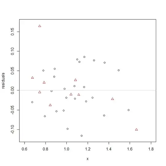
Whereas the black circles, set 2, appear to be appropriately scattered around the 0 line, the red triangles are higher on the left side and lower on the right. Something is amiss here.
For what it's worth, the residuals do seem relatively normal, which the test assumes.
windows()
  qqnorm(c(r1,r0), col=rep(2:1, times=c(10,25)), pch=rep(2:1, times=c(10,25)))
  qqline(c(r1,r0), col="lightgray")

In the end, the $a$'s don't differ much when shoehorned into this functional form, but the specified functional form may not be right for the data from set 1.


