The question asks how to find the amount by which one time series ("expansion") lags another ("volume") when the series are sampled at regular but different intervals.
In this case both series exhibit reasonably continuous behavior, as the figures will show. This implies (1) little or no initial smoothing may be needed and (2) resampling can be as simple as linear or quadratic interpolation. Quadratic may be slightly better due to the smoothness. After resampling, the lag is found by maximizing the cross-correlation, as shown in the thread, For two offset sampled data series, what is the best estimate of the offset between them?.
To illustrate, we can use the data supplied in the question, employing R for the pseudocode. Let's begin with the basic functionality, cross-correlation and resampling:
cor.cross <- function(x0, y0, i=0) {
  #
  # Sample autocorrelation at (integral) lag `i`:
  # Positive `i` compares future values of `x` to present values of `y`';
  # negative `i` compares past values of `x` to present values of `y`.
  #
  if (i < 0) {x<-y0; y<-x0; i<- -i}
  else {x<-x0; y<-y0}
  n <- length(x)
  cor(x[(i+1):n], y[1:(n-i)], use="complete.obs")
}
This is a crude algorithm: an FFT-based calculation would be faster. But for these data (involving about 4000 values) it's good enough.
resample <- function(x,t) {
  #
  # Resample time series `x`, assumed to have unit time intervals, at time `t`.
  # Uses quadratic interpolation.
  #
  n <- length(x)
  if (n < 3) stop("First argument to resample is too short; need 3 elements.")
  i <- median(c(2, floor(t+1/2), n-1)) # Clamp `i` to the range 2..n-1
  u <- t-i
  x[i-1]*u*(u-1)/2 - x[i]*(u+1)*(u-1) + x[i+1]*u*(u+1)/2
}
I downloaded the data as a comma-separated CSV file and stripped its header. (The header caused some problems for R which I didn't care to diagnose.)
data <- read.table("f:/temp/a.csv", header=FALSE, sep=",",
                    col.names=c("Sample","Time32Hz","Expansion","Time100Hz","Volume"))
NB This solution assumes each series of data is in temporal order with no gaps in either one. This allows it to use indexes into the values as proxies for time and to scale those indexes by the temporal sampling frequencies to convert them to times.
It turns out that one or both of these instruments drifts a little over time. It's good to remove such trends before proceeding. Also, because there is a tapering of the volume signal at the end, we should clip it out.
n.clip <- 350      # Number of terminal volume values to eliminate
n <- length(data$Volume) - n.clip
indexes <- 1:n
v <- residuals(lm(data$Volume[indexes] ~ indexes))
expansion <- residuals(lm(data$Expansion[indexes] ~ indexes)
I resample the less-frequent series in order to get the most precision out of the result.
e.frequency <- 32  # Herz
v.frequency <- 100 # Herz
e <- sapply(1:length(v), function(t) resample(expansion, e.frequency*t/v.frequency))
Now the cross-correlation can be computed--for efficiency we search only a reasonable window of lags--and the lag where the maximum value is found can be identified.
lag.max <- 5       # Seconds
lag.min <- -2      # Seconds (use 0 if expansion must lag volume)
time.range <- (lag.min*v.frequency):(lag.max*v.frequency)
data.cor <- sapply(time.range, function(i) cor.cross(e, v, i))
i <- time.range[which.max(data.cor)]
print(paste("Expansion lags volume by", i / v.frequency, "seconds."))
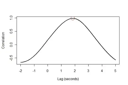
The output tells us that expansion lags volume by 1.85 seconds. (If the last 3.5 seconds of data weren't clipped, the output would be 1.84 seconds.)
It's a good idea to check everything in several ways, preferably visually. First, the cross-correlation function:
plot(time.range * (1/v.frequency), data.cor, type="l", lwd=2,
     xlab="Lag (seconds)", ylab="Correlation")
points(i * (1/v.frequency), max(data.cor), col="Red", cex=2.5)
Next, let's register the two series in time and plot them together on the same axes.
normalize <- function(x) {
  #
  # Normalize vector `x` to the range 0..1.
  #
  x.max <- max(x); x.min <- min(x); dx <- x.max - x.min
  if (dx==0) dx <- 1
  (x-x.min) / dx
}
times <- (1:(n-i))* (1/v.frequency)
plot(times, normalize(e)[(i+1):n], type="l", lwd=2,
     xlab="Time of volume measurement, seconds", ylab="Normalized values (volume is red)")
lines(times, normalize(v)[1:(n-i)], col="Red", lwd=2)
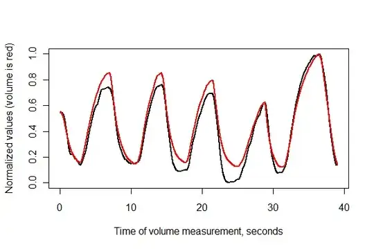
It looks pretty good! We can get a better sense of the registration quality with a scatterplot, though. I vary the colors by time to show the progression.
colors <- hsv(1:(n-i)/(n-i+1), .8, .8)
plot(e[(i+1):n], v[1:(n-i)], col=colors, cex = 0.7,
     xlab="Expansion (lagged)", ylab="Volume")
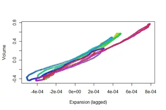
We're looking for the points to track back and forth along a line: variations from that reflect nonlinearities in the time-lagged response of expansion to volume. Although there are some variations, they are pretty small. Yet, how these variations change over time may be of some physiological interest. The wonderful thing about statistics, especially its exploratory and visual aspect, is how it tends to create good questions and ideas along with useful answers.