0

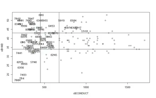
I am looking at environmental data - habitat scores and stream conductivity (water quality measure) and looking to do some change point analysis in a set of 178 observations. As opposed to a more traditional method using time-series, I would like to check for breakpoints in gradient. From other qualitative visualizations methods, I suspect there may be some break points where aquatic communities drop in diversity along the curves of both habitat and conductivity. If I plot the ordered datasets for both:

Habitat Plot

Conductivity Plot

I have the "changepoint" package downloaded and working in R, and can't find any great explanations about how to really proceed. I am interested in showing changepoints that are statistically significant, so I was thinking of using penalty = "Asymptotic" with a pen.value = .05 as a standard test. What method should I use in conjunction with this to get results that are really valid? It seems like I can vary method/penalty/pen.value and get whatever answer I want, but I want it to be the truth! Help!

EDIT: This third image was added for clarification. These numbers represent sites with "passing" species diversity scores. My interest is to determine if threshold values on the y and x axes exist where species diversity drops off. For instance, we can see that above conductivity = 1000, pretty much all sites are considered "failing." There also appears to be a habitat gradient where diversity can thrive in the face of rising conductivity. My interest is run change point analysis along HAB and CONDUCT gradients to see if there are breakpoints that correspond with the idealistic lines I've drawn on this plot. I have already run CCA and PCA on my data with good results, I am just looking to extend my analysis to some specific numerical values. Does this clarify?

enter image description here

WaterGeek
  • 43
  • 8
  • 1
    I'm of the view that any convincing break will be evident graphically. Note that the generating process for a time series is quite different from that producing a quantile function. – Nick Cox Feb 25 '15 at 19:10
  • These two plots show the variables of interest (Habitat in 1, Conductivity in 2), plotted in order from lowest to highest. The y-axis represents the variable of interest value, while x is the position within the ordered list. – WaterGeek Feb 25 '15 at 19:13
  • 1
    Thanks; you did say that and I got it on second reading. I am confident that change-point analysis from time series does **not** apply here. For example, successive quantiles are ordered by definition and mutually dependent regardless of any other dependence structure. My advice is very simple: You have quantified something. There is no need to degrade the quantification by looking for breaks or groups. If you think that is of scientific interest or practical use, you need to worry about interpretability and repeatability. – Nick Cox Feb 25 '15 at 19:24
  • A powerful exploratory technique is to plot the (habitat, conductivity) pairs in the order they are encountered along the stream flow. Connect them with line segments to visualize the sequence. Color or shade those segments to differentiate locations along the stream. Show this plot along with graphs of (location, habitat) and (location, conductivity) (overlaid if possible). Any relatively sudden breaks should be evident in one or both of these plots. See the last two figures in my answer at http://stats.stackexchange.com/a/31691 for an illustration. BTW, how do you measure "diversity"? – whuber Feb 25 '15 at 19:33
  • Let me rephrase the question: I have run CCA and PCA on my data which involves several more variables as well as a species abundance matrix. @whuber - diversity is generally measured using a composite score based on the number and diversity of species found at a particular site. My interest is to find thresholds where this diversity dramatically changes along a gradient of habitat suitability or stream conductvity. I'll edit my above post with something illustrative... one second! – WaterGeek Feb 25 '15 at 19:39
  • You're adding helpful detail but nothing you describe is bringing you a smidgen closer to change-point analysis as defined for time series. As you appear to be an ecologist I am imagining that you are familiar with many classification techniques popular with some groups in some branches of your science; and with the argument that subdividing a continuum is useless and spurious. – Nick Cox Feb 25 '15 at 19:50
  • Agreed. It may have been unclear originally, but I am not interested in time series analysis of any kind. Change point analysis is commonly used to determine threshold values in ecological work without any use of time series. For instance, nutrient pollution may increase along a gradient with some species loss, then at some threshold value there is a dramatic loss of species. This can be identified using change point analysis. This is the application I am interested in. Can this R package be used for this purpose? – WaterGeek Feb 25 '15 at 20:06
  • I'll let that be an open question, as I am only a very occasional R user and I've certainly not examined that package. – Nick Cox Feb 25 '15 at 20:09

0 Answers0