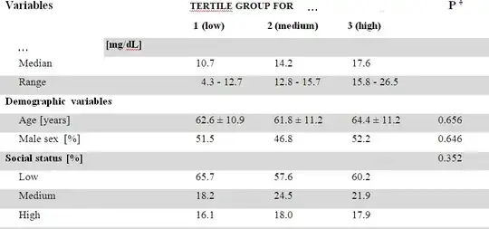
One standard approach we use when describing our data for a paper is to cut our dependent variable into tertiles and then give mean/SD or median/IQR for each tertile for continuous and percentage/number in each tertile for each category for categorical independent variables.
This is fine for an overview. But I can't help but feel that it would be so much nicer if in one extra column, I could plot a scatterplot+smoother for continuous and a barplot for categorical independent variables. However, I have no idea how to create this kind of tabular mixed text/graphics with R. I know I could just be using text() and position the text by pixels, or I could separately make the text table and batch create the graphics and then stitch them together by hand, but this seems very inelegant to me and I'd find it surprising if there wasn't some more automated, convenient way, as with R there often is.
I'm searching for something a bit like latex(describe()) in the rms package, except I want the numerical summary by tertiles (or arbitrary quantiles) and instead of a histogram I want a scatterplot/barplot.
Here's how what we usually do looks like. I'd be happy to have one more column to the right with a meaningful graphical depiction of the relationship, but don't know how to do it with R.