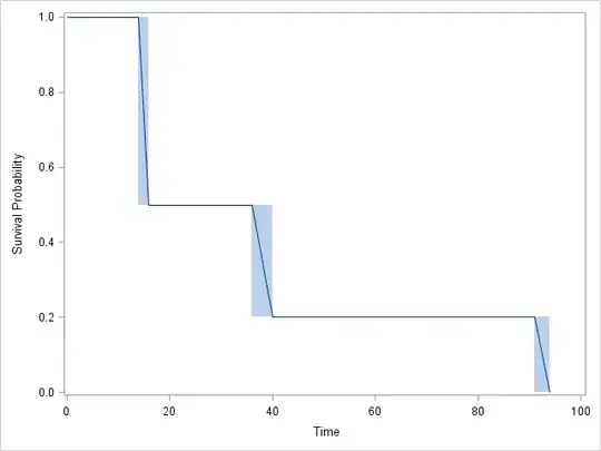
I ran an interval censor survival curve with R, JMP and SAS. They both gave me identical graphs, but the tables differed a bit. This is the table JMP gave me.
Start Time  End Time    Survival    Failure SurvStdErr
.            14.0000      1.0000     0.0000     0.0000
16.0000      21.0000      0.5000     0.5000     0.2485
28.0000      36.0000      0.5000     0.5000     0.2188
40.0000      59.0000      0.2000     0.8000     0.2828
59.0000      91.0000      0.2000     0.8000     0.1340
94.0000     .             0.0000     1.0000     0.0000
This is the table SAS gave me:
Obs Lower Upper Probability Cum Probability Survival Prob Std.Error
1    14    16      0.5          0.5             0.5        0.1581
2    21    28      0.0          0.5             0.5        0.1581
3    36    40      0.3          0.8             0.2        0.1265
4    91    94      0.2          1.0             0.0        0.0
R had a smaller output. The graph was identical, and the output was:
Interval (14,16] -> probability 0.5
Interval (36,40] -> probability 0.3
Interval (91,94] -> probability 0.2
My problems are:
- I don't understand the differences
- I don't know how to interpret the results...
- I don't understand the logic behind the method.
If you could assist me, especially with the interpretation, it would be a great help. I need to summarize the results in a couple of lines and not sure how to read the tables.
I should add that the sample had 10 observations only, unfortunately, of intervals in which events happened. I didn't want to use the midpoint imputation method which is biased. But I have two intervals of (2,16], and the first person not to survive is failed at 14 in the analysis, so I don't know how it does what it does.
Graph: