20

How to decide skewness by looking at a boxplot built from this data:

340, 300, 520, 340, 320, 290, 260, 330

One book says, "If the lower quartile is farther from the median than the upper quartile, then the distribution is negatively skewed." Several other sources said more or less the same.

I built a boxplot using R. It's like the following:

box-plot

I take that it's negatively skewed, because the lower quartile is farther from the median than the upper quartile. But the problem is when I use another method to determine skewness:

mean (337.5) > median (325)

This indicates the data is positively skewed. Did I miss something?

Nick Stauner
  • 11,558
  • 5
  • 47
  • 105
JerryW
  • 303
  • 1
  • 2
  • 6

3 Answers3

20

One measure of skewness is based on mean-median - Pearson's second skewness coefficient.

Another measure of skewness is based on the relative quartile differences (Q3-Q2) vs (Q2-Q1) expressed as a ratio

When (Q3-Q2) vs (Q2-Q1) is instead expressed as a difference (or equivalently midhinge-median), that must be scaled to make it dimensionless (as usually needed for a skewness measure), say by the IQR, as here (by putting $u=0.25$).

The most common measure is of course third-moment skewness.

There's no reason that these three measures will necessarily be consistent. Any one of them could be different from the other two.

What we regard as "skewness" is a somewhat slippery and ill-defined concept. See here for more discussion.

If we look at your data with a normal qqplot:

enter image description here

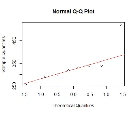
[The line marked there is based on the first 6 points only, because I want to discuss the deviation of the last two from the pattern there.]

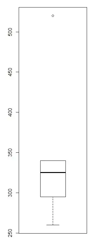
We see that the smallest 6 points lie almost perfectly on the line.

Then the 7th point is below the line (closer to the middle relatively than the corresponding second point in from the left end), while the eighth point sits way above.

The 7th point suggests mild left skew, the last, stronger right skew. If you ignore either point, the impression of skewness is entirely determined by the other.

If I had to say it was one or the other, I'd call that "right skew" but I'd also point out that the impression was entirely due to the effect of that one very large point. Without it there's really nothing to say it's right skew. (On the other hand, without the 7th point instead, it's clearly not left skew.)

We must be very careful when our impression is entirely determined by single points, and can be flipped around by removing one point. That's not much of a basis to go on!


I start with the premise that what makes an outlier 'outlying' is the model (what's an outlier with respect on one model may be quite typical under another model).

I think an observation at the 0.01 upper percentile (1/10000) of a normal (3.72 sds above the mean) is equally an outlier to the normal model as an observation at the 0.01 upper percentile of an exponential distribution is to the exponential model. (If we transform a distribution by its own probability integral transform, each will go to the same uniform)

To see the problem with applying the boxplot rule to even a moderately right skew distribution, simulate large samples from an exponential distribution.

E.g. if we simulate samples of size 100 from a normal, we average less than 1 outlier per sample. If we do it with an exponential, we average around 5. But there's no real basis on which to say that a higher proportion of exponential values are "outlying" unless we do it by comparison with (say) a normal model. In particular situations we might have specific reasons to have an outlier rule of some particular form, but there's no general rule, which leaves us with general principles like the one I started with on this subsection - to treat each model/distribution on its own lights (if a value isn't unusual with respect to a model, why call it an outlier in that situation?)


To turn to the question in the title:

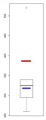
While it's a pretty crude instrument (which is why I looked at the QQ-plot) there are several indications of skewness in a boxplot - if there's at least one point marked as an outlier, there's potentially (at least) three:

enter image description here

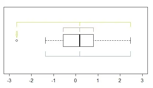
In this sample (n=100), the outer points (green) mark the extremes, and with the median suggest left skewness. Then the fences (blue) suggest (when combined with the median) suggest right skewness. Then the hinges (quartiles, brown), suggest left skewness when combined with the median.

As we see, they needn't be consistent. Which you would focus on depends on the situation you're in (and possibly your preferences).

However, a warning on just how crude the boxplot is. The example toward the end here -- which includes a description of how to generate the data -- gives four quite different distributions with the same boxplot:

enter image description here

As you can see there's a quite skewed distribution with all of the above-mentioned indicators of skewness showing perfect symmetry.

--

Let's take this from the point of view "what answer was your teacher expecting, given that this is a boxplot, which marks one point as an outlier?".

We're left with first answering "do they expect you to assess skewness excluding that point, or with it in the sample?". Some would exclude it, and assess skewness from what remains, as jsk did in another answer. While I have disputed aspects of that approach, I can't say it's wrong -- that depends on the situation. Some would include it (not least because excluding 12.5% of your sample because of a rule derived from normality seems a big step*).

* Imagine a population distribution which is symmetric except for the far right tail (I constructed one such in answering this - normal but with the extreme right tail being Pareto - but didn't present it in my answer). If I draw samples of size 8, often 7 of the observations come from the normal-looking part and one comes from the upper tail. If we exclude the points marked as boxplot-outliers in that case, we're excluding the point that's telling us that it is actually skew! When we do, the truncated distribution that remains in that situation is left-skew, and our conclusion would be the opposite of the correct one.

Glen_b
  • 257,508
  • 32
  • 553
  • 939
  • Wow! What a thorough answer. I have much clearer understanding of skewness now. Thank you very much. – JerryW May 06 '14 at 05:11
  • @Glen_b Do you think comparing the mean to the median is an appropriate measure of skewness in the presence of an extreme outlier? – jsk May 06 '14 at 05:16
  • 1
    @jsk That depends on how you want to measure skewness. Since degree of skewness is partly determined by outlying points (a tendency to be more outlying one direction than another), removing them arguably misses the point of measuring skewness. A more detailed discussion and analysis is in my updated post. If you're unconvinced, please feel free to disagree, such exchanges are often valuable. – Glen_b May 06 '14 at 05:23
  • I just started to learn statistics and skewness is one of the concepts that I thought that I had a solid grasp on. Now look at this and your other post on skewness. I couldn't possibly have imagined that a seemingly basic statistical concept could become so tricky. – JerryW May 06 '14 at 05:34
  • 1
    @Glen_b While I certainly respect and understand the stance you are taking, I do believe there is a reasonable argument to be made for judging skew after removing the outlier as opposed to before. After removing the outlier, the distribution will even still be negatively skewed after removing the 7th point (260). Did you check the qqplot and/or compare the mean and median? – jsk May 06 '14 at 05:44
  • @jsk There's a mild suggestion of left skewness there, I'd agree, but it's quite weak without the seventh point, and I'd be unwilling to declare the distribution left or right skew on the basis of those six points. With the six points that are left you have a result that could easily come from distributions that are right skew by all three measures I mentioned. I just now generated 3 uniform samples of size 6 and one of them looked more left skew than that. If I was asked to stipulate what the sample skewness was, I'd have to ask by what measure. Certainly by some measures, it's negative. – Glen_b May 06 '14 at 06:20
  • 1
    Perhaps the case is quite weak after removing the 7th, but I see no reason to justify judging the skew after removing it. It's not an outlier, though the point is well-taken that the measures of skew, no matter how you look at them in this case, are being driven by single points. – jsk May 06 '14 at 06:30
  • @jsk How do you judge what's an outlier in a right-skewed distribution (as it appears to be with the 8th point there)? – Glen_b May 06 '14 at 06:32
  • 1
    @Glen_ b Q3 + 1.5IQR is the typical rule of thumb taught at this level for identifying outliers in the upper tail. Whether or not to remove them is another matter. Are you arguing that the distribution is right skewed because the mean is larger? Why ignore the fact that Q1 is further from Q2 than Q3 is? – jsk May 06 '14 at 06:57
  • The boxplot rule-of-thumb is based on a robust approximation to a rule using normality. I'm arguing it's right skew from the appearance of the QQ plot when all data is included. – Glen_b May 06 '14 at 08:45
  • 1
    I want to spell out what is near the surface here but not quite: often boxplots condense too much, so you may need to look at all the data too. – Nick Cox May 06 '14 at 08:55
  • @Nick A good point to make. – Glen_b May 06 '14 at 09:00
  • @jsk I added a little to my answer to address some of your points. I think you make some good ones! – Glen_b May 06 '14 at 10:11
  • @Glen_b You make good points regarding not using the 1.5 IQR rule of thumb. I would however point out that we have likely gone past the level at which the material was taught to the student and that the student may no longer get the answer the teacher intended. This is not a homework help site, but it's quite possible that the views presented here, however reasonable they are, may be in conflict with the material presented to the student. – jsk May 06 '14 at 12:58
  • @Glen_b How large would the max have to be in this case before you would feel comfortable calling it an outlier? – jsk May 06 '14 at 13:12
  • 1
    @jsk It really depends on context. Without some basis to call it an atypical point, how would one declare it so? If I know it's a count, or a physical measurement of something, I might have some basis for understanding what a truly atypical value is. If I have a model - such as 'the data are normal' then I also have a basis. If I were computing a sample mean, I might even have some way of deciding. If I don't know what I am dealing with and I only have n=8? It would have to be pretty darn big for me to say "no matter what I am dealing with, no matter what my model, that point doesn't belong' – Glen_b May 06 '14 at 20:22
  • 1
    @jsk Many of my answers conflict with information that is often given to students. And information here should be useful to a variety of people. I have sympathy with not confusing students (having had many myself), but there are also other considerations. – Glen_b May 06 '14 at 20:30
12

No, you did not miss anything: you are actually seeing beyond the simplistic summaries that were presented. These data are both positively and negatively skewed (in the sense of "skewness" suggesting some form of asymmetry in the data distribution).

John Tukey described a systematic way to explore asymmetry in batches of data by means of his "N-number summary." A boxplot is a graphic of a 5-number summary and thereby is amenable to this analysis.


A boxplot displays a 5-number summary: the median $M$, the two hinges $H^{+}$ and $H^{-}$, and the extremes $X^{+}$ and $X^{-}$. The key idea in Tukey's generalized approach is to choose some statistics $T_i^{+}$ reflecting the upper half of the batch (based on ranks or, equivalently, percentiles), with increasing $i$ corresponding to more extreme data. Each statistic $T_i^{+}$ has a counterparts $T_i^{-}$ obtained by computing the same statistic after turning the data upside-down (by negating the values, for instance). In a symmetric batch, each pair of matching statistics must be centered at the middle of the batch (and this center will coincide with $M = M^{+}=M^{-}$). Thus, a plot of how much the mid-statistic $(T_i^{+} + T_i^{-})/2$ varies with $i$ provides a graphical diagnostic and can furnish a quantitative estimate of asymmetry.

To apply this idea to a boxplot, just draw the midpoints of each pair of corresponding parts: the median (which is already there), the midpoint of the hinges (ends of the box, shown in blue), and the midpoint of the extremes (shown in red).

Boxplot

In this example the lower value of the mid-hinge compared to the median indicates the middle of the batch is slightly negatively skewed (thereby corroborating the assessment quoted in the question, while at the same time suitably limiting its scope to the middle of the batch) while the (much) higher value of the mid-extreme indicates the tails of the batch (or at least its extremes) are positively skewed (albeit, on closer inspection, this is due to a single high outlier). Although this is almost a trivial example, the relative richness of this interpretation compared to a single "skewness" statistic already reveals the descriptive power of this approach.

With a small amount of practice you do not have to draw these mid-statistics: you can imagine where they are and read the resulting skewness information directly off any boxplot.


An example from Tukey's EDA (p. 81) uses a nine-number summary of heights of 219 volcanoes (expressed in hundreds of feet). He calls these statistics $M$, $H$, $E$, $D$, and $X$: they correspond (roughly) to the middle, the upper and lower quartiles, the eighths, the sixteenths and the extremes, respectively. I have indexed them in this order by $i=1, 2, 3, 4, 5$. The left hand plot in the next figure is the diagnostic plot for the midpoints of these paired statistics. From the accelerating slope, it is clear the data are becoming more and more positively skewed as we reach out into their tails.

Figure 2

The middle and right plots show the same thing for the square roots (of the data, not of the mid-number statistics!) and the (base-10) logarithms. The relative stability of the values of the roots (notice the relative small vertical range and the level sloped in the middle) indicates that this batch of 219 values becomes approximately symmetric both in its middle portions and in all parts of its tails, almost out to the extremes when the heights are re-expressed as square roots. This result is a strong--almost compelling--basis for continuing further analysis of these heights in terms of their square roots.

Among other things, these plots reveal something quantitative about the asymmetry of the data: on the original scale, they immediately reveal the varying skewness of the data (casting considerable doubt on the utility of using a single statistic to characterize its skewness), whereas on the square root scale, the data are close to symmetric about their middle--and therefore can succinctly be summarized with a five-number summary, or equivalently a boxplot. The skewness again varies appreciably on a log scale, showing the logarithm is too "strong" a way to re-express these data.

The generalization of a boxplot to seven-, nine-, and more-number summaries is straightforward to draw. Tukey calls them "schematic plots." Today many plots serve a similar purpose, including standbys like Q-Q plots and relative novelties such as "bean plots" and "violin plots." (Even the lowly histogram can be pressed into service for this purpose.) Using points from such plots, one can assess asymmetry in a detailed fashion and perform a similar evaluation of ways to re-express the data.

whuber
  • 281,159
  • 54
  • 637
  • 1,101
7

The mean being less than or greater than the median is a shortcut that often works for determining the direction of skew so long as there are no outliers. In this case, the distribution is negatively skewed but the mean is larger than the median due to the outlier.

jsk
  • 2,810
  • 1
  • 12
  • 25
  • That explains. The books I read didn't mention this at all! – JerryW May 06 '14 at 05:01
  • Hopefully the books at least mentioned how the mean is much less resistant to outliers than the median! – jsk May 06 '14 at 05:05
  • Whether that counts as negatively skewed depends on how you measure skewness. – Glen_b May 06 '14 at 05:06
  • Fair enough. It's a small dataset which makes it especially challenging to judge skewness. I would guess this example was unfortunately thrown in there just for the reason of having conflicting rules of thumb for determining skew – jsk May 06 '14 at 05:10
  • 1
    I agree that small datasets like this can make it challenging, but it's perfectly possible to construct continuous distributions which are equally challenging. – Glen_b May 06 '14 at 05:47