3

This boxplot shows 5 different forms of dancing. On the y-axis we have the number of injuries

This boxplot shows 5 different forms of dancing. On the y-axis we have the number of injuries. This is an ANOVA model. The question is, what assumptions could not be met according to this boxplot?

I think that the assumption of normal distribution is not met here, I am doubting as well whether non-constancy of variance is there.

Can someone help me and point out what I should focus on when presented with a boxplot?

Ben Bolker
  • 34,308
  • 2
  • 93
  • 126
user233927
  • 31
  • 1
  • 2
  • 5
    If this is homework, please consider adding the [self-study](https://stats.stackexchange.com/tags/self-study/info) tag. – Stefan Jan 13 '19 at 18:46
  • 1
    With count data where some counts are typically small, constant variance and approximate normality will both tend to be unreasonable -- you don't generally need to even look at the data. Using analysis suited to counts from the outset will usually be a better choice than testing a bunch of assumptions that you know *a priori* will be false like constant variance or [normality](https://stats.stackexchange.com/questions/2492/is-normality-testing-essentially-useless/2501#2501) in order to try to shoehorn it into an ANOVA. – Glen_b Jan 14 '19 at 04:29
  • I find it a little perverse that many textbooks indicate distributions by box plots when ANOVA is being discussed. In this example, and often, it is easy to see that means will be close to the medians, and to make guesses about heteroscedasticity, but ANOVA deals with means and SDs, not medians and IQRs. – Nick Cox May 30 '19 at 12:52
  • This graph cries out for trying analysis on logarithmic scale. – Nick Cox May 30 '19 at 12:53

1 Answers1

4

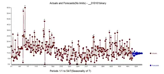
Boxplots summarize distributions to only a handful of numbers. This can be convenient when comparing many dozens of groups but with only a few groups it's better to look at all of the data.

Nevertheless, sometimes it's the only option available (such as when we have nothing but the side-by-side boxplot to look at).

In that case you have a couple of indications of the relative spreads, and several indications of skewness (or at least asymmetry).

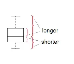
For equality of spreads, you can compare the box-lengths,

comparison of box-lengths from boxplot in question; very different spreads

or the range (or you might look at the distance between the whiskers if that differs from the range). Of those the box-lengths tend to be a little more robust. See also the discussion here.

Typically you're looking for a substantial difference in spread (typically a deal more than a factor of two, say) before there's much impact on tests. Of course you can avoid this issue easily by not making an assumption you're not confident in (perhaps using a Welch-Satterthwaite instead, or a more suitable parametric assumption, perhaps one where mean and variance are related, such as you get with count data).

For looking at skewness, there's an extensive discussion here about the assessment of skewness using boxplots

skewness in a boxplot

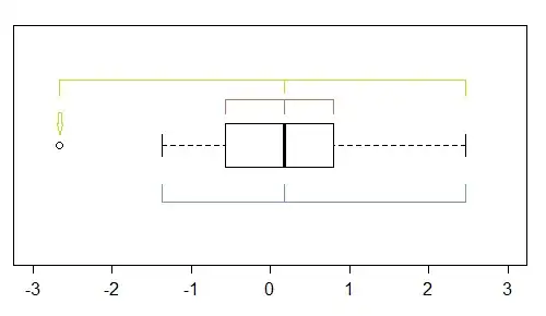
(as well as some discussion of alternative ways of considering it). In that case, you're effectively comparing the relative spread on the left and right (below and above) of the middle within each group:

boxplot indicating right skewness because the upper half of the box is longer and the upper whisker is further from the median than the corresponding elements in the lower half

Caution is required, however, as boxplots can sometimes be quite misleading as indicators of shape. This can be seen in the four boxplots in the example at the end of the previously mentioned link.

Ben Bolker
  • 34,308
  • 2
  • 93
  • 126
Glen_b
  • 257,508
  • 32
  • 553
  • 939
  • 1
    One thing I would add to the answer is that you can notice immediately that all data are positive, despite some being close to 0. Very unlikely if normal. – Martin Modrák May 30 '19 at 11:19