I am new to PCA and wanted to do a bit of experimentation on my data set just to see what it looked like (using R). I am not able to give access to the data here since it is confidential. However, if there is some other kind of statistic/visualization you would like to see that would help you answer my questions please let me know and I will provide it.
I found the following information about the explained variance:
Component Prop.Var
1         0.911804348
2         0.033618098
3         0.020827269
4         0.011772988
5         0.006611746
6         0.005372772
7         0.004464788
8         0.003436401
9         0.002091589
This raises the following questions:
- Am I justified in removing the other 8 principal components?
- How do I interpret 91% of explained variance on one component?
- If I only kept one component what would be the best way to visualize the data?
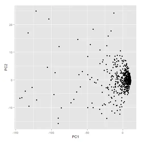
Below is how the graph of the first two principal components looks. The spread of the data like this is not surprising given how little of the variance is on the second component.
As I mentioned, I am new to PCA so I really do not know if there is even any useful information to be found from this kind of dimensional reduction. Any insight would be appreciated.