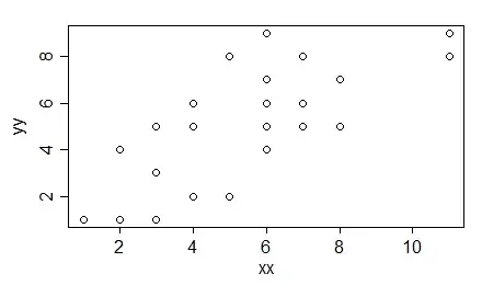
I have a dataset containing two columns and a total of 90 rows. The data is from my experiment where in the first column I have an integer representing the quantity, in the second column I have a percentage. A small example:
Quantity   Percentage
1          53%
1          51%
1          67%
2          73%
2          69%
3          73%
...        ...
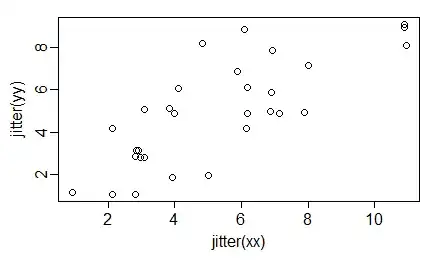
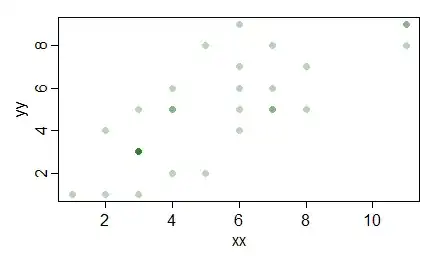
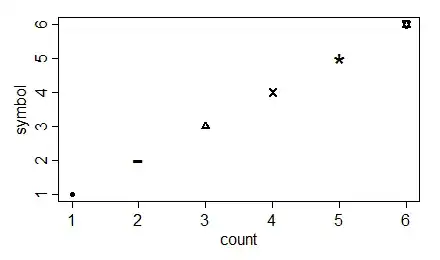
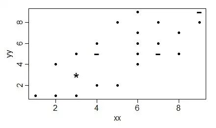
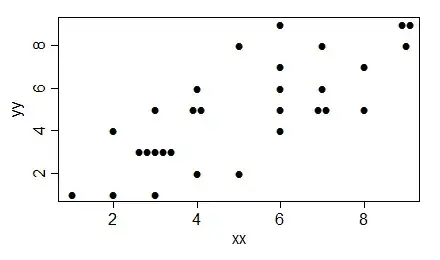
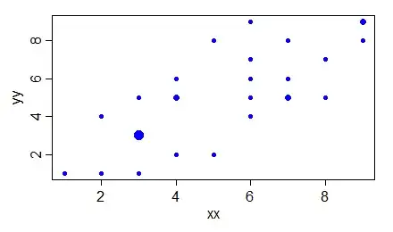
As you can see in both columns the numbers can occur more than once. Now I wish to plot this in a graph (I was thinking a scatter plot) in R. I just am a real beginner in using R and statistics so I was hoping someone can help me out how to get a good graph. If someone has an other suggestion that would give a better representation, shoot!
I just need to have a visual representation that shows the correlation between the two values.