11

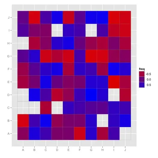
I'd like to obtain a graphic representation of the correlations in articles I have gathered so far to easily explore the relationships between variables. I used to draw a (messy) graph but I have too much data now.

Basically, I have a table with:

  • [0]: name of variable 1
  • [1]: name of variable 2
  • [2]: correlation value

The "overall" matrix is incomplete (e.g., I have the correlation of V1*V2, V2*V3, but not V1*V3).

Is there a way to graphically represent this ?

Coronier
  • 343
  • 2
  • 7

3 Answers3

12

Building upon @GaBorgulya's response, I would suggest trying fluctuation or level plot (aka heatmap displays).

For example, using ggplot2:

library(ggplot2, quietly=TRUE)
k <- 100
rvals <- sample(seq(-1,1,by=.001), k, replace=TRUE)
rvals[sample(1:k, 10)] <- NA
cc <- matrix(rvals, nr=10)
ggfluctuation(as.table(cc)) + opts(legend.position="none") + 
  labs(x="", y="")

(Here, missing entry are displayed in plain gray, but the default color scheme can be changed, and you can also put "NA" in the legend.)

enter image description here

or

ggfluctuation(as.table(cc), type="color") + labs(x="", y="") +
  scale_fill_gradient(low = "red",  high = "blue")

(Here, missing values are simply not displayed. However, you can add a geom_text() and display something like "NA" in the empty cell.)

enter image description here

chl
  • 50,972
  • 18
  • 205
  • 364
  • 2
    +1 for `ggfluctuation`, hadn't seen that before! This post has other useful code to visualize this type of dater: http://stackoverflow.com/questions/5453336/r-plot-correlation-matrix-into-a-graph/5453398#5453398 – Chase Apr 01 '11 at 16:42
  • @Chase (+1) Thx. BTW, it seems I had some problem with my color scheme for negative correlation values. – chl Apr 01 '11 at 16:59
  • Reordering the rows and columns by (`hclust(…)$order`)[http://stat.ethz.ch/R-manual/R-devel/library/stats/html/hclust.html] the visualization will be often easier to overview. – GaBorgulya Apr 01 '11 at 17:23
  • @GaBorgulya Good point. I use this when I'm doing exploratory data analysis *and* the variables have no particular order (as would be the case for spatial or temporal data, or structured data that you want to see as is). The `mixOmics::cim` function is very good for that. A related issue was discussed here, http://stats.stackexchange.com/questions/8370/how-to-visualize-summarize-a-matrix-with-number-of-rows-gg-number-of-columns/8372#8372. – chl Apr 01 '11 at 19:29
5

Your data may be like

  name1 name2 correlation
1    V1    V2         0.2
2    V2    V3         0.4

You can rearrange your long table into a wide one with the following R code

d = structure(list(name1 = c("V1", "V2"), name2 = c("V2", "V3"), 
    correlation = c(0.2, 0.4)), .Names = c("name1", "name2", 
    "correlation"), row.names = 1:2, class = "data.frame")
k = d[, c(2, 1, 3)]
names(k) = names(d)
e = rbind(d, k)
x = with(e, reshape(e[order(name2),], v.names="correlation", 
  idvar="name1", timevar="name2", direction="wide"))
x[order(x$name1),]

You get

  name1 correlation.V1 correlation.V2 correlation.V3
1    V1             NA            0.2             NA
3    V2            0.2             NA            0.4
4    V3             NA            0.4             NA

Now you can use techniques for visualizing correlation matrices (at least ones that can cope with missing values).

GaBorgulya
  • 3,253
  • 15
  • 19
  • 2
    the `reshape` package can be useful as well. Once you have `e`, consider something like `library(reshape) cast(melt(e), name1 ~ name2)` – Chase Apr 01 '11 at 16:08
3

The corrplot package is a useful function for visualizing correlation matrices. It accepts a correlation matrix as the input object and has several options for displaying the matrix itself. A nice feature is that it can reorder your variables using hierarchical clustering or PCA methods.

See the accepted answer in this thread for an example visualization.

Iris Tsui
  • 681
  • 4
  • 14