I have the following set of model-averaged fixed effects from a set of binomial GLMMs:

I would like to plot the predicted effect of "NBT", along with confidence bands, while holding all the other variables at their baseline levels. My attempt to do this in ggplot:
Xvars <- seq(from=0, to=100, by=0.1)  #NBT range is 0-100
  binomIntercept <- 1.317
  binomSlope <- -0.0076
  binomSE <- 0.009
Means <- logistic(binomIntercept + binomSlope*Xvars)
loCI <- logistic(binomIntercept + (binomSlope - 1.96*binomSE)*Xvars)
upCI <- logistic(binomIntercept + (binomSlope + 1.96*binomSE)*Xvars)
df <- data.frame(Xvars,Means,loCI,upCI)
p <- ggplot(data=df, aes(x = Xvars, y = Means)) +
geom_line() +
geom_line(data=df, aes(x = Xvars, y = upCI),col='grey') +
geom_line(data=df, aes(x = Xvars, y = loCI), col='grey')
p
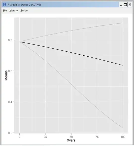
I'm assuming that the confidence bands are cone shaped because I'm not accounting for uncertainty in the estimate for the intercept. Maybe this is okay (?), but it does look different from every regression line I've ever seen with confidence intervals plotted.
Can someone please tell me how I should be writing my equations to get the correct confidence intervals, given the intercept, slope, and standard errors from my model output?
(I know I can use the predict function to do this in R, but would like to know how to do it by hand.)