I'm using R to plot some graphs for visually inspecting the normality of variables that will go into a linear regression model. Except for a histogram and a QQ plot, what other graphics could I use?
Asked
Active
Viewed 867 times
1
-
2PP plot. The classic paper Wilk, M.B., & Gnanadesikan, R. 1968. Probability plotting methods for the analysis of data. _Biometrika_ 55: 1-17 which introduced the terminology of QQ and PP plots is very much worth reading. The QQ plot remains the best in my opinion. – Nick Cox Dec 04 '13 at 08:37
-
1See also http://stats.stackexchange.com/questions/64026/benefits-of-using-qq-plots-over-histograms – Nick Cox Dec 04 '13 at 10:36
-
2Also density plots and box plots can be useful to highlight different aspects of violations of normality. As an aside, variables that go into a regression do not have to be normally distributed; the residuals from the model do. – Peter Flom Dec 04 '13 at 10:54
-
2Histograms are okay, [with appropriate levels of caution](http://stats.stackexchange.com/questions/51718/assessing-approximate-distribution-of-data-based-on-a-histogram/51753#51753). I'd second the recommendation of the QQ plot as probably the best choice. = – Glen_b Dec 04 '13 at 11:02
-
And please do not forget that most regression models do not assume normality of *any* of their variables, so why are you doing this in the first place? – whuber Feb 23 '14 at 16:43
1 Answers
2
As suggested by @Peter Flom a third option could be the boxplot.
The picture below shows two distributions (with n=1000):
- On the left column a Normal distribution with $\mu = 4$ and $\sigma = 1$ and,
- On the right a two parameter Weibull distribution, with shape = 1.5 and scale = 2.
The first line shows the histograms and the second line illustrates a quantile-quantile plot (with the normal distribution as the baseline for comparison). The third line contains the boxplot plots). Note how the Weibull presents non symmetric whiskers in the boxplot.
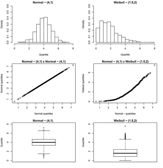
Here is the R code to reproduce the picture
set.seed(77)
x=rnorm(1000,4,1)
y=rweibull(1000,shape=1.5,scale=2)

par(mfrow=c(3,2),mar=c(5,4,1.5,2))

hist   (x,prob=T, main="Normal ~ (4,1)  "                  , ylab="Density"          , xlab="Quantile"          , ylim=c(0,0.6), xlim=c(0,8))
hist   (y,prob=T, main="Weibull ~ (1.5,2)"                 , ylab="Density"          , xlab="Quantile"          , ylim=c(0,0.6), xlim=c(0,8))
qqplot (x,x     , main="Normal ~ (4,1) x Normal ~ (4,1)"   , ylab="Normal quantiles" , xlab="Normal quantiles"                              )
qqplot (x,y     , main="Normal ~ (4,1) x Weibull ~ (1.5,2)", ylab="Weibull quantiles", xlab="Normal ~ quantiles"                            )
boxplot(x       , main="Normal ~ (4,1)  "                  , ylab="Quantile"         , xlab=""                  , ylim=c(0,8               ))
boxplot(y       , main="Weibull ~ (1.5,2)"                 , ylab="Quantile"         , xlab=""                  , ylim=c(0,8               ))
Lastly, just to emphasize the hint provided by Peter, regression assumption of normality is observed over the residuals' distribution and not the predictors'.
Andre Silva
- 3,070
- 5
- 28
- 55