19

What is the best way graphically to visualize a 3-D density function? As in I would like to visualize $$z=f_{X,Y}(x,y)$$?

Not necessary but R code for this would be great.

  • This belongs to StackOverflow. In any case you should probably give some more information as to what you are trying to visualize, as the answer may change depending on what your data looks like. – nico Sep 19 '13 at 21:25
  • 3
    I changed it to be more statistical. –  Sep 19 '13 at 21:27
  • Are there other choices besides what Babakp suggests? –  Sep 19 '13 at 21:32
  • 1
    If there's something lacking about those options, it will be most helpful if you can specify what it is & what exactly your needs are so that we can find a kind of visualization that might better suit them. – gung - Reinstate Monica Sep 19 '13 at 21:35
  • 1
    Those are adequate sure but what are my other options/ –  Sep 19 '13 at 21:36
  • 3
    @nico, I don't think this would have been off-topic / better suited for SO even before the changes. The request for code was specified as optional, & `data-visualization` is part of our mandate. – gung - Reinstate Monica Sep 19 '13 at 21:38
  • I discuss some ways of visually exploring a multi-variable dataset in my answer here: [first-quick-glance-at-a-dataset](http://stats.stackexchange.com/questions/21809//21840#21840). Those aren't specific to density functions per se, but you could work out some other possibilities from those options, I'm sure. – gung - Reinstate Monica Sep 19 '13 at 21:41
  • @gung I agree both with you and nico: visualizing a mathematically-given function in 3D could be claimed as appropriate subject matter by a large number of SE sites ranging from SO to here to Physics to *Mathematica* and perhaps even GIS (which has an analogous thread). Because the question was posted here, though, our default assumption should be that somehow $f$ has been derived from *data*. This opens a large variety of alternatives to the fine set of options already nicely illustrated by BabakP, depending on the nature of the data and how $f$ has been estimated from them. – whuber Sep 19 '13 at 21:41
  • 1
    @whuber, the original question was just "visualize a 3D dataset" (you can see it in the edit history). I take that to be on-topic, although your point, as made, is clearly correct. – gung - Reinstate Monica Sep 19 '13 at 21:43
  • So can I get more options or explanantions of plots? –  Sep 19 '13 at 21:43
  • I don't understand your question, @StatMan. – gung - Reinstate Monica Sep 19 '13 at 21:43
  • So as not to seem mysterious or coy, some visualizations I have in mind would include graphical representations of the raw data superimposed on some rendering of the graph of $f$ and they could include renderings of uncertainty in $f$: none of these potentially useful and informative options are possible when $f$ is given *in abstracto* without a data-dependent context. (@gung: Hmm... somehow the reference to "data set" was edited out early in the process. Thanks for pointing out that it was originally there.) – whuber Sep 19 '13 at 21:44
  • @buber what do you mean abstracto? –  Sep 19 '13 at 21:48
  • You mean "@whuber", Stat Man. I'm pretty sure he didn't write [*I and Thou*](http://www.amazon.com/I-Thou-Martin-Buber/dp/1578989973) ;-). – gung - Reinstate Monica Sep 19 '13 at 21:50
  • http://www.merriam-webster.com/dictionary/in%20abstracto – whuber Sep 19 '13 at 21:55
  • 1
    I'm voting for this to remain open, primarily because the question - how to visualize a multidimensional density - is not inherently a computational problem (and, since it was called a _density_, I'd call this on topic here and on Math SE). Babek's response was to primarily give R examples of some good ways, but the way the answer was formed shouldn't necessarily determine the nature of the question. As a secondary point, I recall that googling to find how to generate and customize such plots in R (albeit, this was c. 2004) is a pain so the accepted answer is likely to have lasting value. – Macro Sep 19 '13 at 22:21

1 Answers1

28

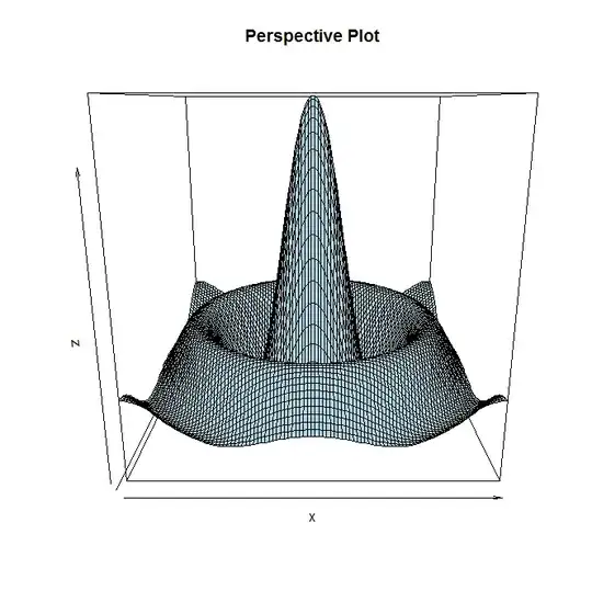
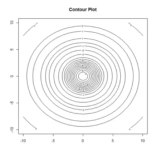
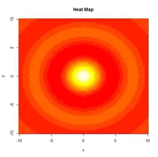
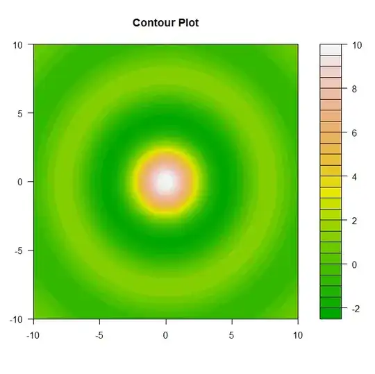
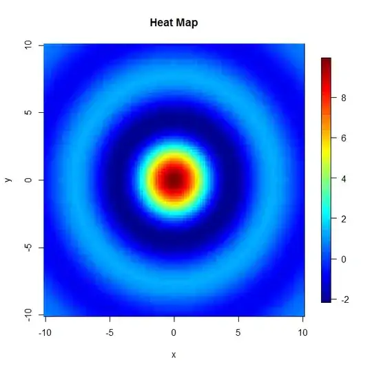
Well there are four possible approaches that come to mind (although I am sure that there are many more) but basically you could either plot the data as a perspective plot, a contour plot, a heat map or if you prefer a 3-D scatter plot (which is more or less a perspective plot when you have values of $z$ for all $(x,y)$ pairs. Here are some examples of each (from a well known 3-D data set in R):

enter image description here enter image description here enter image description here enter image description here

Here are two additional plots that have nicer plotting features than the ones given prior. enter image description here enter image description here So depending on your preference will dictate which way you like to visualize 3-D data sets.

Here is the `R` code used to generate these four mentioned plots.
library(fields)
library(scatterplot3d)

#Data for illistarition
x = seq(-10, 10, length= 100)
y = x
f = function(x, y) { r = sqrt(x^2+y^2); 10 * sin(r)/r }
z = outer(x, y, f)
z[is.na(z)] = 1

#Method 1
#Perspective Plot
persp(x,y,z,col="lightblue",main="Perspective Plot")

#Method 2
#Contour Plot
contour(x,y,z,main="Contour Plot")
filled.contour(x,y,z,color=terrain.colors,main="Contour Plot",)

#Method 3
#Heatmap
image(x,y,z,main="Heat Map")
image.plot(x,y,z,main="Heat Map")

#Method 4
#3-D Scatter Plot
X = expand.grid(x,y)
x = X[,1]
y = X[,2]
z = c(z)
scatterplot3d(x,y,z,color="lightblue",pch=21,main="3-D Scatter Plot")
  • 1
    That heatmap is blinding. – gung - Reinstate Monica Sep 19 '13 at 21:47
  • @Gung, (or anyone really) do you know if there is a was to add a side bar that tells what the values the colors of the heatmap correspond to? That is of course using the image command. –  Sep 19 '13 at 21:50
  • There is some way, but I don't know off the top of my head--I'd have to figure it out. You could probably get a quick answer on SO though; how to add `` to an R plot is a typical SO Q. – gung - Reinstate Monica Sep 19 '13 at 21:53
  • 3
    I think you want the `image.plot()` command to add a color bar. Also, `filled.contour()` generates a similar plot with a color bar added by default. – Macro Sep 19 '13 at 22:03
  • @Macro Thanks! Which package are those commands in? –  Sep 19 '13 at 22:04
  • @gung literally ;-) R's `image` colour palette leaves a lot to be desired... – Gavin Simpson Sep 19 '13 at 22:07
  • @BabakP Re the colour bar, it may also be easier to plot using **lattice** (`wireframe()` and `cloud()`) or **ggplot2** (for the contour/image plot only - £d plots aren't in the Grammar IIRC). They will both handle the colour scale/key for you more nicely than the options in base graphics. – Gavin Simpson Sep 19 '13 at 22:07
  • 6
    [Mama always told me not to look into the eyes of the sun](http://www.youtube.com/watch?v=2GCr1eTbxbw), @GavinSimpson. – gung - Reinstate Monica Sep 19 '13 at 22:10
  • 2
    While we're here, I'll just point out that you can customize the color palette any way you want... The easiest (but probably not the best) way to do this is using `colorRampPalette()`, e.g. if you type `a = colorRampPalette(c('dark blue','blue','light blue','yellow','orange', 'red','dark red'))` it creates a function `a` that generates a discrete approximation of a color continuum that passes through those colors. The argument to `a` is an integer that determines the resolution of this discrete approximation. – Macro Sep 19 '13 at 22:12
  • The `filled.contour()` command is in `graphics` which I think is part of the basic stuff you get when you download R. `image.plot()` is in `fields`. – Macro Sep 19 '13 at 22:36
  • FWIW, `fields` gives the z-axis legend by default, which I find *incredibly* handy. – Sycorax Sep 19 '13 at 22:38
  • I changed the plots to reflect your suggestions to use the `filled.contour()` and `image.plot()` option in `R` –  Sep 19 '13 at 22:52