I have the following data:
t       mean
147     1.4
143     3
137.5       1.8
133     1.9
129.5       1.8
124.5       2.5
115.5       1.9
107     2.5
102.5       6.3
98.5        6.5
94.5        5
89      5.5
81      4.8
73      9.3
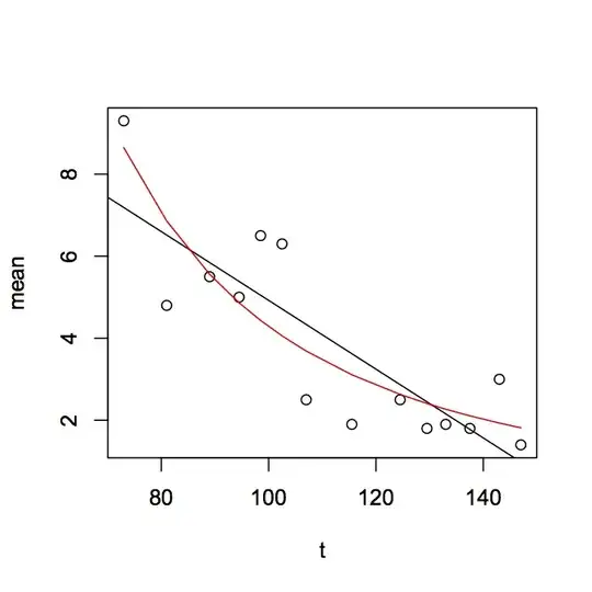
To me, the slope looks more exponential than linear when plotted as a scatterplot. I've been using the following code in R:
data<-read.csv("regression.csv")
attach(data)
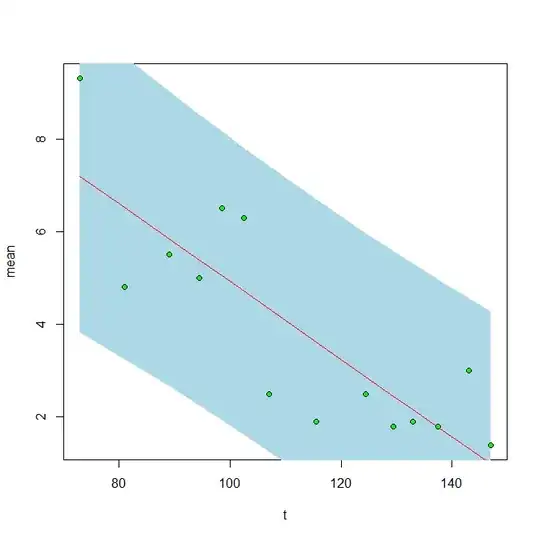
plot(t,mean)
data.lm<-lm(mean~t,data=data)
summary(data.lm)
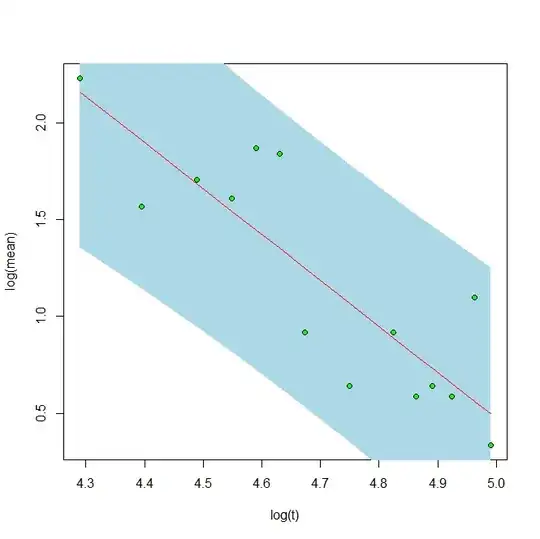
data.exp<-lm(log(mean) ~ log(t) ,data=data)
summary (data.exp)
AIC(data.lm, k=2)
AIC(data.exp, k=2)
data.exp, the exponential regression, has a much lower p-value and a much lower AIC score than data.lm, the linear model: 6.869e-05 vs. 0.000194, and 11.4641 vs. 52.22926.
But (how) can I demonstrate that the data fits an exponential line better than a straight line? Is the use of AIC legitimate here? Sorry to ask such as simple question but I've looked online and haven't found an answer.
Thank you!