I have an example data set as follows:
Volume <- seq(1,20,0.1)
var1 <- 100
x2 <- 1000000
x3 <- 30

x4 = sqrt(x2/pi)
H = x3 - Volume
r = (x4*H)/(H + Volume)

Power = (var1*x2)/(100*(pi*Volume/3)*(x4*x4 + x4*r + r*r))

Power <- jitter(Power, factor = 1, amount = 0.1)
plot(Volume,Power)
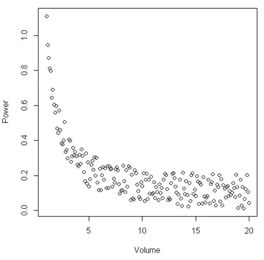
From the figure, it can be suggested that between a certain range of 'Volume' and 'Power' the relationship is linear, then when 'Volume' becomes relatively small the relationship becomes non-linear. Is there a statistical test for illustrating this?
With regards to some of the recommendations shown in the responses to the OP:
The example shown here is simply an example, the dataset I have looks similar to the relationship seen here although noisier. The analysis that I have conducted so far shows that when I analyse a volume of a specific liquid, the power of a signal drastically increases when there is a low volume. So, say is I only had an environment where the volume was between 15 and 20, it would almost look like a linear relationship. However, by increasing the range of points i.e. having smaller volumes, we see that the relationship is not linear at all. I am now looking for some statistical advice on how to statistically show this. Hope this makes sense.