4

I have two sets of data of protein-protein interactions in a matrices entitled: s1m and s2m. Each DB and AD pair make an interaction and the one matrix looks like:

> head(s1m)
     DB_num AD_num
[1,]      2   8153
[2,]      7   3553
[3,]      8   4812
[4,]     13   7838
[5,]     24   3315
[6,]     24   6012

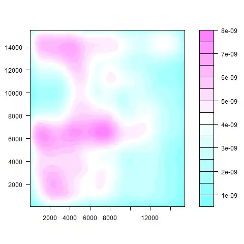
I can then plot the density of the points basically showing where the points are the most concentrated:

s1m:

enter image description here

s2m:

enter image description here

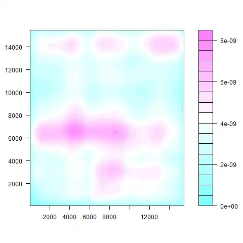
The code I used in R to make these plots was:

z <- kde2d(s1m[,1], s1m[,2], n=50)
filled.contour(z)
z <- kde2d(s2m[,1], s2m[,2], n=50)
filled.contour(z)

I want to be able to somehow compare how simiarly these plots are rather than just looking at them by eye. Is there someway to do this? By the way, I know very little about statistics. These are very large datasets also, something like 10,000 points among a matrix of 15k by 15k.

ran8
  • 149
  • 8
  • 1
    Would it be possible for you to upload at least a part of the dataset somewhere and maybe better explain what you are analysing? Anyway, I would start by plotting the histograms on each dimension, which would be probably cleaner to look at then the image. You could then maybe try to create a linear(?) model for each dataset and compare those. It is difficult to say without knowing exactly what you are looking at. – nico Aug 01 '13 at 07:21
  • @nico What do you mean by "plotting the histograms on each dimension?" And, how would I upload the data? Is there a feature somewhere to do that? – Kerpal Jenkiens Aug 01 '13 at 07:45
  • 1
    @KerpalJenkiens There is a [FAQ on Stack Overflow](http://stackoverflow.com/a/5963610/1412059) which explains how to share data for R-related questions. – Roland Aug 01 '13 at 08:58
  • @Kerpal Jenkiens: try something like `hist(s1m[,1])` or `hist(s2m[,1])` to see the different distributions of the two variables. Or you can do something like [this](http://blog.mckuhn.de/2009/09/learning-ggplot2-2d-plot-with.html) or [this](http://rgraphgallery.blogspot.fr/2013/04/rg54-scatter-diagram-with-rugs-spike.html) – nico Aug 01 '13 at 10:03
  • @nico would `hist(s1m[,1])` or `hist(s2m[,1])`, just display the distribution of DBs within each set? Would that really tell me anything about how the _pairs_ of DBs and ADs compare within "clustered groups", i.e.(something like what a contour map produces)? – Kerpal Jenkiens Aug 02 '13 at 17:05
  • @KerpalJenkiens: from what you show it looks like the dimension on x has definitely a different distribution in the two datasets... – nico Aug 02 '13 at 17:21

3 Answers3

4

You could look at the distribution of the differences between the z values returned by kde2d (i.e., z$z).

Let's create some example data:

set.seed(42)

x <- 1:100
y <- 1:100


Z1 <- outer(x, y, function(a,b) rnorm(length(a)))
Z2 <- outer(x, y, function(a,b) rnorm(length(a)))

filled.contour(Z1-Z2)

enter image description here

summary(as.vector(Z1-Z2))
#   Min.   1st Qu.    Median      Mean   3rd Qu.      Max. 
#-6.844000 -0.973200 -0.003553 -0.012130  0.942800  5.598000 
sd(Z1-Z2)
#[1] 1.429194

Z3 <- outer(x, y, function(a,b) a+b-mean(a+b)+rnorm(length(a)))

filled.contour(Z1-Z3)

enter image description here

summary(as.vector(Z1-Z3))
#    Min.   1st Qu.    Median      Mean   3rd Qu.      Max. 
#-99.49000 -29.37000   0.08199  -0.01940  29.46000 101.00000 

sd(Z1-Z3)
#[1] 40.83703
Roland
  • 5,758
  • 1
  • 28
  • 60
  • This all looks very cool, but I don't exactly understand what `Z1 – Kerpal Jenkiens Aug 02 '13 at 16:59
  • Also would this method work correctly if the x & y points on the plot were listed as one x column and one y column in a data frame, or would they need to be placed and arranged into a matrix of dimensions: (highest x or y) by (highest x or y)? – Kerpal Jenkiens Aug 02 '13 at 17:10
  • Since you didn't provide data, I created some dummy data. You can use `Z1 – Roland Aug 02 '13 at 20:18
1

What about something like this (using the "geyser" data set for illustrative purposes)

From the example:

attach(geyser)
f1 <- kde2d(duration, waiting, n = 50, 
            lims = c(0.5, 6, 40, 100))

Make up new data:

geyser2 <- geyser*rnorm(1)
f2 <- with(geyser2, kde2d(duration, waiting, n = 50,
            lims = c(0.5, 6, 40, 100)))

Create differences and plot them:

zdiff <- f1$z - f2$z
contour(zdiff)
nico
  • 4,246
  • 3
  • 28
  • 42
Peter Flom
  • 94,055
  • 35
  • 143
  • 276
  • 1
    How would you go to test whether those differences are significant or merely due to chance? I guess you could do some simulation by randomly shuffling the data a large number of times and have some sort of 95% confidence bands of the differences. Would that make sense? – nico Aug 02 '13 at 08:49
  • To simulate, you'd have to figure out how to "shuffle" the data properly. I don't know if that's been done for this type of problem – Peter Flom Aug 02 '13 at 10:21
0

You could compare contour line plots directly on the same graph.

 library(ggplot2)
   ggplot(mpg, aes(x = displ, y = cyl)) + stat_density2d () + 
   stat_density_2d(mapping = aes(x = mpg$displ[sample(1:length(mpg$displ))], y = mpg$cyl),
     color = "green", geom = "density_2d", position = "identity" , contour = TRUE, n = 100,
     h = NULL, na.rm = FALSE, show.legend = F, inherit.aes = F)

real and permuted density contours

Unfortunately the contours are hard to see though the obvious linear relationship is not. Also using few data points means every permutation changes the plot. Maybe we need something like probability distribution of each 2d bin.

If you just want a test instead here is the question: goodness of fit for 2d histograms.

ran8
  • 149
  • 8