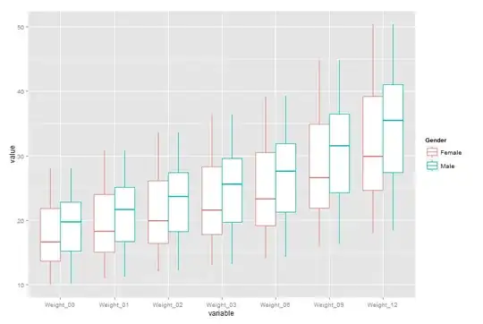
I have a group of 200 children who came to clinic at months 0, 1, 2, 3, 6, 9, and 12 this year. At each clinic visit the children were weighed.
# Set seed to create reproducible example data
set.seed(50)

# Create patient ID numbers, genders, and ages
control <- NULL
control$Age_0 = round(runif(200,1,10), digits = 1)
control$Gender <- sample(c("Male","Female"),200,T)

# Create monthly weights
control$Weight_0  = ((control$Age_0 + 4) * 2)
control$Weight_1  = (control$Weight_0 * 1.1)
control$Weight_2  = (control$Weight_0 * 1.2)
control$Weight_3  = (control$Weight_0 * 1.3)
control$Weight_6  = (control$Weight_0 * 1.4)
control$Weight_9  = (control$Weight_0 * 1.6)
control$Weight_12 = (control$Weight_0 * 1.8)

# Store as data frame
control <- as.data.frame(control)
This gives me data that looks like:
head(control)
  Age_0 Gender Weight_0 Weight_1 Weight_2 Weight_3 Weight_6 Weight_9 Weight_12
1   7.4   Male     22.8    25.08    27.36    29.64    31.92    36.48     41.04
2   4.9 Female     17.8    19.58    21.36    23.14    24.92    28.48     32.04
3   2.8 Female     13.6    14.96    16.32    17.68    19.04    21.76     24.48
4   7.9   Male     23.8    26.18    28.56    30.94    33.32    38.08     42.84
5   5.6 Female     19.2    21.12    23.04    24.96    26.88    30.72     34.56
6   1.4   Male     10.8    11.88    12.96    14.04    15.12    17.28     19.44
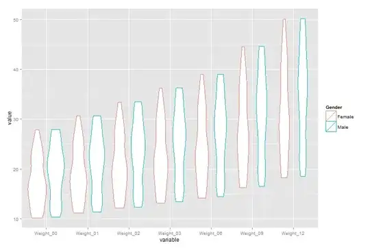
I asked for help on analyzing this data set previously here: Comparing weights versus time graphically with error bars. Spacedman suggested that I try making a violin plot of the data. I figured out how to do this, like so:
library(vioplot)
vioplot(control$Weight_0, control$Weight_1, control$Weight_2, control$Weight_3, control$Weight_6, control$Weight_9, control$Weight_12, col = "gold", names = c("0", "1", "2", "3", "6", "9", "12"))
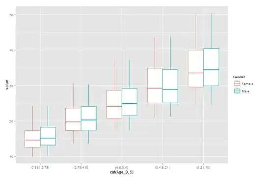
Spacedman suggested that I make plots by age group. Apparently this would be easier if I were to put the data in long format. I think I figured out how to do this, like so:
long <- reshape(control, idvar = "ID", ids = row.names(control), times = names(control)[3:9], timevar = "Characteristic", varying = list(names(control)[3:9]), direction = "long")

head(long)
           Age_0 Gender Characteristic Weight_0 ID
1.Weight_0   7.4   Male       Weight_0     22.8  1
2.Weight_0   4.9 Female       Weight_0     17.8  2
3.Weight_0   2.8 Female       Weight_0     13.6  3
4.Weight_0   7.9   Male       Weight_0     23.8  4
5.Weight_0   5.6 Female       Weight_0     19.2  5
6.Weight_0   1.4   Male       Weight_0     10.8  6
My question is:
Now that I have the data in long format, can anyone suggest how to use either vioplot or ggplot2 to create graphics that are stratified in this manner? And any other suggestions on how to analyze these data graphically? And in particular how else to take advantage of this "long" format?