11

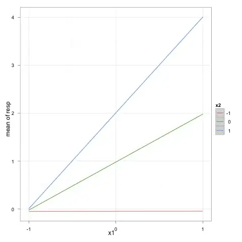
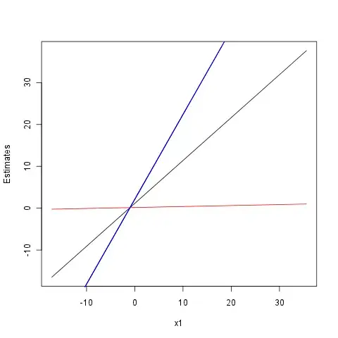
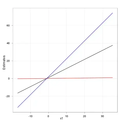
Let's say I have data:

x1 <- rnorm(100,2,10)
x2 <- rnorm(100,2,10)
y <- x1+x2+x1*x2+rnorm(100,1,2)
dat <- data.frame(y=y,x1=x1,x2=x2)
res <- lm(y~x1*x2,data=dat)
summary(res)

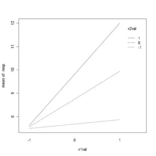
I want to plot the continuous by continuous interaction such that x1 is on the X axis and x2 is represented by 3 lines, one which represents x2 at a Z-score of 0, one at Z-score of +1, and another at a Z-score of -1, with each line a separate color and labelled. How can I do this using ggplot2?

For example, it might look something like this (though of course with different colored lines rather than different line types): Example Image

russellpierce
  • 17,079
  • 16
  • 67
  • 98
  • Could you show an example image from an other package/software or give a more detailed description what you want to plot? – daroczig Jan 26 '11 at 01:38

2 Answers2

9

Here's my version with your simulated data set:

x1 <- rnorm(100,2,10)
x2 <- rnorm(100,2,10)
y <- x1+x2+x1*x2+rnorm(100,1,2)
dat <- data.frame(y=y,x1=x1,x2=x2)
res <- lm(y~x1*x2,data=dat)
z1 <- z2 <- seq(-1,1)
newdf <- expand.grid(x1=z1,x2=z2)

library(ggplot2)
p <- ggplot(data=transform(newdf, yp=predict(res, newdf)), 
            aes(y=yp, x=x1, color=factor(x2))) + stat_smooth(method=lm)
p + scale_colour_discrete(name="x2") + 
  labs(x="x1", y="mean of resp") + 
  scale_x_continuous(breaks=seq(-1,1)) + theme_bw()

I let you manage the details about x/y-axis labels and legend positioning.

enter image description here

chl
  • 50,972
  • 18
  • 205
  • 364
5

Computing the estimates for y with Z-score of 0 (y0 column), -1 (y1m column) and 1 (y1p column):

dat$y0 <- res$coefficients[[1]] + res$coefficients[[2]]*dat$x1 + res$coefficients[[3]]*0 + res$coefficients[[4]]*dat$x1*0
 dat$y1m <- res$coefficients[[1]] + res$coefficients[[2]]*dat$x1 + res$coefficients[[3]]*-1 + res$coefficients[[4]]*dat$x1*-1
dat$y1p <- res$coefficients[[1]] + res$coefficients[[2]]*dat$x1 + res$coefficients[[3]]*1 + res$coefficients[[4]]*dat$x1*1

Plotting the lines with base plot():

plot(dat$x1, dat$y0, type="l", xlab="x1", ylab="Estimates")
lines(dat$x1, dat$y1m, col="red")
lines(dat$x1, dat$y1p, col="blue")

enter image description here

To use ggplot, you may call geom_line:

ggplot(dat, aes(x1, y0)) + geom_line() +
    geom_line(aes(x1, y1m), color="red") +
    geom_line(aes(x1, y1p), color="blue") +
    theme_bw() + opts(title="") + xlab("x1") + ylab("Estimates")

enter image description here

daroczig
  • 571
  • 5
  • 12