14

For approximately normally distributed data, boxplots are a great way to quickly visualize the median and spread of the data, as well as the presence of any outliers.

However for more heavy-tailed distributions, a lot of points are shown as outliers, since outliers are defined as being outside of fixed factor of the IQR, and this happens of course a lot more frequently with heavy-tailed distributions.

So what do people use to visualize this kind of data? Is there something more adapted? I use ggplot on R, if that matters.

Nick Cox
  • 48,377
  • 8
  • 110
  • 156
static_rtti
  • 745
  • 1
  • 11
  • 24
  • 1
    Samples from heavy tailed distributions tend to have a huge range compared to the middle 50%. What do you want to do about that? – Glen_b Jul 03 '13 at 08:47
  • 7
    Several relevant threads already e.g. http://stats.stackexchange.com/questions/13086/is-there-a-boxplot-variant-for-poisson-distributed-data Short answer includes transform first then! histograms; quantile plots of various kinds; strip plots of various kinds. – Nick Cox Jul 03 '13 at 08:47
  • @Glen_b : that's precisely my problem, it makes the boxplots unreadable. – static_rtti Jul 03 '13 at 08:51
  • 2
    The thing is, there's more than one thing that *might* be done... so what do you *want* it to do? – Glen_b Jul 03 '13 at 08:51
  • @Glen_b : I'd like to know what the options are, so I can make an informed decision. How can I chose without knowing what the options are? – static_rtti Jul 03 '13 at 08:57
  • 2
    Perhaps worth noting that most of the statistical world knows boxplots from their naming and (re-)introduction by John Tukey in the 1970s. (They were used for several decades earlier in climatology and geography.) But in the later chapters of his 1977 book on _Exploratory data analysis_ (Reading, MA: Addison-Wesley) he has quite different ideas on handling heavy-tailed distributions. It seems that none has caught on at all. But quantile plots are in similar spirit. – Nick Cox Jul 03 '13 at 09:16

4 Answers4

9

The central problem the OP appears to have is that they have very-heavy tailed data - and I don't think most of the present answers actually deal with that issue at all, so I am promoting my previous comment to an answer.

If you did want to stay with boxplots, some options are listed below. I have created some data in R which shows the basic problem:

 set.seed(seed=7513870)
 x <- rcauchy(80)
 boxplot(x,horizontal=TRUE,boxwex=.7)

unsatisfactory boxplot

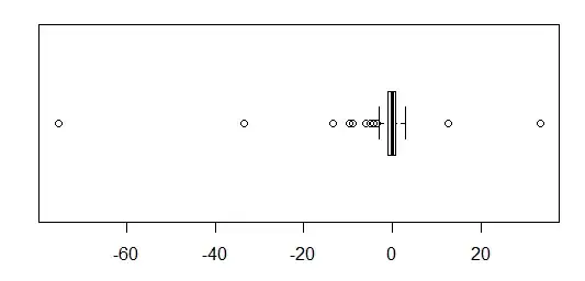
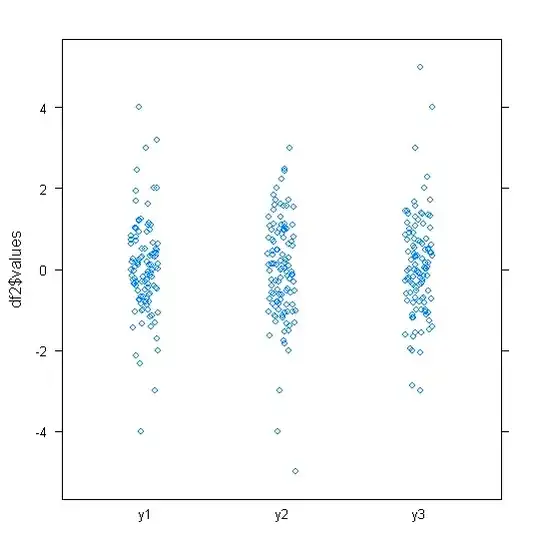
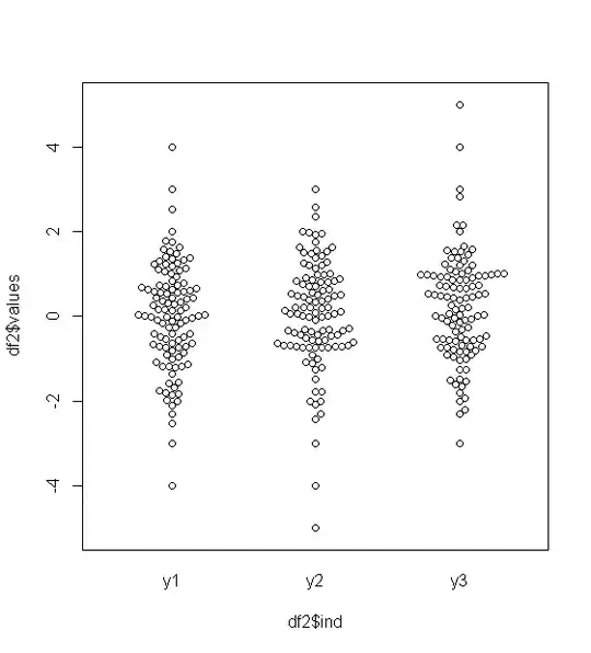
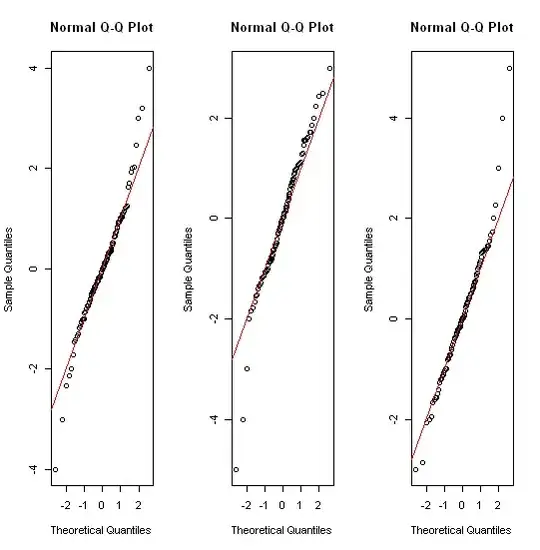
The middle half of the data is reduced to a tiny strip a couple of mm wide. The same problem afflicts most of the other suggestions - including QQ plots, strip charts, beehive/beeswarm plots, and violin plots.

Now some potential solutions:

1) transformation,

If logs, or inverses produce a readable boxplot, they may be a very good idea, and the original scale can still be shown on the axis.

The big problem is there's sometimes no 'intuitive' transformation. There's a smaller problem that while quantiles themselves translate with monotonic transformations well enough, the fences don't; if you just boxplot the transformed data (as I did here), the whiskers will be at different x-values than in the original plot.

boxplot of transformed values

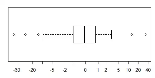
Here I used a inverse-hyperbolic-sin (asinh); it's sort of log-like in the tails and similar to linear near zero, but people generally don't find it an intuitive transformation, so in general I wouldn't recommend this option unless a fairly intuitive transformation like log is obvious. Code for that:

xlab <- c(-60,-20,-10,-5,-2,-1,0,1,2,5,10,20,40)
boxplot(asinh(x),horizontal=TRUE,boxwex=.7,axes=FALSE,frame.plot=TRUE)
axis(1,at=asinh(xlab),labels=xlab)

2) scale breaks - take extreme outliers and compress them into narrow windows at each end with a much more compressed scale than at the center. I highly recommend a complete break across the whole scale if you do this.
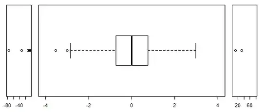
boxplot with scale breaks

opar <- par()
layout(matrix(1:3,nr=1,nc=3),heights=c(1,1,1),widths=c(1,6,1))
par(oma = c(5,4,0,0) + 0.1,mar = c(0,0,1,1) + 0.1)
stripchart(x[x< -4],pch=1,cex=1,xlim=c(-80,-5))
boxplot(x[abs(x)<4],horizontal=TRUE,ylim=c(-4,4),at=0,boxwex=.7,cex=1)
stripchart(x[x> 4],pch=1,cex=1,xlim=c(5,80))
par(opar)

3) trimming of extreme outliers (which I wouldn't normally advise without indicating this very clearly, but it looks like the next plot, without the "<5" and "2>" at either end), and

4) what I'll call extreme-outlier "arrows" - similar to trimming, but with the count of values trimmed indicated at each end

boxplot with count of, and arrows pointing to, the extreme values

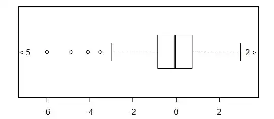
xout <- boxplot(x,range=3,horizontal=TRUE)$out
xin <- x[!(x %in% xout)]
noutl <- sum(xout<median(x))
nouth <- sum(xout>median(x))
boxplot(xin,horizontal=TRUE,ylim=c(min(xin)*1.15,max(xin)*1.15))
text(x=max(xin)*1.17,y=1,labels=paste0(as.character(nouth)," >"))
text(x=min(xin)*1.17,y=1,labels=paste0("< ",as.character(noutl)))
Glen_b
  • 257,508
  • 32
  • 553
  • 939
  • Thanks for taking the time to write this! This is exactly the kind of answer I was expecting. Now I only need to find out how to implement these plots with R :) – static_rtti Jul 09 '13 at 07:19
  • 1
    Some code is there now. I didn't give code for 3) because it's a simpler version of 4); you should be able to get it by cutting out lines from that. – Glen_b Jul 09 '13 at 07:40
  • Incidentally most of these ideas work also with the other great displays suggested here - jittered stripcharts and beeswarm/beehive plots and violin plots and such. – Glen_b Jul 09 '13 at 07:53
  • Thanks again. I'm sure this answer will be useful to quite a few people. – static_rtti Jul 09 '13 at 10:03
  • I agree, this addresses the question much better than my answer did. Good stuff. – TooTone Jul 09 '13 at 12:19
  • @TooTone That's very kind. – Glen_b Jul 09 '13 at 23:16
4

Personally I like to use a stripplot with jitter at least to get a feel for the data. The plot below is with lattice in R (sorry not ggplot2). I like these plots because they're very easy to interpret. As you say, one reason for this is that there isn't any transform.

df <- data.frame(y1 = c(rnorm(100),-4:4), y2 = c(rnorm(100),-5:3), y3 = c(rnorm(100),-3:5))
df2 <- stack(df)
library(lattice)
stripplot(df2$values ~ df2$ind, jitter=T)

enter image description here

The beeswarm package offers a great alternative to stripplot (thanks to @January for the suggestion).

beeswarm(df2$values ~ df2$ind)

enter image description here

With your data, as it's approximately normally distributed, another thing to try might be a qqplot, qqnorm in this case.

par(mfrow=c(1,3))
for(i in 1:3) { qqnorm(df[,i]); abline(c(0,0),1,col="red") }

enter image description here

TooTone
  • 3,631
  • 24
  • 33
  • 2
    I like stripplots too, but the question is explicitly about what to do with heavy-tailed distributions. – Nick Cox Jul 03 '13 at 10:57
  • @NickCox I would still use stripplots here as a first cut. I'd definitely be interested in other answers though, as I have come across similar problems to the OP in the past. – TooTone Jul 03 '13 at 10:59
  • 1
    The point is just that the advice to use e.g. qqnorm does not match the question. Other kinds of quantile-quantile plots could, I agree, be a very good idea, as I mentioned earlier. – Nick Cox Jul 03 '13 at 11:03
  • @NickCox I also found your comments re transformations on the other answer illuminating. – TooTone Jul 03 '13 at 12:48
  • 1
    Even better than stripplots from R are the plots from the `beeswarm` package. – January Jul 03 '13 at 14:06
  • 1
    @January Yeah that's pretty cool, I'm adding it to my answer (if you object please say so). – TooTone Jul 03 '13 at 14:25
  • I believe the motivation behind @Nick Cox's comments is that all the methods presented in this answer are seen to be unhelpful when applied to heavy-tailed data: they all produce clusters of points at one end of the plot (or, in the case of Q-Q plots, a nearly horizontal line) and one or a few sparse points at the other end, merely confirming what was known at the outset: a tail is heavy. An effective solution would both reveal the heaviness of the tails *and* effectively resolve the main mass of data. – whuber Jul 03 '13 at 14:38
  • @Whuber Thanks for trying to summarize. Sometimes one does needs a graph showing the clustering explicitly. To go beyond that, one often needs something else. I don't think there can be a universal solution e.g. if there are zeros logarithms are often a bad idea, although some people are happy to fudge to log(x + 1). – Nick Cox Jul 03 '13 at 14:41
  • @Whuber thanks for explaining further. I'd welcome an answer from either you or Nick. – TooTone Jul 03 '13 at 15:07
  • 1
    My answer was posted at http://stats.stackexchange.com/questions/13086, which I view as an (inconsequentially narrower) version of this question. I summarized it as "don't change the boxplot algorithm: re-express the data instead." The issue hinted at by the "adapted" in this question is addressed by standard techniques of Exploratory Data Analysis for finding helpful re-expressions of variables. – whuber Jul 03 '13 at 15:12
  • +1. If you want to use boxplots, there is no problem in principle with skewed distributions, but in practice they are not very helpful; so transformation is a good idea. In general, I often have found quantile-quantile plots useful, _but_ you have to find out which congenial distribution fits adequately. – Nick Cox Jul 03 '13 at 15:52
2

You can stick to boxplots. There are different possibilities for defining whiskers. Depending on tail thickness, number of samples and tolerance to outliers you can choose two more or less extreme quantiles. Given your problem I would avoid whiskers defined through the IQR.
Unless of course you want to transform your data, which in this case makes understanding harder.

Quartz
  • 878
  • 8
  • 18
  • 1
    The last sentence is too unqualified to pass without comment. Transformation is not a panacea, but not transforming highly skewed data does not make any easier to understand. If the data are all positive, you can at least try using root, logarithmic or reciprocal scale. If it really doesn't help, then back off. – Nick Cox Jul 03 '13 at 09:37
  • To what difficulties in understanding skewed data are you referring to? Those with IQR-dependent whiskers? That's a problem even with light tails. And aren't we talking about heavy tails, independently of skewness? Transformations lightening tails surely give more regular boxplots, but add an interpretation layer, trading understanding for comfort. But one can call that a feature if he likes. – Quartz Jul 03 '13 at 10:25
  • 2
    Transformations often help: that's my bottom line. A statistical person who hasn't learned that many things look clearer on logarithmic scale (especially) is missing out seriously on the one of the oldest and most effective tricks there is. You seemed to be denying that; I hope I misread you. – Nick Cox Jul 03 '13 at 10:33
  • Of course transformations in general can help, just not in the case discussed, where they'd hide an important feature of the data for aesthetic purposes. – Quartz Jul 03 '13 at 10:41
  • 1
    I disagree. I transform highly skewed data all the time and my experience is that this is far more than a question of aesthetics. It often works. An anonymous statistician wrote some time ago that the lognormal is more normal than the normal. He/she was being a little facetious but there's an important truth there too. (Not that many other distributions might not be better fits.) – Nick Cox Jul 03 '13 at 10:43
  • So what? That has nothing to do with the case being discussed, which *again* is about heavy tails. – Quartz Jul 03 '13 at 10:48
  • 1
    I guess I need to stop here to let others judge, but my view is not eccentric. Transformation is discussed as one possibility at e.g. http://stats.stackexchange.com/questions/13086/is-there-a-boxplot-variant-for-poisson-distributed-data I suggest that you answer or comment there to explain why that advice is unsound. – Nick Cox Jul 03 '13 at 10:54
  • Thanks for the nice link. That might seem related to this case but differs crucially. Here the issue is avoiding heavy tails to be treated as outliers, while there discussion is about "real" outliers and skewness. – Quartz Jul 03 '13 at 11:08
  • I offered that only as an example of people suggesting that transformations help in visualizing highly skewed data. There are many, many others. – Nick Cox Jul 03 '13 at 11:14
0

I assume this question is about understanding data (as opposed to otherwise “managing” it )
If the data are heavy tailed and/or multimodal, I find these "layers" of ggplot2 very useful for the purpose: geom_violin and geom_jitter.

chl
  • 50,972
  • 18
  • 205
  • 364
6th
  • 9
  • 1
  • 3
    Could you summarize why violin plots and/or jittered points would be useful with heavy-tailed distributions? – chl Jul 03 '13 at 11:57