I have some data like
A  2
A  4
A  76
B  8
B  13
.. ....
Basically, what is the spread of A, B, etc. What would be a suitable graph to visualize such information in R?
I have some data like
A 2
A 4
A 76
B 8
B 13
.. ....
Basically, what is the spread of A, B, etc. What would be a suitable graph to visualize such information in R?
There are numerous possible displays, depending on what more specifically you want.
One example would be a boxplot for each group (A, B, ...) (assuming there are enough values in each group to support one*):
boxplot(len~supp,data=ToothGrowth,horizontal=TRUE,boxwex=.7)

But you might want to look at histograms, ecdfs, or a number of other possibilities
* Edit: from your later comments, it looks like there's enough data for boxplots.
You already got some excellent answers but let me suggest another plot that was not mentioned yet (this is an example that I created to answer another question):
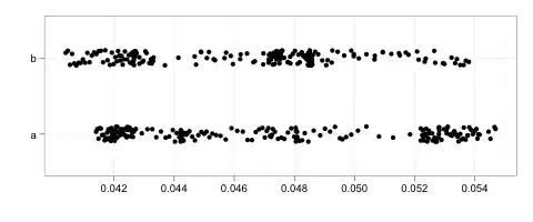
In R, it is available e.g. through stripchart() or ggplot2's geom_point() or geom_jitter(). (Jitter adds a little bit of noise to avoid too much overlap.) This plot allows you to look at the data somewhat more directly than histograms (which can be badly misleading, see Glen_b's great answer to another question) or boxplots (which are great but a little more complicated to understand and explain).
In GGPlot, you can also combine boxplots and jittered dots, see the documentation.
As mentioned by Glen_b, there are a number of possibilities.
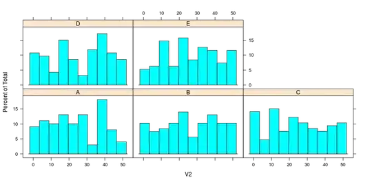
Here is an example of a histogram and density plot using the "lattice" package. I've also provided some sample data.
set.seed(1)
mydf <- data.frame(V1 = sample(LETTERS[1:5], 500, replace = TRUE),
                   V2 = sample(0:50, 500, replace = TRUE))
head(mydf)
tail(mydf)
library(lattice)
histogram(~V2 | V1, data = mydf)
densityplot(~V2 | V1, data = mydf)
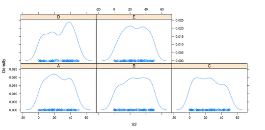
Both are with default settings applied.