From the look of your link below, you obtained this plot:
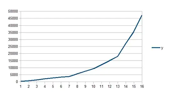
It looks like you're just plotting y vs its index in Libre Office Calc.
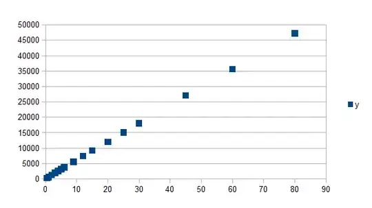
Let's look at the difference - first in R:
R gives (using plot(x,y)):

But if you plot y vs its index and plot lines (plot(y, type="l", col=4)), you get:

If you don't tell Libre Office Calc to do a scatter plot, by default it does a barplot of the series. Instead you seem to have got it to do a line plot of just the $y$ series. You can, for example, get that (the top plot in my answer) by selecting the $y$ column and then Insert, Chart and then choosing Line and then clicking on the third plot, "Lines only".
Libre Office Calc will produce the correct plot if you tell it the right things:
You can do this as follows:
Select both data columns. Insert then Chart
The Chart Wizard window should pop up (if you're using a recent version, anyway, mine were done in 4.0.0.3).
Choose the XY (Scatter) option.
Click Finish (or choose one of the related plots there, like the line-and-points or the line-only plot and then click Finish).