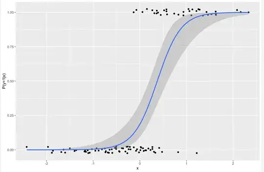
The other variables are categorical and I've used bar plots for them, but would like your opinions on how to visualise the results for a continuous variable, from a binary regression
Asked
Active
Viewed 158 times
2
-
1If you wanted to do the reverse, plot the continuous values present in two groups, how would you do it? – Dave Jan 06 '22 at 21:31
-
2Examples: https://stats.stackexchange.com/a/69873/919, https://stats.stackexchange.com/a/525877/919, https://stats.stackexchange.com/a/314363/919, https://stats.stackexchange.com/a/14501/919, https://stats.stackexchange.com/a/35370/919. – whuber Jan 06 '22 at 21:32
-
1Note the within-the-bar bias, [Newman & Scholl (2012)](https://link.springer.com/article/10.3758%2Fs13423-012-0247-5), and consider dot plots for your categorical variables. – Stephan Kolassa Jan 06 '22 at 22:06
1 Answers
8
Why not just plot the predictions on the same axis as the data?
If your model has several predictors, you are going to have to either fix them or predict across a grid and color the lines accordingly, like so
Demetri Pananos
- 24,380
- 1
- 36
- 94

