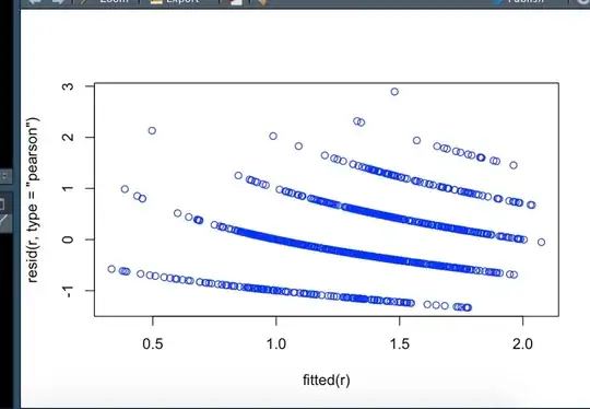
I have species richness data and serval environmental data. My study design is nested i.e, 30 sites, with each site has 2 - 8 plots, and each plot has 20 quadrat. I used the species richness from each quadrat as Y.
Then I fitted a Generalized linear mixed models (see below the code). But when I plot the result, the figure looks weird (see attached), I wonder what could trigger this? The random effect?
        r = glmer(species richness ~ scale(X1) + scale(X2) +
               scale(X3) + scale(X4)
               + (1|site/plot), data = data, family =
               poisson(link = "log"))

       plot(r)