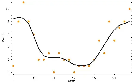
Let us say I have several KPI measurements per month. There may be different numbers of measurements per month but there are more than 30. The monthly distributions do not look normally as shown in this raincloud plot:
Maybe one can just use a log/box cox transformations and apply standard statistical process charts?
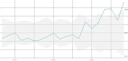
Using the qicharts2 package's and using an xbar chart without data transformation the following chart is produced:
There are breaches of the control limit but I am worried that these can be misleading, as the data is clearly not normal. Mind you having more than 30 samples could the CLT not be invoked?
Could I use transformations or are there other methods/packages I could use to detect such breaches? I am happy to implement something from scratch.
Any pointers very much appreciated. Thanks!
PS:
Looking at this:
Quality control - non-normal distribution (answer by Tavrock). Maybe one could simply determine the 99.5th, 50th and .5th percentiles for the whole data and then determine "outliers" using the upper and lower percentile?

