59

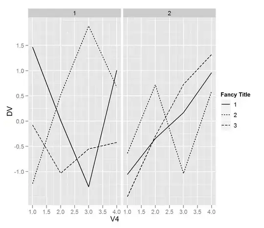
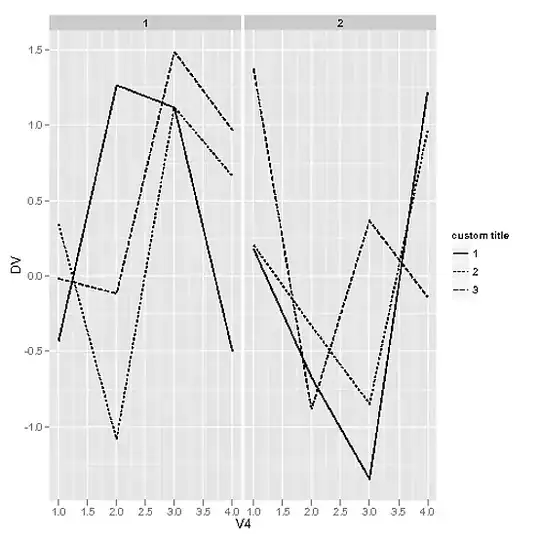
I have a plot I'm making in ggplot2 to summarize data that are from a 2 x 4 x 3 celled dataset. I have been able to make panels for the 2-leveled variable using facet_grid(. ~ Age) and to set the x and y axes using aes(x=4leveledVariable, y=DV). I used aes(group=3leveledvariable, lty=3leveledvariable) to produce the plot so far. This gives me a visualization that is paneled by the 2-leveled variable, with the X axis representing the 4 leveled variable and different lines plotted within the panels for the 3-leveled variable. But the key for the 3-leveled variable is titled with the 3-leveled variable's name and I want it to be a title that has a character space in it. How can I rename the title of the legend?

Things I've tried that don't seem to work (where abp is my ggplot2 object):

 abp <- abp + opts(legend.title="Town Name")
 abp <- abp + scale_fill_continuous("Town Name")
 abp <- abp + opts(group="Town Name")
 abp <- abp + opts(legend.title="Town Name")

Example data:

ex.data <- data.frame(DV=rnorm(2*4*3), V2=rep(1:2,each=4*3), V4=rep(1:4,each=3), V3=1:3)
gung - Reinstate Monica
  • 132,789
  • 81
  • 357
  • 650
russellpierce
  • 17,079
  • 16
  • 67
  • 98
  • 2
    @drknexus - if you can share your data, that would be helpful, or point to a similar dataset within R that has the same shape as your data. – Chase Nov 29 '10 at 21:09
  • 1
    Everybody here seems very knowledgeable but I know for ggplot related questions I find their google group to be incredibly helpful. http://groups.google.com/group/ggplot2 – Dason Dec 06 '10 at 19:48
  • 1
    In response to several flags asking for SO migration, it is actually impossible; see why on SO.meta: http://meta.stackexchange.com/q/8004/150510, http://meta.stackexchange.com/q/151890/150510. – chl May 12 '13 at 20:00
  • Besides the well known and excellent documentation on Hadley's page, the not-so-known [reference on Git Hub](https://github.com/hadley/ggplot2/wiki/%2Bopts()-List) really helps with these kind of issues. – hans0l0 Mar 06 '11 at 23:17
  • Alternatively, `theme_get()` provides you with the same reference in the console. – Brandon Bertelsen Jun 20 '11 at 04:55

2 Answers2

39

You can change the title of the legend by modifying the scale for that legend. Here's an example using the CO2 dataset

library(ggplot2)

p <- qplot(conc, uptake, data = CO2, colour = Type) + scale_colour_discrete(name = "Fancy Title")
p <- p + facet_grid(. ~ Treatment)
p 

EDIT:

Using the example data from above, here is a working solution. I think this mimics the plot that @drknexus is trying to create. As a side note, if anyone can explain why we have to treat V3 as a factor for it to be mapped to the legend, I'd appreciate it.

p <- qplot(V4, DV, data = ex.data, geom = "line", group = V3, lty = factor(V3)) 
p <- p + scale_linetype_discrete(name = "Fancy Title") + facet_grid(. ~ V2)
p 

alt text

Chase
  • 3,055
  • 2
  • 19
  • 28
  • I think what I'm missing is a function like scale_color_discrete that ties into the "group" or "lty" specification in ggplot(data=ex.daata, aes(x=V4, y=DV, group=V3, lty=V3)) – russellpierce Nov 29 '10 at 21:31
  • 1
    Ah I found it: scale_linetype_discrete(name="bob") – russellpierce Nov 29 '10 at 21:35
  • @Chase: Edit with the scale_linetype_discrete bit and I'll accept your answer. – russellpierce Nov 29 '10 at 21:36
  • 1
    @drknexus - the issue with that is in my working example, the appropriate command is `scale_colour_discrete()` and the code you are working with is obviously a bit different. I don't know what that code is... – Chase Nov 29 '10 at 22:09
  • 3
    @Chase Re: "why we have to treat V3 as a factor" `scale_linetype_discrete` expects a variable with discrete values (factor or character, from `plyr::is.discrete`), check out the src code on Github, http://j.mp/ejaRRT. Nice response (+1). – chl Nov 29 '10 at 23:29
  • @chl (+1) for the link to Github, very informative. – Chase Nov 30 '10 at 17:43
27

Another option is to use

p + labs(aesthetic='custom text')     

For example, Chase's example would look like:

library(ggplot2)

ex.data <- data.frame(DV=rnorm(2*4*3),V2=rep(1:2,each=4*3),V4=rep(1:4,each=3),V3=1:3)
p <- qplot(V4, DV, data=ex.data, geom="line", group=V3, linetype=factor(V3)) + facet_grid(. ~ V2)
p + labs(linetype='custom title')

and yield the figure: enter image description here

Brian Diggs
  • 1,021
  • 8
  • 17
user116293
  • 508
  • 4
  • 7