3

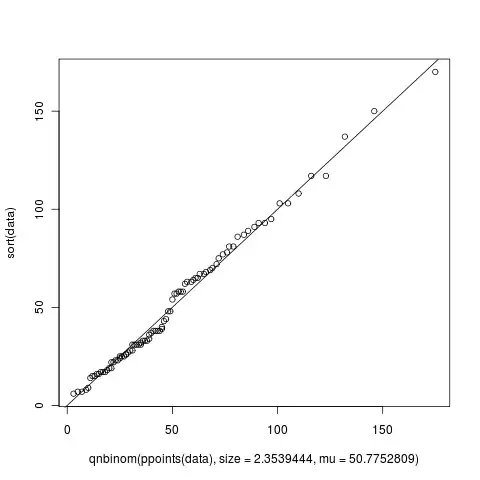
I must have generated at least 5 Q-Q plots until now when trying to fit my data into a known distribution but I just noticed something that I could not understand. In the figure shown below, from what I've read from the wiki, X-axis is supposed to read "Negative Binomial Theoretical Quantiles" and Y-axis is supposed to read "Data quantiles". Agreed that this makes perfect sense. But when I looked at the figure, the X and Y axis go beyond 100 but how can there be quantiles beyond 100? What do they mean if they exist? Or is this graph produced by the qqplot of R totally different? Can someone help me understand this?

The way I was generating this data was using the following script:

library(MASS)

# Define the data
data <- c(67, 81, 93, 65, 18, 44, 31, 103, 64, 19, 27, 57, 63, 25, 22, 150,
          31, 58, 93, 6, 86, 43, 17, 9, 78, 23, 75, 28, 37, 23, 108, 14, 137,
          69, 58, 81, 62, 25, 54, 57, 65, 72, 17, 22, 170, 95, 38, 33, 34, 68, 
          38, 117, 28, 17, 19, 25, 24, 15, 103, 31, 33, 77, 38, 8, 48, 32, 48, 
          26, 63, 16, 70, 87, 31, 36, 31, 38, 91, 117, 16, 40, 7, 26, 15, 89, 
          67, 7, 39, 33, 58)

# Fit the data to a model
params = fitdistr(data, "Negative Binomial")

#using the answer from params create a set of theoretical values
plot(qnbinom(ppoints(data), size=2.3539444, mu=50.7752809), sort(data))
abline(0,1)

alt text

kjetil b halvorsen
  • 63,378
  • 26
  • 142
  • 467
Legend
  • 4,232
  • 7
  • 37
  • 50
  • 1
    Please do *not* cross-post simultaneously on SO and here. – Dirk Eddelbuettel Nov 29 '10 at 01:53
  • 1
    @Dirk Eddelbuettel: Deleted my other post. I wasn't sure if this comes under programming or pure statistics.. Anycase, thanks for pointing it out. – Legend Nov 29 '10 at 03:14
  • 1
    I came across [this article](http://cran.r-project.org/doc/contrib/Ricci-distributions-en.pdf) regarding QQ plots and various distributions and thought you may appreciate reading through it. – Chase Nov 30 '10 at 12:58
  • @Chase: Awesome! Looks like it discusses a number of things. I'll read it right away. +1 Thank you very much. – Legend Nov 30 '10 at 14:33
  • As it happens, I'm working on a very similar problem, with about the same experience level. Have you taken into account that your data appear to be left- or zero-truncated? Also, in addition to negative-binomial, have you considered the beta binomial or geometric distributions for your count data? –  Dec 17 '10 at 06:44

1 Answers1

5

I think R is doing perfectly what you want it to do.

You are plotting:

x = qnbinom(ppoints(data), size=2.3539444, mu=50.7752809)

which is:

[1] 3 5 7 9 10 11 12 13 14 15 16 17 18 19 20 [16] 21 21 22 23 24 25 25 26 27 28 28 29 30 31 31 [31] 32 33 34 35 35 36 37 38 39 39 40 41 42 43 44 [46] 45 45 46 47 48 49 50 51 52 53 54 55 56 57 59 [61] 60 61 62 63 65 66 68 69 71 72 74 76 77 79 81 [76] 84 86 89 91 94 97 101 105 110 116 123 132 146 175

with respect to

y = sort(data)

which is:

[1] 6 7 7 8 9 14 15 15 16 16 17 17 17 18 19 [16] 19 22 22 23 23 24 25 25 25 26 26 27 28 28 31 [31] 31 31 31 31 32 33 33 33 34 36 37 38 38 38 38 [46] 39 40 43 44 48 48 54 57 57 58 58 58 62 63 63 [61] 64 65 65 67 67 68 69 70 72 75 77 78 81 81 86 [76] 87 89 91 93 93 95 103 103 108 117 117 137 150 170

Therefore, you have 100+ values on both the axis. If you want to plot quantiles, you need to tell R to do so by doing this:

plot(pnbinom(sort(data), size=2.3539444, mu=50.7752809), ppoints(data))

suncoolsu
  • 6,202
  • 30
  • 46
  • Awesome! Thanks a lot for your time and explanation. I have accepted this as an answer but can you kindly explain how to interpret my original graph? – Legend Nov 29 '10 at 06:52
  • @Legend. As I pointed out, your graph plots the sorted data points (y in our case) vs the corresponding values of negative binomial random variable which correspond to the value of probabilities `ppoints(data)` in your case. Therefore, the last point in your graph is (175, 170) which is below the `abline(0,1)`. – suncoolsu Nov 29 '10 at 07:34