2

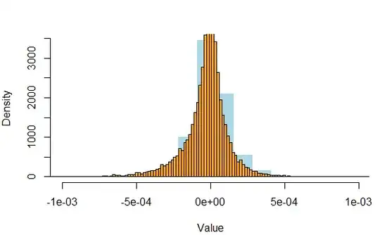
I'm trying to fit Variance-Gamma distribution to empirical data of 1-minute logarithmic returns. In order to visualize the results I plotted together 2 histograms: empirical and theoretical. ('a' is a vector of empirical data):

SP_hist<-hist(a,col="lightblue",freq=FALSE,breaks = seq(min(a),max(a),length.out = 141), border="white",main="", xlab="Value",xlim=c(-0.001,0.001)) hist(VG_sim_rescaled,freq=FALSE,breaks=seq(min(VG_sim_rescaled),max(VG_sim_rescaled),length.out = 141),xlab="Value",main="",col="orange",add=TRUE)

(empirical histogram - blue, theoretical histogram-orange)

enter image description here

However,after having plotted 2 histograms together, I started wondering about 2 things:

  1. In both histograms I stated, that freq=FALSE. Therefore, the y-axis should be in range (0,1). In the actual picture values on the y-axis exceed 3000. How could it happen? How to solve it?
  2. I need to change the bucketing size (the width of the buckets) and the density per unit length of the x-axis. How is it possible to do these tasks?

Besides, how is it possible to use any statistical tests to prove the goodness-of-fit of the Variance-Gamma distribution to a given set of empirical data? I've tried to use chisq.test(a,VG_sim_rescaled), but when I run this code, RStudio stops reacting on my commands and soon switches off. Maybe it's caused by extremely long vectors, which are given to chisq.test() (each of them contains about 16000 values).

Thank you for your help.
Maxim
  • 33
  • 5

1 Answers1

6

Despite the title -- which is software-specific -- there are some statistical issues within this thread.

A probability density necessarily integrates to $1$ over the range of the data. In your case the empirical range is about $1$ or $2 \times 10^{-3}$ or more plainly about $0.001$ or $0.002$. So the average density should be between $1000$ and $500$, which checks out visually. Otherwise put, probability density is not probability and isn't obliged to be $< 1$ at all.

Formal goodness-of-fit tests are in essence a waste of time and effort for sample sizes this large. Even a well-fitting distribution will usually fail a significance test as being discrepant in details. The practical questions are whether the fitted distribution fits well enough for what you want to do next and whether there are other distributions that fit better. This issue has been much discussed on CV.

Opinion, backed up by logic and experience: histograms are a mediocre graphical method for this problem. In fact, it is hard to see one distribution at all on your plot. Dedicated quantile plots usually work much better.

Nick Cox
  • 48,377
  • 8
  • 110
  • 156
  • **This issue has been much discussed on CV** What do you mean by CV? Frankly speaking, I didn't resort to using qq-plots, as visualization,from my point of view, doesn't give such exact and unambiguous results, as the p-value of any statistical test. – Maxim Sep 29 '20 at 14:34
  • 3
    CV = Cross Validated. Frankly speaking, p-values are useless here. https://stats.stackexchange.com/questions/64026/benefits-of-using-qq-plots-over-histograms and https://stats.stackexchange.com/questions/111010/interpreting-qqplot-is-there-any-rule-of-thumb-to-decide-for-non-normality are two possible threads. The ideas in the second transcend its focus on checking for normal distributions. – Nick Cox Sep 29 '20 at 14:50