2

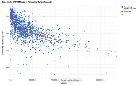
I'm trying to find out the shape of the curve that reflects electro vehicles battery degradation data (depending on cumulative travelling distance). The red line on the plot doesn't seem a perfect fit. Is it stretched exponential of some sort?

enter image description here Source: link

So, as I do not fully understand the nature of the process, I cannot figure out what would be appropriate distributions for such continuous variable as remaining capacity.

Any tips will be much appreciated.

garej
  • 227
  • 4
  • 16
  • 3
    How do you get >100% what measurement is it based on? – Sextus Empiricus Jul 11 '20 at 09:33
  • Plotting the x-axis with some transform might help to see some pattern. The points with small mileages are not easy to separate. – Sextus Empiricus Jul 11 '20 at 09:34
  • 1
    It looks like some exponentially degradation $$\frac{\text{capacity}}{100 \%} = c^{\text{mileage}} $$ but this factor for the degredation rate per mile $c$ might vary from car tot car and in addition you have some measurement error in the capacity. Then the statistical model is like:$$\frac{\text{capacity}}{100 \%}= (c+\epsilon_c)^{\text{mileage}} + \epsilon_{\text{capacity}}$$ This is a bit tricky to fit because of the two sources of error, but you could try to see if a plot with y logarithmic gives a reasonable view. – Sextus Empiricus Jul 11 '20 at 09:51
  • 1
    $$\log\left( \frac{\text{capacity}}{100 \%} \right)= \log\left((c+\epsilon_c)^{\text{mileage}} + \epsilon_{\text{capacity}}\right) \approx \log\left((c+\epsilon_c)^{\text{mileage}} \right) = \text{mileage} \times \log\left( c + \epsilon_c\right)$$ And you should get some linear function where the error is heterogeneous (increasing for larger mileages). – Sextus Empiricus Jul 11 '20 at 09:56
  • The variance of the degradation as function of the mileage is actually such large that the exact function of the degredation doesn't really matter that much (the curve is just to predict the expectation value and the model might have some error in estimating this value, but it may not matter so much since the individual cars deviate much more from this expectation value). If you would like to investigate the underlying deterministic part of the model, then maybe you could better track individual cars over time. That could provide curves that could relate closer with some physical intuition. – Sextus Empiricus Jul 11 '20 at 10:07
  • 1
    Something remarkable about that scatter plot is that some of those points are clustered in some special way by lying on a single line. It might be my imagination but it makes me wonder how that data is generated and why there is this pattern. Maybe the data is partially computed and not raw measurements? Or this could be measurements from single cars at different points/times? It seems that it would be of great value to have the data for single cars. Then you could see a cloud of curves. – Sextus Empiricus Jul 11 '20 at 10:12
  • @SextusEmpiricus, that is a good point about 100%. The guess is that battery is a complex of many cells with different capacities. So a manufacture declare some expected value, but physically some cells might charge some extra capacity. Battery management system should handle this issue. – garej Jul 11 '20 at 10:14
  • 1
    A similar concept is here https://stats.stackexchange.com/a/363859 your scatter plot is actually a collection of lines/curves. The individual curves might be reasonably estimated. See also errors in variables model. https://en.m.wikipedia.org/wiki/Errors-in-variables_models – Sextus Empiricus Jul 11 '20 at 10:21
  • @SextusEmpiricus Re: "clustering on lines" batteries of different numbers of cells and cells of different compositions/makes? – Alexis Jul 16 '20 at 15:45

1 Answers1

1

The webpage that you link provides the answer, near the bottom, in a note dated 11 Feb 2016:

The old trendline was a third order polynomial trendline. It worked fine for 0-120,000 km where there are lots of entries but after there were no more entries it showed a sharp drop. The new trendline is polynomial until the data ends but linear afterwards.

It's not clear what is meant by "until the data ends", but that type of plot (nonlinear to start, linear at an extreme) seems to be pretty consistent with the trend line pictured. Other text on that page specifies that a linear trend is assumed at high mileage: "The red fitted line has a slope above 60.000 km (say 40,000 miles) of 1% per 50.000 km (30,000 miles)."

That's not an unusual way to proceed. As another example, restricted cubic splines fit nonlinear relationships for most of the data, but enforce linear relationships for data points near the extremes.

So there is no theoretical basis for the shape of the relationship, it's just a fit of an arbitrary curve to the data.

Finally, plots like this, with the lower y-axis limit far from 0, can be misleading. Note that the value of the trend line even near 200,000 miles is still 90% of capacity. The web page also shows a plot with the y-axis lower limit at 0, which is perhaps more enlightening. Data are consistent with some early loss followed by a slow linear decline.
EdM
  • 57,766
  • 7
  • 66
  • 187