1

pseudo random number generators should give as output random sequences u1, u2, ... that are independent and identically distribuited (iid). Since testing for independence is not easy, the first check is testing for noncorrelation. As a first visual test you could check the scatterplot of (Ui, Ui-1).

Let's do that for the R built in function runif (Mersenne Twister generator):

nsample <- 5000 #number of random uniform numbers that I'll generate 
set.seed(111) #set the seed
U_mersennetwister <- runif(nsample) #generate nsample pseudo RN using the built-in R function (ie Mersenne Twister algorithm) 
plot(U_mersennetwister[1:(nsample-1)],U_mersennetwister[2:nsample]) #scatterplot (Ui vs Ui-1)

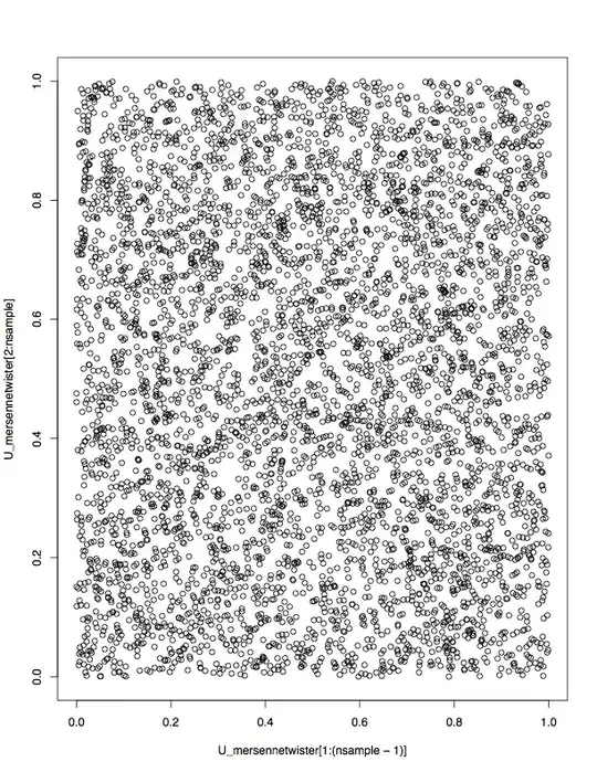
The output, as expected span the unit square almost evenly, so we can conclude that Ui is incorrelated to Ui-1:

enter image description here

However, if I repeat the same procedure for the built-in function rnorm, I get that the following output, which not span evenly the two axis, so for example the probability that Zi-1 < 0 given that Zi = 3 is much smaller than the probability that Zi-1 < 0 given that Zi = 0:

N <- rnorm(100000)
plot(N[1:99999],N[2:100000]) 

This is the output:

enter image description here

Can someone explain me why (Zi, Zi-1) does not span evenly the two axis?
Luca Dibo
  • 467
  • 1
  • 4
  • 19
  • "So for example the probability that Zi-1 < 0 given that Zi = 3 is much smaller than the probability that Zi-1 < 0 given that Zi = 0" is not supported by your data (or by theory). It looks like you might be misinterpreting the plots. See https://stats.stackexchange.com/a/429367/919 for a detailed explanation. – whuber Oct 23 '19 at 19:20

2 Answers2

3

Xi'an pointed out the original answer was wrong and I have corrected it (hopefully):

runif() generates samples from the uniform distribution while rnorm() generates samples from the normal distribution. So in the first plot you are essentially drawing from a multivariate uniform distribution while in the latter example you are not drawing from a multivariate uniform distribution. This is because the random number generators work as expected.

What you are doing in the first case is plotting a multivariate uniform distribution which has uniform coverage on a square and in the second case because both $U_i$ and $U_{i+1}$ are normally distributed you are making a multivariate normal distribution and plotting that. This is expected to look like a circle centered at (0,0) since rnorm() draws from a normal distribution with mean 0. You have effectively plotted the level sets of a 2D normal distribution: https://mathinsight.org/level_sets

Patrick
  • 1,369
  • 8
  • 14
1

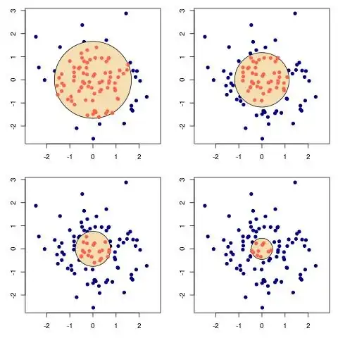
The joint density of a pair of Normal rvs is $$\frac{1}{2\pi}\exp\{-(x_1^2+x_2^2)\,/\,2\}$$ This means the level sets of the density are the circles of centre $(0,0)$. Since $$X_1^2+X_2^2\sim\chi^2_2$$ it is further feasible to check the repartition of the simulated points inside/outside discs with known probability:

enter image description here

This plot contains 100 simulations of a bivariate Normal random vector, along with discs that correspond to the 75%, 50%, 25% and 10% quantiles of a $\chi^2_2$ distribution. It can be seen that approximately 75%, 50%, 25% and 10% of the simulated sample are inside the discs, respectively.

Here is my R code for plotting those graphs:

par(mfrow=c(2,2),mar=c(3,3,1,1))
for(pr in c(.75,.5,.25.1)){
plot(x,y, asp=1, xlim=c(-2,2),pch=19,col="navyblue")
draw.circle(0,0,sqrt(qchisq(pr,2)),nv=1000,bord=NULL,col="wheat",lwd=1)
points(x[x^2+y^2<qchisq(pr,2)],y[x^2+y^2<qchisq(pr, 2)],col="tomato",pch=19)}
Xi'an
  • 90,397
  • 9
  • 157
  • 575