2

How would I describe this QQ plot? Would it indicate fair normality? Or would it be skewed? I have attached the histogram also.

I have been asked to the answer the following: "By referring to the normal quantile plot below briefly discuss if the measurements are approximately normally distributed."

I have said it looks normally distributed as the majority of the dots are close to the reference line and appears linear based on the minimal sample size.

Would that fly?

Thank you.
enter image description here

enter image description here

Jaime
  • 21
  • 2
  • With fewer than 20 observations, it is difficult to establish or refute normality. Depending on binning, the histogram of of the sample might be 'bimodal', but that may not be an indication that the population is a mixture of two distributions. – BruceET Jul 28 '19 at 08:38
  • You can't really "establish" normality. A sample might appear reasonably consistent with normality but it will also be consistent with many non-normal distributions. – Glen_b Jul 28 '19 at 14:37
  • How would I describe it if it is not normally distributed? Would it be considered right skewed? Thank you. – Jaime Aug 01 '19 at 04:16

2 Answers2

1

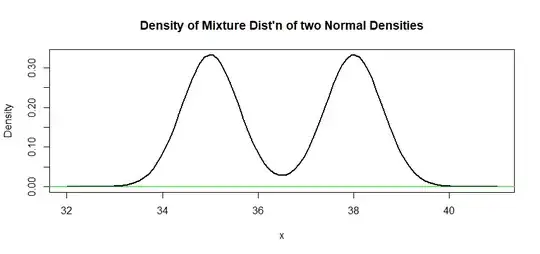
Here are histograms and Q-Q plots of three samples of size $n=20$ from a 50:50 mixture of distributions $\mathsf{Norm}(\mu = 35, \sigma=0.6)$ and $\mathsf{Norm}(\mu = 38, \sigma=0.6).$

Because the means are more than two standard deviations apart, the density of the mixture distribution is bimodal. [See this page.] The 'bimodal effect' is somewhat more pronounced in my example than in your question.

enter image description here

The density function is shown below:

lbl="Density of Mixture Dist'n of two Normal Densities"
curve(.5*dnorm(x,35,.6)+.5*dnorm(x,38,.6), 32, 41, ylab="Density", lwd=2, main=lbl)
  abline(h=0, col="green2")

enter image description here

The following R code was run three times to make the first figure:

n = 20;  p = rbinom(n, 1, .5)
x1 = rnorm(n, 35, .6);  x2 = rnorm(n, 38, .6)
x = p*x1 + (1-p)*x2
hist(x, col="skyblue2");   qqnorm(x, pch=19)
BruceET
  • 47,896
  • 2
  • 28
  • 76
0

You've too few points to say anything conclusive but for posterity, as a rough visual guide, you might expect (1) as many dots above the line as there are below it for every quartile, and (2) a similar amount of dots to the left and right of your 50% quartile with a self-evident visual symmetry.

At the moment, to me your graph looks to depart from (1) substantially, and whilst there is a similar number of points on either side, they don't look visually symmetrical around the 50% quartile.

emir
  • 3
  • 2
  • Thank you for your answer. How would I describe it if I was to state that it is not normally distributed? – Jaime Aug 01 '19 at 04:27