first question so I apologize in advance if my formatting is rough.
I'm currently working on a project with a professor I'll be starting a MSc in statistics with soon. One curious thing I've been asked to do when making residual plots is to have our predictor variables on the x axis instead of the fitted values from the model.
Heres an example using the iris dataset
library(tidyverse)
library(broom)

fit <- lm(Sepal.Length ~ Petal.Length, data = iris)

d <- fit %>%
  augment()

##Residuals vs fitted
ggplot(data = d, aes(x = .fitted, y = .resid)) +
  geom_point() +
  geom_smooth(se = FALSE, col = "red") + #Adds the line of fit
  geom_hline(yintercept = 0, linetype = 2) + #Adds the horizontal dashed line
  labs(x ="Fitted Values", y ="Residuals", title = "Residual vs Fitted") +
  theme_bw()

##Residuals vs Petal.Length (what my prof wants)
ggplot(data = d, aes(x = Petal.Length, y = .resid)) +
  geom_point() +
  geom_smooth(se = FALSE, col = "red") + #Adds the line of fit
  geom_hline(yintercept = 0, linetype = 2) + #Adds the horizontal dashed line
  labs(x ="Petal.Length Values", y ="Residuals", title = "Residual vs Petal.Length") +
  theme_bw()
Which lead to these (mostly) identical graphs

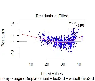
While I understand that theoretically that fitted values and observed values should be equivalent, and we can clearly see this example is the same, everything i've been taught, seen, or read plots residuals against fitted values.
Is there any benefit or statistical reason to do otherwise?
