I'm referring to something like this:
suggested dataset for showing a solutions:
data(mtcars)
plot(hclust(dist(mtcars)))
I'm referring to something like this:
suggested dataset for showing a solutions:
data(mtcars)
plot(hclust(dist(mtcars)))
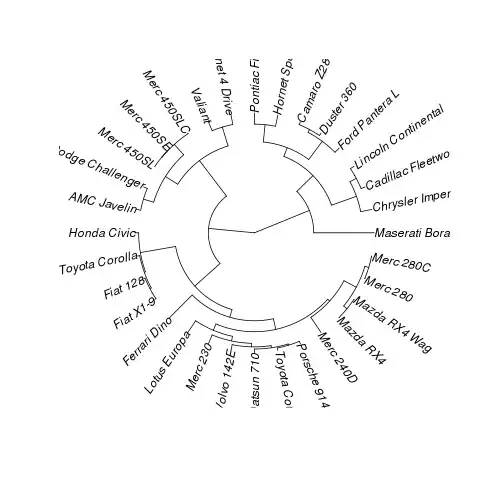
In phylogenetics, this is a fan phylogram, so you can convert this to phylo and use ape:
library(ape)
library(cluster)
data(mtcars)
plot(as.phylo(hclust(dist(mtcars))),type="fan")
Result:
Did you see this post? http://groups.google.com/group/ggplot2/browse_thread/thread/8e1efd0e7793c1bb
Take the example, add coord_polar() and reverse the axes and you get pretty close:
library(cluster)
data(mtcars)
x <- as.phylo(hclust(dist(mtcars)))

p <- ggplot(data=x)
p <- p + geom_segment(aes(y=x,x=y,yend=xend,xend=yend), colour="blue",alpha=1)
p <- p + geom_text(data=label.phylo(x), aes(x=y, y=x, label=label),family=3, size=3) + xlim(0, xlim) + coord_polar()

theme <- theme_update(  axis.text.x = theme_blank(),
                        axis.ticks = theme_blank(),
                        axis.title.x = theme_blank(),
                        axis.title.y = theme_blank(),
                        legend.position = "none"
                     )
p <- p + theme_set(theme)
print(p)
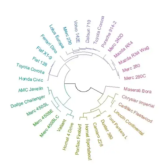
Four years later, I am now able to answer this question. It can be done by combining two new packages: circlize and dendextend.
The plot can be made using the circlize_dendrogram function (allowing for a much more refined control over the "fan" layout of the plot.phylo function).
# install.packages("dendextend")
# install.packages("circlize")
library(dendextend)
library(circlize)

# create a dendrogram
hc <- hclust(dist(datasets::mtcars))
dend <- as.dendrogram(hc)

# modify the dendrogram to have some colors in the branches and labels
dend <- dend %>%
   color_branches(k=4) %>%
   color_labels

# plot the radial plot
par(mar = rep(0,4))
# circlize_dendrogram(dend, dend_track_height = 0.8)
circlize_dendrogram(dend, labels_track_height = NA, dend_track_height = .4)
And the result is: