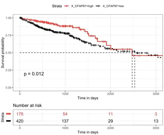
I have a gene CFAP97 with expression values and clinical information like FollowupDays and patient_vitalstatus.
Using the gene expression data first I classified the samples into CFAP97_low and CFAP97_high groups. Using the surfit function with all the information available I wanted to know which group is good for survival and which group is worse.
library(survival)
fit <- survfit(Surv(FollowUpDays, patient_vital_status) ~ CFAP97,
                       data = data)

summary(fit)$table

low_high    records n.max   n.start events  *rmean      *se.rmean.  median  0.95LCL 0.95UCL
CFAP97=high  176     176     176     25   2746.767649   261.3634514 2475    1910     NA
CFAP97=low   420     420     420     99   2534.369762   144.8695301 2532    1849     NA
From the above summary I see that, median survival is approximately 2532 days for low group and 2475 days for high group, suggesting a good survival for CFAP97_low group compared to CFAP97_high group. And 0.95LCL is other way around, big number for high group. Which one should I choose to say worse or good survival?
But when I made a plot out of this, it looks like this 
So, from the plot it looks like CFAP97_low group is worse for survival compared to high. But in the summary results I see it different.
Am I wrong in interpreting the plot? Can anyone clear my confusion. thanq