I have been checking density plots to get a feel for the plausibility of values that have been imputed using the mice package in R. I would be grateful for some advice/guidance/comment on the following problem.
The imputations are created by a call to mice() :
require(mice)
imp <- mice(...)
The details omitted as it a lot of code and a large dataset. Hopefully this won't detract from the question. This is the plot which is generated by the built-in densityplot function in the mice package: densityplot( x=imp , data= ~ age)
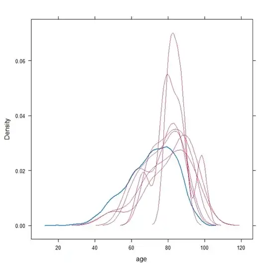
The blue line is the observed data, the red lines are the imputed data. This caused me some alarm. Particularly:
Since the observed data are fully contained in each imputed dataset, how can some values which appear in the observed data have a zero density in the imputed data ?
There are 7019 observations of which only 11 are missing, so I would expect the imputed densities to be nearly identical to the observed.
In a general sense, how can the plots look so different ?
So I compared it to a plot using ggplot:
require(ggplot2)
require(reshape)

fortify.mids <- function(x){
 imps <- do.call(rbind, lapply(seq_len(x$m), function(i){
   data.frame(complete(x, i), Imputation = i, Imputed = "Imputed")
 }))
 orig <- cbind(x$data, Imputation = NA, Imputed = "Observed")
 rbind(imps, orig)
}

x11()
ggplot(fortify.mids(imp), aes(x = age, colour = Imputed,
   group = Imputation)) +
geom_density() +
scale_colour_manual(values = c(Imputed = "#000000", Observed = "#D55E00"))
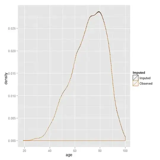
And as you see, all the densities overlap (you can't even really notice that there is more than 1 line).
Can anyone explain what is going on with the first plot ? Note that the data used to generate these 2 plots is the same.