5

I understand the critiques of pie charts as referenced here: Problems with pie charts

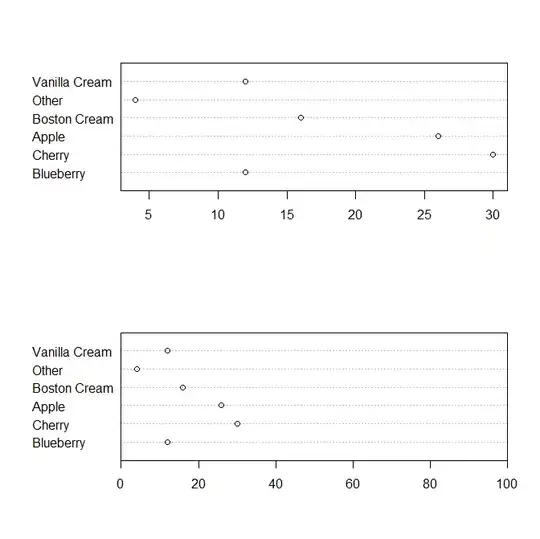
However, the above response (and the R manual) always cite dot plots from Cleveland as an alternative. My question is why are dot plots considered an alternative? It seems to be that dot plots only apply when:

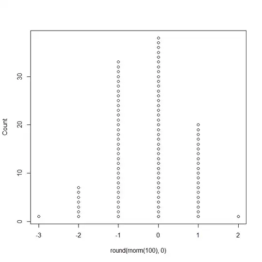
  1. the data set is relatively small (so that you can perhaps even by eye count dots in the plot, each dot corresponding to a data point, and

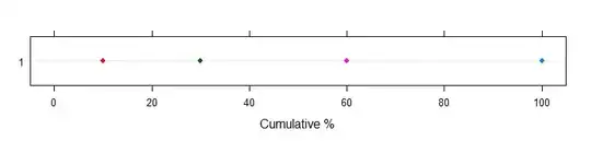
  2. they are not intended to display percentages / density estimates of data.

It seems to me like the main goal of the pie chart is (even if it does so badly) to highlight the fact that the categories must sum to 1 or 100%. with the dot plots you can show the cardinal value of each category, but it will not be obvious what fraction of all the categories a particular value is. Also, with a pie chart it doesn't matter if you have 10 data points or 1,000,000, where as a dot plot with a million points (even if the number of categories is small) seems odd and might just collapse to a bar graph.

Could someone explain why dots plots are seen as an alternative and maybe provide a few examples of dot plots to other quantitative alternatives to pie charts (like bar plots?)

user248237
  • 569
  • 7
  • 14
  • There are some nice discussions about this in Andrew Gelman's blog: ["Please stop me before I barf again"](http://andrewgelman.com/2012/04/please-stop-me-before-i-barf-again/), ["Why tables are really much better than graphs"](http://andrewgelman.com/2009/04/why_tables_are/), ["A data visualization manifesto"](http://andrewgelman.com/2010/05/a_data_visualiz/). –  Aug 15 '12 at 15:25
  • See [mbq's answer](http://stats.stackexchange.com/a/8978/1036) to the question you linked to, you certainly can not effectively display 1 million pie slices in a pie chart and the chart still be intelligible. – Andy W Aug 15 '12 at 15:26
  • I agree that dot plots don't substitute for pie charts. They are like bar charts. In my comments about pie charts on another post I mentioned that sometimes they can be useful. I think the main complaint is that the eye cannot discern proportions based on looking at slices especially thin ones. But 90 degree and 45 degree slices are discernable I think. At least in a pie chart you can tell whether a particular category has a slice that is large or small relative to the complete pie. – Michael R. Chernick Aug 15 '12 at 15:47
  • @AndyW: I did not say 1 million pie slice -- I just 1 million data points. 1 million pie slices would correspond to 1 million categories. What I meant was that a dot plot cannot handle large numbers of points if each point is a dot, while a pie chart can, assuming a small number of categories (or "slices") for both. – user248237 Aug 15 '12 at 16:23
  • @Procrastinator: Those Gelman links are interesting but they do not address this issue. The first post just rehashes some standard critiques of pie charts. – user248237 Aug 15 '12 at 16:27
  • 1
    @user248237 Yeah, but the question is too subjective/broad to get a convincing answer in the general case, so I just wanted to point those references. –  Aug 15 '12 at 16:29
  • 1
    @user248237, that comparison doesn't make sense. If you summarize the information in a pie chart you can summarize that same information into a dot plot or a bar chart (what we are talking about here *is the number of pie slices or bars in a bar chart*, not the number of disaggregated items used to make the chart). I would suggest to read Cleveland's work, as it should illuminate how human perception is better at identifying points along a common axis, as opposed to identifying the angles within slices in a pie chart. – Andy W Aug 15 '12 at 16:35
  • @AndyW It is true as Cleveland points out that people have trouble relating pie slices to their actual proportion except for a few special cases that I mentioned. But the OPs point which most people are not addressing is that the pie chart gives a sense of fractions of a whole whereas a bar chart or dot plot does not unless it is scaled as a percentage. – Michael R. Chernick Aug 15 '12 at 16:43
  • @MichaelChernick understands and reiterated what I wrote... Andy W, I read the original Cleveland, and he too agrees that dot plots do not give a sense of *density* / fractions, while Pie charts obviously do, so I wanted to know why people categorically say that dot plots should be used in place of pie charts -- in my opinion, they do not serve the same purposes and thus dot plots cannot be used as substitute, contrary to the famous R warning, etc. but I wanted to her what others have to say about this. – user248237 Aug 15 '12 at 17:11
  • @Procrastinator: no, it's very simple. Can dot plots substitute pie charts always? Why or why not? How do dot plots compare to bar graphs for visualizing the same info intended to be visualized by pie charts? – user248237 Aug 15 '12 at 17:12
  • I think that Bill Cleveland has turned many of my colleagues against pie charts. I just don't think they are all that horrible and the dot plot that Greg Snow presents can substitute for a pie chart but if the percentages are labelled on each slice of the pie I think the pie chart is easier to understand! – Michael R. Chernick Aug 15 '12 at 18:03

2 Answers2

7

There are two different types of chart that that are referred to as 'dotplots' and I think that you are getting the two confused. The type of dotplot that it looks like you are thinking about is really a variation on a histogram and does not convey the same type of information that a pie chart would.

The type of dotplot from Cleveland is essentially a bar chart with a dot placed at the end of each bar, then the bar is removed. So even with millions of data points, they would be tabled the same as for creating a pie chart, then a single dot is plotted for each category. The summary preparing for the plot is the same in a pie chart and a dotplot: the difference is in a pie chart you are trying to compare non-aligned angles or areas (and the temptation to add chartjunk or otherwise distort the perception of the values is much higher) and in the dotplot you are comparing points on an aligned scale.

If you want the viewer to be able to easily judge percentage of the whole then just make sure that the axis for the dot positions goes from 0 to the total count. You can also easily add another axis (or replace the main one) that shows the percentage rather than the counts, then the percentage can be read off that axis much more accurately than estimating angles and areas in pie charts.

Here are a couple of examples using R:

This is the type of dotplot that I think you are thinking of, and this would not replace a pie chart:

library(TeachingDemos)
dots(round( rnorm(100),0 ) )

enter image description here

But this is the type of dotplot being referred to in Cleveland as a replacement for pie charts:

# steal data from ?pie
pie.sales <- c(0.12, 0.3, 0.26, 0.16, 0.04, 0.12)
names(pie.sales) <- c("Blueberry", "Cherry",
    "Apple", "Boston Cream", "Other", "Vanilla Cream")
par(mfrow=c(2,1))
dotchart(pie.sales*100)
# or
par(xaxs='i')
dotchart( pie.sales*100, xlim=c(0,100) )

enter image description here

Nick Cox
  • 48,377
  • 8
  • 110
  • 156
Greg Snow
  • 46,563
  • 2
  • 90
  • 159
  • Thanks for the clarification. The two types of dot plots are very different. I guess I can read the proportions off the dot plot and have the numbers clear. But the same could be done with a pie chart putting the percentage inside each slice or if the slice is too narrow it could be given pointing to the appropriate slice. I actually think that would give me a better sense of how the pecentages are distributed than this dot plot. – Michael R. Chernick Aug 15 '12 at 17:59
  • 4
    Adding percentages (or counts) to a pie chart (or at the ends of the bars in a bar chart, or at the dots in a dot plot) accomplishes 2 things: 1. Serves as an admission that the plot cannot convey the information by itself; 2. Converts the plot into a poorly laid out table (with colorful background). And in the case of the bar chart it also 3. distorts the lengths of the bars (what effect this has in the bar and dot plots is less clear). – Greg Snow Aug 15 '12 at 18:18
  • 1
    To note in addition to this (+1), if you want the percentages in the dot plots (the usual Cleveland dot plots, not the what I will call [Wilkinson Dot plots](http://moderngraphics11.pbworks.com/f/wilkinson_1999.DotPlots.pdf) (why did he pick that name!?!) all you have to do is change the X axis labels, the "dots" all stay in the same location. This should also reinforce why dot plots can really replace pie charts (in the vast majority of instances). The extra information in knowing "proportion" of whole is really trivial, and starting from the dot plot allows more flexibility. – Andy W Aug 15 '12 at 18:34
  • The pie chart can look very nice either using a legend or well placed percentages. I agree with Greg that the fact that these numbers are needed conveys the point that none of these types of graphs convey the proportion information without the addition of the numbers. – Michael R. Chernick Aug 15 '12 at 19:56
7

Greg Snow's response has covered much about dot plot. I'd just like to suggest an alternative which you can compress the dimension further:

enter image description here

Sorry the legend is missing but the idea is pretty much here. Instead of displaying the four pieces of data on four horizontal lines, we can put them in one line with accumulative percentage as the scale. This way, the difference between dots will allow quantitative comparison just like usual dot plots do. In addition, it can overcome the difficulty of comparing multiple pie charts: if we need to show data from another entity, we could just add one more horizontal line in the illustration.

Reference code:

library(lattice)
perc <- c(100, 60, 30, 10)
setnum <- rep(1,4)
category <- c("A", "B", "C", "D")
dotplot(setnum ~ perc, group=category, xlim=c(-5,105),ylab="", xlab="Cumulative %", pch=16)
Penguin_Knight
  • 11,078
  • 29
  • 48
  • Hi @Penguin_Knight - do you mind elaborating on how this answers the question? – Macro Aug 15 '12 at 17:53
  • 1
    @Macro Thanks, I am just merely suggesting an alternative to what Greg Snow has shown. As how this answers the question, because the questions asks "Could someone explain why dots plots are seen as an alternative and **maybe provide a few examples** of dot plots to other quantitative alternatives to pie charts." – Penguin_Knight Aug 15 '12 at 17:58
  • @Macro Thanks for the comment. I just quickly put this together. Will expand. Regards. – Penguin_Knight Aug 15 '12 at 18:07
  • I like this plot (I've never seen this type of 'dot plot' before), as it does convey the exact same information as a pie chart, except using the length of the interval to denote the proportion, rather than the area of a slice of pie. Some expansion of this answer will be good to see. In some ways this is more intuitively appealing than the Cleveland dot plot, but I can see that it would become unwieldy more quickly that the Cleveland dot plot as the number of categories increases. – Macro Aug 15 '12 at 18:09
  • @Macro this is synonymous with a stacked bar chart (I'm sure you've seen one of those) in which you replace the bar ends with a dot. Hence any complaints about stacked bar charts apply to this as well. – Andy W Aug 15 '12 at 18:32
  • @AndyW Yes. It all comes down to if we are more likely to have a protractor or a ruler in hands. – Penguin_Knight Aug 15 '12 at 18:36