I am trying to mimic partial dependence plots as explained in R's pdp package (https://journal.r-project.org/archive/2017/RJ-2017-016/RJ-2017-016.pdf). The second page (page 422) of the document describes a loop to calculate partial dependence for a specific variable.
I tried to mimic this on the PimaIndiansDiabetes dataset in R, focusing on the pregnant variable. pregnant ranges from 0 to 17. Here's my code:
library(mlbench)
library(pdp)
library(caret)
library(randomForest)

data("PimaIndiansDiabetes")

#Create 0/1 for target variable
dmy <- dummyVars(~., data=PimaIndiansDiabetes, fullRank = T)
pid <- as.data.frame(predict(dmy, PimaIndiansDiabetes))
pid$diabetes.pos <- as.factor(pid$diabetes.pos)

#Build random forest model
set.seed(4)
model <- randomForest(diabetes.pos~., data=pid, ntree=10, mtry=3)

#Create partial dependence plot for 'pregnant' using pdp package
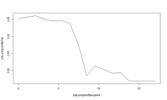
pdp.pregnant <- partial(model, pred.var="pregnant", prob=T)

#Create partial dependence plot for 'pregnant' using pdp document methodology
pid2 <- pid
part.pregnant <- data.frame(pregnant=numeric(18), yhat=numeric(18))
for(i in 0:17){
  pid2$pregnant <- i
  part.pred <- as.numeric(as.character(predict(model, pid2)))
  part.pregnant[i+1, 1] <- i
  part.pregnant[i+1, 2] <- mean(part.pred)
}

#Plot both - they are different
plot(pdp.pregnant$pregnant, pdp.pregnant$yhat, type='l')
plot(part.pregnant$pregnant, part.pregnant$yhat, type='l')

 As you can see, the plots are different. So my questions are: 1) Why are they different? Did I miss something in my implementation of the methodology? 2) How am I supposed to interpret the effect of
 pregnant on diabetes.pos according to the plot from the pdp package?