It is best to get the data into a normalized form where smoking and heart attack are separate, parallel columns and other columns provide the identifying (key) fields:
    country  year   smoking heart
1   Congo    1988      1200   900
2   Congo    1984      1146   400
3   Congo    2010       675   550
4   Nigeria  1988      1100   950
5   Nigeria  1984       786   568
6   Nigeria  2010       765   590
7   Zimbabwe 1988      1098  1098
8   Zimbabwe 1984       897   769
9   Zimbabwe 2010       900   865
In R they ought to be in a data frame:
data <- data.frame(country=c(rep("Congo", 3), rep("Nigeria", 3), rep("Zimbabwe", 3)),
                   year=rep(c(1988, 1984, 2010), 3),
                   smoking=c(1200, 1146, 675, 1100, 786, 765, 1098, 897, 900),
                   heart=c(900,400, 550, 950, 568, 590, 1098, 769, 865))
With this format, the solution is a one-liner:
by(data, data$country, function(x) cor(x$smoking, x$heart))
The output gives correlations of 0.315, 0.994, and 0.962 for Congo, Nigeria, and Zimbabwe, respectively.
However, correlations by themselves can be misleading. It is far better to look at the data:
plot(data$smoking, data$heart, col=data$country, pch=19,
 main="Heart attack and smoking, 1984-2010", xlab="Smoking", ylab="Heart attacks")
points(data$smoking, data$heart, cex=1.25)
legend(675, 1075,  levels(data$country), pch=19, col=1:length(levels(data$country)))
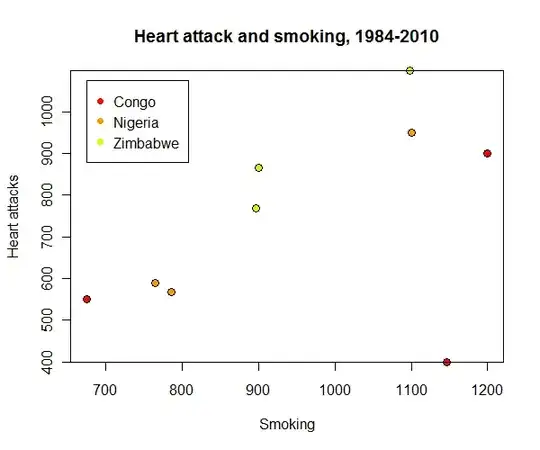
An outlying value for Congo visible in the lower right at (1146, 400) is responsible for its low correlation coefficient: the correlation is a poor description of the smoking-heart attack relation for this country's data.