1

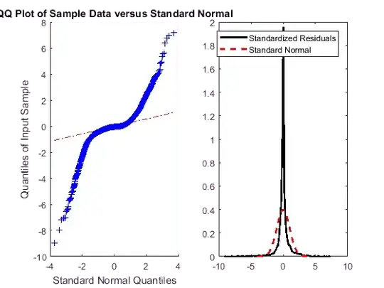
I am working with a dataset (900 observations) and have the following normal QQ plot in R:

enter image description here

Seeing that the QQ-plot little bit strange, what could I infer about the underlying distribution? It seems to me that a distribution has too many pikes at 2, is that right? Also, what other conclusions can we draw from the data?
Sharek
  • 61
  • 1
  • 5
  • 4
    Your distribution is approximately symmetric but has much higher kurtosis than the normal. That's not "a little bit strange", but a common phenomenon. I don't see a spike at 2 but rather a peak density of nearly 2. – Nick Cox Aug 09 '17 at 07:59

0 Answers0