2

This question is an extension from an earlier question.

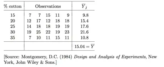
The tensile strength of a synthetic fibre used to make cloth for men’s shirts is of interest to a manufacturer. It is suspected that the strength is affected by the percentage of cotton in the fibre (Table 1). Five levels of cotton percentage are of interest: 15%, 20%, 25%, 30% and 35%. Five observations were taken at each level of cotton percentage; the 25 observations were run in random order. Y denotes the response variable, that is, the tensile strength, measured as resistance to a fixed stress on a scale from 0 to 50. The means of Y for the different levels of cotton percentage, and the overall mean response, are also given.

Table 1

enter image description here

Problems to solve

The idea is to analyse the data with an analysis of variance. Let Yij be the ith replicate of the response variable taken at the jth level of the factor representing the percentage of cotton.

I have read extensively but I still am confused with the following concepts:-

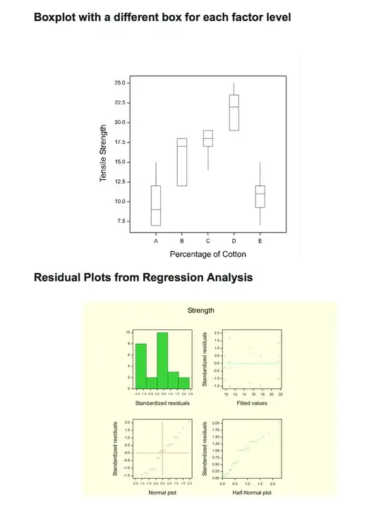
  1. Is it reasonable to believe that the variance is the same for each factor level shown in the boxplot below. There are stark differences between the mean and variance for each factor level. Would this be an example of heteroscedasticity referring to the circumstance in which the variability of each factor level is unequal?

  2. Would it be reasonable to model the relationship between strength and percentage cotton (as a continuous variate) with a simple linear regression model shown in the residual plots below. Would the answer change if the observations for 35% cotton were discarded?

Code for factor levels for the % of cotton in fibres:

  • 15 % cotton = A
  • 20 % cotton = B
  • 25 % cotton = C
  • 30 % cotton = D
  • 35 % cotton = E

Boxplots and Residual Plots from a Simple Linear Regression
enter image description here

Ferdi
  • 4,882
  • 7
  • 42
  • 62
Alice Hobbs
  • 273
  • 1
  • 7

2 Answers2

5

Let's take the easy question first. Because the boxplots clearly do not follow any nearly linear relationship with the proportions of cotton, a simple linear regression model is out of the question.


(1) is a good question, one that always should be asked when performing an ANOVA: when you see seemingly large variation among the spreads of residuals, is that evidence of heteroscedasticity (and if so, what should be done about it)?

The correct way to compare variances (or standard deviations) is through their ratios (rather than their differences, say). The ratios are unitless and have universal interpretations.

As a rule of thumb, variances in two moderate-sized groups can easily vary by a factor of three. Thus, the apparent spreads among a small set of boxplots (which are proxies for the square roots of the variances--the standard deviations) will typically vary by around a factor of $\sqrt{3}\approx 1.7$. The variation will be greater with more groups and when the groups are small. Since both are the case here, we shouldn't be at all surprised to see one boxplot be two or three times longer than another.

What we're doing, evidently, is comparing the longest boxplot to the shortest. It would be foolish to make that comparison based on the full range in each plot, because ranges are highly variable. In an ANOVA setting it makes sense to compare variances (or possibly interquartile ranges, which are depicted by the lengths of the boxes without their whiskers).

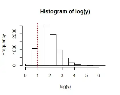
The math needed to work out the sampling distributions of these ratios is difficult. A quick simulation is revealing. Here is one which computes $y$, the ratio of the largest of five variances to the smallest, a total of $10,000$ times. Each variance is based on five independent but identically distributed Normal values. It tells us how your boxplots might vary if indeed the within-group variation were homoscedastic and Normally distributed, which are the default assumptions you wish to examine.

Figure

This figure needs a log scale because the ratios can get large. (The maximum ratio found in this particular simulation was $500:1$!) Their logs average around $1.5$ to $2$, corresponding to a ratio around $5$ to $8$: a little larger than suggested by the rule of thumb. This is due to the rather small size of each group. It means that in a dataset of five groups of five, we should expect to see the longest of the five boxes to be around $\sqrt{5}\approx 2$ to $\sqrt{8}\approx 3$ times as long as the shortest one.

The vertical red dotted line marks the maximum variance ratio for these particular data, equal to $2.6$. It's actually unusually low! Only $10\%$ of the simulated ratios were lower than this.

We conclude that you have no evidence of heteroscedasticity in these data.

It is very instructive to produce simulations like this for a variety of ANOVA settings so that you can get a feel for how much the spreads within each group can naturally vary. To provide a foundation for such simulations, I offer the code used for this one (written in R).

#
# Compute the max ratio for the data.
#
x <- matrix(c(7,7,15,11,9,
              12,17,12,18,18,
              14,18,18,19,19,
              19,25,22,19,23,
              7,10,11,15,11), ncol=5, byrow=TRUE)
x <- apply(x, 1, var)
stat <- max(x)/min(x)
#
# Simulate max ratios for similar datasets.
#
n <- 1e4
x <- matrix(rchisq(5*n, 4), ncol=n)
y <- apply(x, 2, function(x) max(x)/min(x))
#
# Display the results.
#
hist(log(y))
abline(v=log(stat), col="Red", lty=3, lwd=2)
whuber
  • 281,159
  • 54
  • 637
  • 1,101
5

I don't have to care about whatever formal questions have to be answered by those following the text; you may not have that luxury. I have a bundle of comments that do not add up to a complete answer but (given the graph below at least) would not work so well as comments.

enter image description here

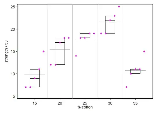
The graph here is a quantile-box plot in which each point is shown separately and means are added too (as longer lines).

In terms of the question:

  1. The now apparently strong convention of showing box plots to support analysis of variance is better than no graph at all but (a) bizarrely limited in not even showing the means, which are the focus of the analysis, for goodness' sake; (b) a poor choice with these data, because one has to struggle even to interpret the boxes without constant reference back and forth to see where tied values end up.

  2. Part of the dark art in statistical analysis is to sit very loose to apparent differences in variability for very small samples. Those here don't trouble me at all, but it's hard to explain that briefly and convincingly unless you are talking to people with a lot of experience. A more formal handle would be to simulate lots of samples of size 5 from even some well-behaved distributions; I predict that you will be surprised at how erratic they can be. EDIT: Fortunately @whuber has provided an outstanding analysis in his answer.

  3. The overall pattern here is certainly one of nonlinearity, indeed an asymmetric nonlinearity. As in #2, it would be a mistake to be over-confident about the indications which hinge largely on the last group, but the fall-off from 30 to 35% seems dramatic and well supported by low variability for those levels.

I've worn lots and lots of cotton-based shirts over the years, but I can't say that the experience gives me any extra insight into the problem.

Nick Cox
  • 48,377
  • 8
  • 110
  • 156