3

I have a dataset (~20k samples) of sensor data gathered from a smartphone. What I want to do with it is to detect those spikes you can see in the graphs below. They occur when the user presses a button.

I want to label the data that refers to those spikes, but only this data. The other data is not relevant for my research task. I read about using filters for this, but I honestly have no idea to do this.

enter image description here

How can I do this easily? I work with R and RapidMiner.

During the training process, I created a predictive model for mobile sensor data to label sensor data. Now I want to apply the model on "real-world" data, but first I need to get filter out the samples I do not need.

Would it be possible to use a Support Vector Machines to do this? And if so, could someone explain how?

Here a sample set: link

keinabel
  • 189
  • 2
  • 8
  • 1
    I guess by SVM you mean Signal Vector Magnitude? But in this case the period of your measure would be really small right? you seem to have mnay of those spikes per second... Anyway I don't quite understand what do you mean when you say you want to label the data that refers to those spikes. You mean you want to label a period of let's say a few seconds in which there are spikes, versus a period with no spikes? Else you want to label the spikes themselves? And what's the purpose? Thanks. – lrnzcig Dec 30 '16 at 20:10
  • The spikes identify keystrokes. And I want to label those. The other data that doesn't refers to keystrokes should remain unlabeled / can be ignored. Hope this makes it clearer. – keinabel Dec 30 '16 at 20:32
  • Could you provide some actual data for testing? – Roland Jan 06 '17 at 08:08
  • @Roland just added a link to a sample set – keinabel Jan 06 '17 at 15:00
  • This data may not be the best for training. It seems to contain just one of the anomalous events and there is a big gap in the measurements just before the event. Notice that there is a gap in the timestamps of 38717 units right around the measurement number 32776. – G5W Jan 15 '17 at 22:39
  • When you say that you want to identify the spikes, what kind of answer are you looking for? The spikes occur over more than one timestamp. Do you just want a reference point for each spike or do you need the extent of the spike [beginning, end] ? – G5W Jan 15 '17 at 22:48
  • a starting point would be great. Or better, a criterion that would help me tell if a given subset of samples contains a touch event or not – keinabel Jan 15 '17 at 22:53
  • 2
    Wow, that is interesting, you should eventually be able to derive the actual keys being pressed. Could an (malicious) app track the accelerometer while people are typing passwords in other apps? – Sextus Empiricus Mar 05 '19 at 08:11
  • @MartijnWeterings this was actually the purpose of it, and the answer is yes and no. It was the subject of my master's degree thesis. I am not sure though, that SO's guidelines allow that we discuss this in here. – keinabel Apr 02 '19 at 13:13

2 Answers2

1

First of all, the data provided is a bit questionable. It has a gap in the timestamps of 38717 units right around the measurement number 32776. This occurs immediately before the event that we are supposed to detect, so we have to worry that whatever happened in there might change the analysis. Recklessly plowing ahead with this data ...

In order to get axis labels that are meaningful, I will use a shifted timestamp relative to the first measurement.

ShiftedTimestamp = KPTS$Timestamp - min(KPTS$Timestamp)
par(mfrow=c(2,3))
for(i in 2:7) {
plot(ShiftedTimestamp, KPTS[,i], pch=20, col="#00000044", 
    xlab="Timestamp", ylab=names(KPTS)[i])
}

Plots WRT ShiftedTimestamp

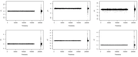
You have quite distinctive signals. All six of your variables show a pulse at the same time (and some sort of echo effect just after the main pulse). On all six, the magnitude at the main pulse is much bigger than the non-pulse values.

In the early part of the data (before the gap) most values for all variables have absolute value less than 1. Only a few extreme outliers in zA have absolute value bigger than 3. Only a single zA value has absolute value greater than 5.

summary(KPTS[ShiftedTimestamp < 180000, 2:7])
       xA                 yA                 zA           
 Min.   :-2.24648   Min.   :-1.00681   Min.   :-5.434228  
 1st Qu.:-0.08406   1st Qu.:-0.08416   1st Qu.:-0.179236  
 Median :-0.01199   Median :-0.01219   Median :-0.007965  
 Mean   :-0.01382   Mean   :-0.01518   Mean   :-0.009050  
 3rd Qu.: 0.05895   3rd Qu.: 0.05692   3rd Qu.: 0.167179  
 Max.   : 1.22819   Max.   : 0.95787   Max.   : 2.014981  
       xG                  yG                  yZ            
 Min.   :-0.203262   Min.   :-0.273178   Min.   :-0.1130829  
 1st Qu.:-0.018662   1st Qu.:-0.028778   1st Qu.:-0.0117798  
 Median : 0.002869   Median :-0.002518   Median :-0.0009308  
 Mean   : 0.003584   Mean   :-0.002234   Mean   :-0.0012117  
 3rd Qu.: 0.025257   3rd Qu.: 0.024143   3rd Qu.: 0.0097084  
 Max.   : 0.242538   Max.   : 0.332275   Max.   : 0.0948639 

sapply(KPTS[ShiftedTimestamp < 180000,2:7], function(x) sum(abs(x)>3))
xA yA zA xG yG yZ 
 0  0 17  0  0  0 

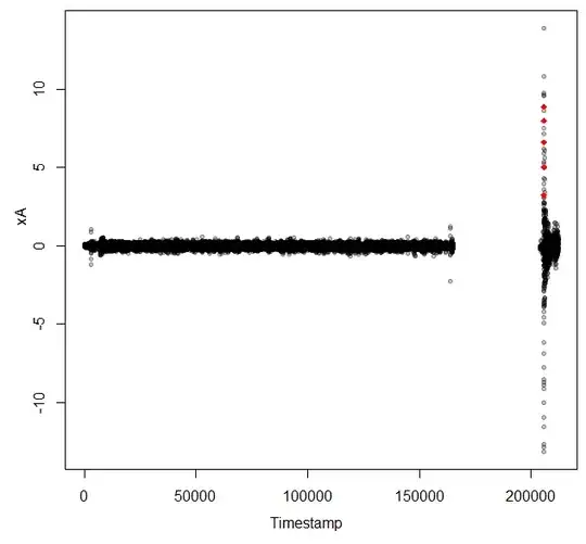
By contrast, all variables show values over 5 during the pulse.

sapply(KPTS[ShiftedTimestamp > 180000,2:7], function(x) sum(abs(x)>5))
xA yA zA xG yG yZ 
33 20 59  5 22 15 

Note that there 32776 points before the gap and 1658 after the gap.

Based on this data, I would say that you do not anything complicated to find the pulses. This code computes how many variables have absolute value greater than 3 for each point.

Extremes = rep(0, nrow(KPTS))
for(i in 2:7) {  Extremes = Extremes + (abs(KPTS[,i]) > 3) }
table(Extremes)
Extremes
    0     1     2     3     4     5     6 
34281    66    32    27    19     4     5 

So there are five points at which all six variables have absolute value greater than 3 and another four points at which five of the six variables have absolute value greater than 3. You probably need to know where those peaks occurred.

which(Extremes == 6)
[1] 33165 33166 33167 33168 33169

plot(ShiftedTimestamp, KPTS$xA, pch=20, col="#00000044", 
    xlab="Timestamp", ylab="xA")
points(ShiftedTimestamp[E], KPTS$xA[E], pch=18, col="red")

xA with Extreme points marked

In order to really use this you will need to do some tuning against your full data. Do you want to find the places that all six variables have extrema or is 5 out of 6 enough? I used 3 as a threshold abs(attribute) > 3. Is there a better value? You will probably want to group the multiple timestamps that are close together into a single event. How far apart can they be and be considered the same event? I think if you make good choices for these thresholds, you can get good results out of this very simple model.

G5W
  • 2,483
  • 1
  • 9
  • 21
0

Create a training and a test dataset where you label the spikes explicitly. You could then use any classification method such as logistic regression, svm etc to train the classifier and use the trained classifier to predict unseen instances.